Where Are You Headed Today? – Self-Initiated Project Workshop Challenge
Running rather late all of a sudden with this project, but finally I concluded it. So recapping from the previous blog posts, my topic for the project, or rather, the question that wanted to answer was:
How is urbanisation impacting the reputation of Malta? And how is this impacting foreigners visiting the country?
Granted that is a very broad topic, in fact I will only be brushing upon this concept in this project, but the idea is to show a different side to the Maltese islands. Building on the postage stamp project for the ‘Noticing the Ignored’ week back in Module 1, I wanted to portray Malta in a rather unusual landscaoe and on a different canvas if I may.
Putting the pieces together…
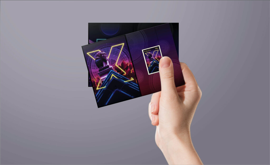
So, I had the design style in place and the ‘canvas’, but I did not want this to be a simple keepsake you would find in a souvenir shop. I wanted to elevate it a bit more, turn it into an activity, even if it is a simple one. The idea of creating the Miniature Card (in philately, the miniature card is a decorative sheet carrying a number of stamps still attached together) only came after some serious thinking and some intense Googling. I was not familiar with philately terms and I only learned what a miniature card is a couple of days ago. Since my project outcome was indeed a postage stamp, it was a good fit.
The Where are You Headed Today Explorer Cards
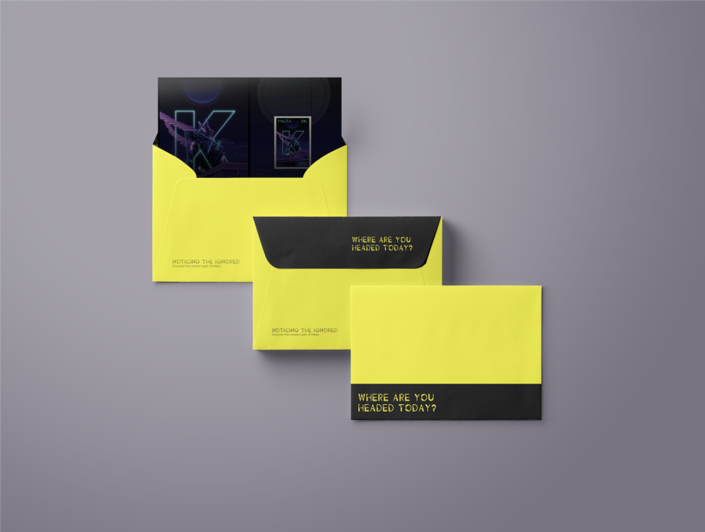
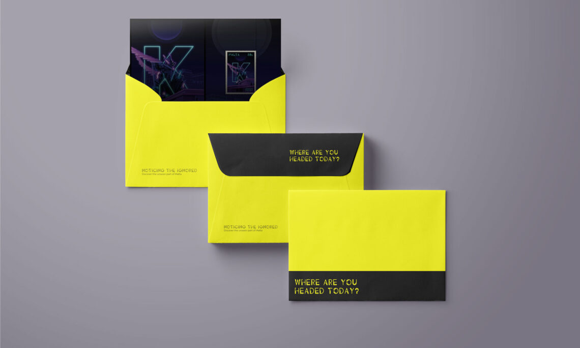
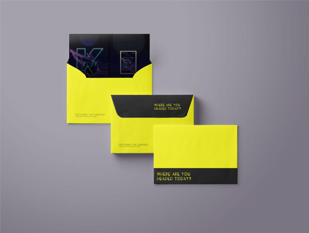
These cards are designed and aimed for whoever is interested in exploring the island. The cards come in six colour-coded envelopes – each colour corresponding to one of the major regions in Malta. The idea behind the colour-coding is to help the user in deciding how far would they like to venture from the starting point.
Each envelope would contain one card:
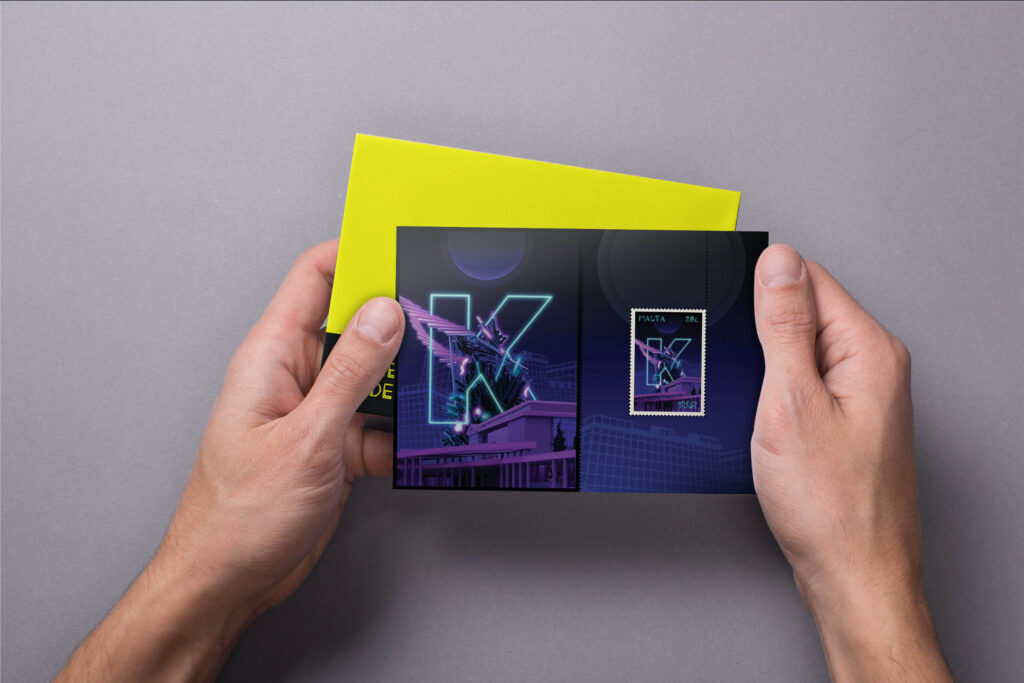
- The Front: the front is the ‘miniature card’ side. The user can see the postage stamp and a larger version of the stamp’s artwork.
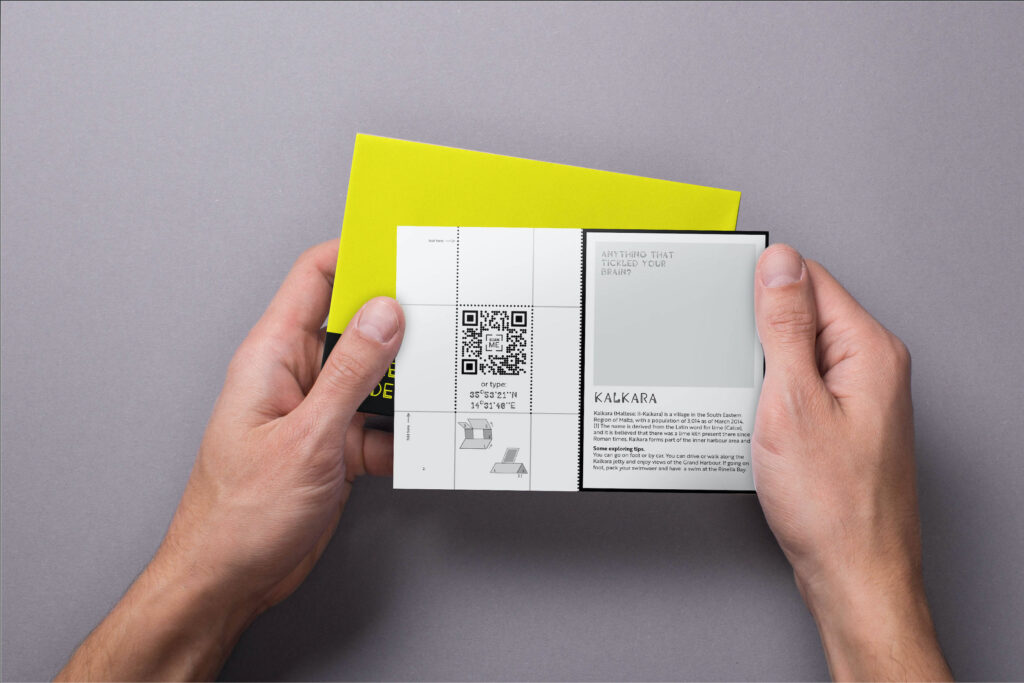
- The Back: this side is the activity part. On the left side, there is a QR code and map co-ordinates. The user can either scan the QR code or type in the coordinates in a navigation app to their choice. Either way, this would tell the user where the town with the corresponding card and stamp is. On the right side, there is the name of the town where the user would be headed, some information about the town and some tips for the user.
Once they are done with the hiking, the card can be split in two parts: , and the artwork can also be cut separately, and the stamp can be either cut out using the perforations. Alternatively, the user can use the outside frame round the stamp as a stand by folding it along the lines at the back and turn it into a free diorama of the stamp.

Why the envelope? And Why a Postage Stamp?
The fact that users do not get to see the designs straight away will amplify more the idea to make people explore unfamiliar areas around the island. Also, a bit of a mystery makes people curious, and even try it again. In addition to this, there is also the ‘collectable’ element in it. Inspired by the sticker packs and baseball cards, collectors of all ages would like to give this a shot. Even if they do not visit the area physically, they get a taste of the greater picture of Malta.
As for the postage stamp, as mentioned in previous posts, it was inspired by the saying ‘tiny but mighty’. Malta measures 27km from end to end, so it is rather small, yet it has a lot to offer, and there are Maltese immigrants all across the whole world, and similarly Maltese expats are from every corner of the world. Like a postage stamp, it is very small, yet it gets to travel everywhere and without it, even the most important of documents would not make it to its destination.
In Conclusion
It was an interesting project in many aspects. I got to work on a rather unusual project – definitely I was not expecting to be reading about postage stamps and philately. In addition, the design style I adopted was something I wanted to explore for a while, just did not have the opportunity to find the right context for it. Considering contacting Maltapost still, and maybe even the Malta Tourism Authority regarding this project to see whether they would be interested in promoting, and possibly funding this project. Alternatively, the designs can also be converted to merchandise and prints and be placed for sale.


One Comment
Evaluating My Own Projects – Yays and Nays – Lindsay Aquilina – Graphic Designer
[…] My inspiration for my project was to shed light on the not-so touristic places of the Maltese Islands, to promote the island as a whole especially to expats. In the end I created a series of ‘exploration cards’ where users can buy them and get a location where they can visit, hike to or just read about. (You can read about my project here). […]