Type and Page – Constructs of Typography, Systems and Theory
People have always felt the need to document all sorts of information. Prior to the invention of writing systems and books, people used images and symbols and use walls and chisels as their “writing” equipment. In addition to this, people also wanted to make this information project a mood to the observer to the presentation and shape of it.
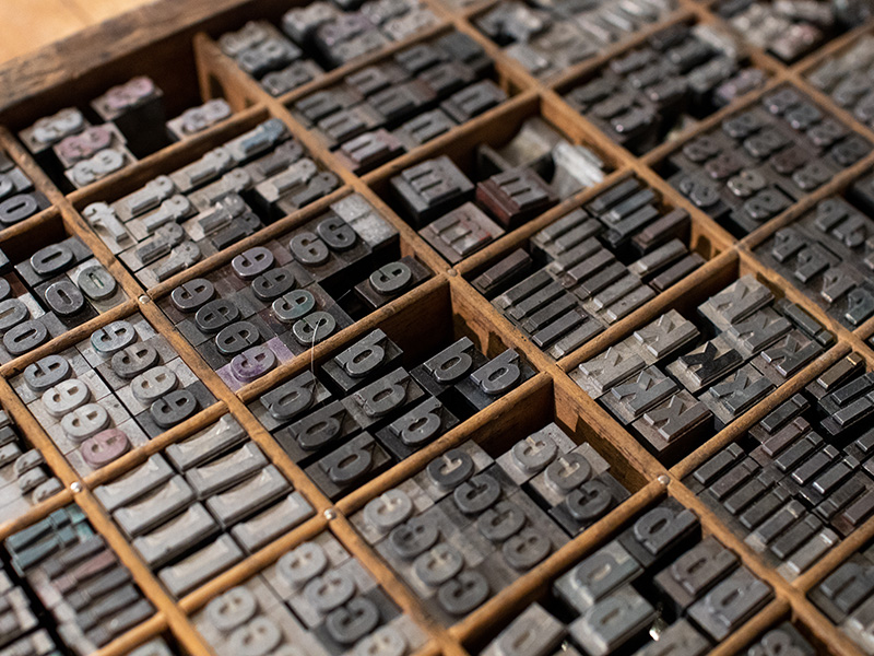
This week’s lecture kicks off with the Illuminated Manuscripts. These manuscripts are the foundation of what can be called a ‘mass-produced book’. These were obviously produced by hand, meaning having scribes writing over and over again, which was time consuming. Back then, since sources were limited and producing a book was very laborious, the book production was limited mostly to religious texts, until Johannes Gutenberg created moveable type in 1439.
Moveable type was a leap forward and it paved the way to the art of typography. As discussed in the lecture, the origins on much of the techniques and terminology are derived from the tools and setups that were used way back when printing was done by hand. The terms uppercase and lowercase are an example of this. The capital letters are stacked in the upper part of the letter casing and the small letters in the lower part. With this new invention, typographers where also experimenting with different lettering styles, and the first typefaces were emerging. In the Renaissance period, scholars, like Nicolas Jenson, were favouring more ‘humanist’ fonts over gothic scripts. Jenson was a Frenchman who studied printing in Germany. In 1469, he set up a printing firm in Venice. From this firm, the first roman typefaces were created. He merged the gothic traditions from the France and Germany and combined them with the Italian, lighter, rounder styles. During this time, artists prioritised proportions, including lettering. Geofroy Tory, a French designer and typographer, published a series of diagrams that link the anatomies of letters and man in 1529.
To this, in 1693, a committee was appointed by Louis XIV of France specifically to construct roman letters following a finely meshed grid. Unlike Tory’s diagrams, where the letters were produced in wood, the king’s committee were to engrave letters in copper. This were engraving earned its style and status of ‘formal lettering’. Unlike the rigid mechanical grid of the letterpress, engraved lettering was less restricting, making room for more decoration in the lettering.
In contrast to the 18th century, typographers like William Caslon and John Baskerville, moved away from the humanist style and went for a more fluidity and swelling paths in the lettering. However, in the case of Baskerville, his designs were initially rejected and was accused of ‘blinding all the Readers in the Nation; for the strokes of [his] letters, being too thin and narrow, hurt the Eye”. However, at the turn of the century, the typographers Gaimbattista Bodoni and Firmin Didot followed on Baskerville’s creations and extenuate the style. Following this new typographic style, unhinged from the conventional calligraphy, more experimental and expressive lettering. As the industrial revolution was in full swing, the need for advertising increased, therefore there was a need, simply put, to stand out. This meant that lettering was taking a mechanized approach that treated the alphabet as a flexible system, where proportion and formal features such as weight, angles and curves were prioritised, which lead up to the way which typeface are designed today.
Through the course of time, various design movements have explored the field of typography. Some sought to design the perfect letterforms, whereas others are completely experimental. Some designers viewed the distortion of the alphabet repulsive, as they linked it to the inhumane industrial system. In 1906, Edward Johnston revived the need for the essential, standard typeface that moved away from the “immoral” experimental typefaces. Inspired by Morris’s Arts and Crafts movement, he sought to design a typeface that was pure and stripped down from any decoration. On the other hand, avant-garde artists like Theo van Doesburg and Herbert Bayer, looked into more geometric shapes to create revolutionary letterforms that were unpreceded.
As the world entered the digital era, producing typographic artworks became easier, making way for exploration. Examples of this are the works of Neville Brody and David Carson. During this period, typography also took the role of a narrative through the letterforms and layout. With that said, the importance of well-designed typography artworks – regardless whether minimalist or experimental – became even more important. Quoting David Carson, “Don’t mistake legibility for communication”. Typography is one of the pillars of graphic design that is often overlook, however, it is worth noting that making the wrong font choice can ruin the whole artwork.


One Comment
ปั้มไลค์
Like!! Thank you for publishing this awesome article.