Some Seeds of Inspiration
As I already mentioned in a previous post, this week’s lecture was full of inspiring materials that it would be more than enough to use as a trigger of ideas for this week’s challenge. All the examples shown were inspiring in their own right, however, I found Stephen Gill’s and Laura Coombs particularly striking.
Stephen Gill
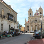
Stephen Gill is a British photographer born in 1971 in Bristol. His interest in photography started from a young age, probably influenced by his father, who was also a photographer. Also, Gill had a keen interest in birds and insects and he often collected pieces of pond life and look at them under the lens of a microscope. At the age of 11, his father taught him how to process film in a darkroom which they had at home. His interest in photography stuck to him as he grew up, so much so that in 1992, he enrolled in Filton College to study photography. After finishing school, Gill moved to London, then settled in Hackney till 2014, to which he then moved to Sweden and set up a studio there. Over the years, he has worked on various publications where he showcases his photography in various contexts.
Whilst in Hackney, he worked on a book named Hackney Flowers, published in 2007 by Nobody Books, which is the book that got my attention in this week’s lecture. In Hackney Flowers, Gill used photos which he took when in Hackney, which include landscapes, people, closeup shots etc and combined them with dried flowers, seeds and other bits and bobs that found around when in Hackney. This creates and interesting composition that is full of colour and vigour.
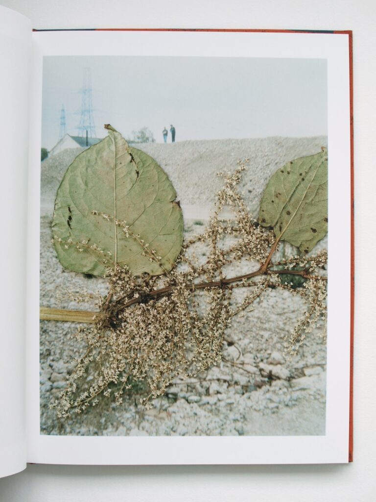
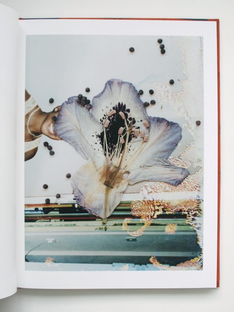
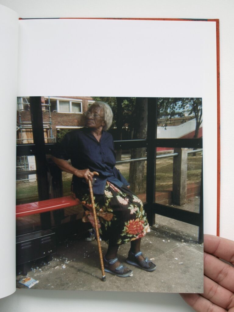
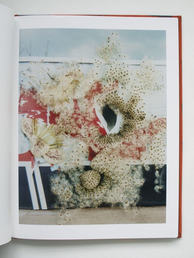
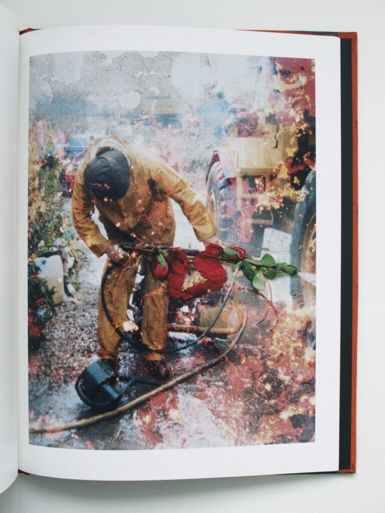
Above are some examples from the book. I found this combination of elements very inspiring and interesting. Firstly, it is because of the unconventional combination, as well as due to the fact that the whole composition conveys different emotions. I see these compositions as a combination of two parallel life cycles that are living together in synchronisation. On the one hand, I see the photos, which is showing an instance in our daily lives, and on the other, there is the flower, the culmination of a tree’s life cycle that is reached every spring. Syncing the flora with the fauna in a frame of sorts. I described these ‘lives’ as ‘parallel’ for we can never be plants, nor can a plant become human. It is a beautiful book indeed.
Laura Coombs
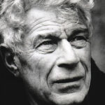
Laura Coombs is an American graphic Designer based in New York. She is a prominent figure in the academic side of the creative industry. She has taught, lectured and served as. A critic at various design schools, including the Yale School of Art, Parsons and Werkplaats Typographie. Also, her work has been recognised and awarded exhibition at the 28th International Biennial of Graphic Design Brno 2018 and her publications received the AIGA Best Books award in 2018.
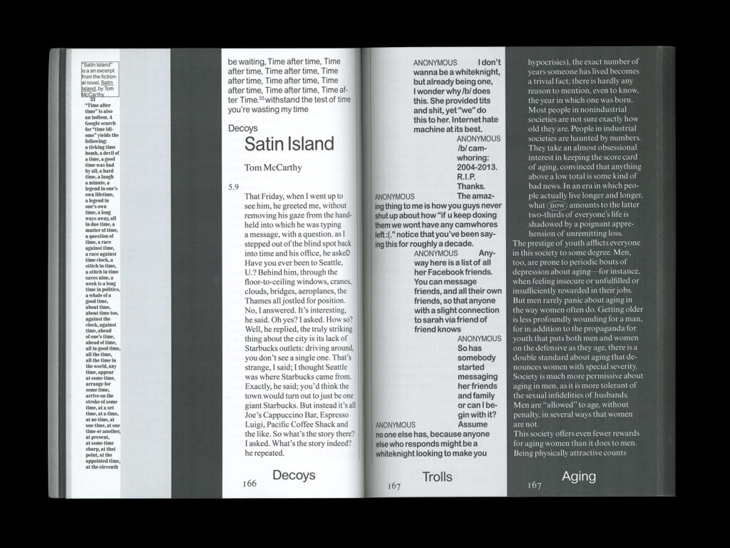
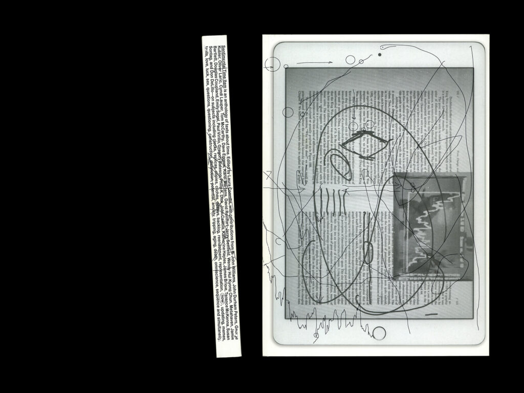
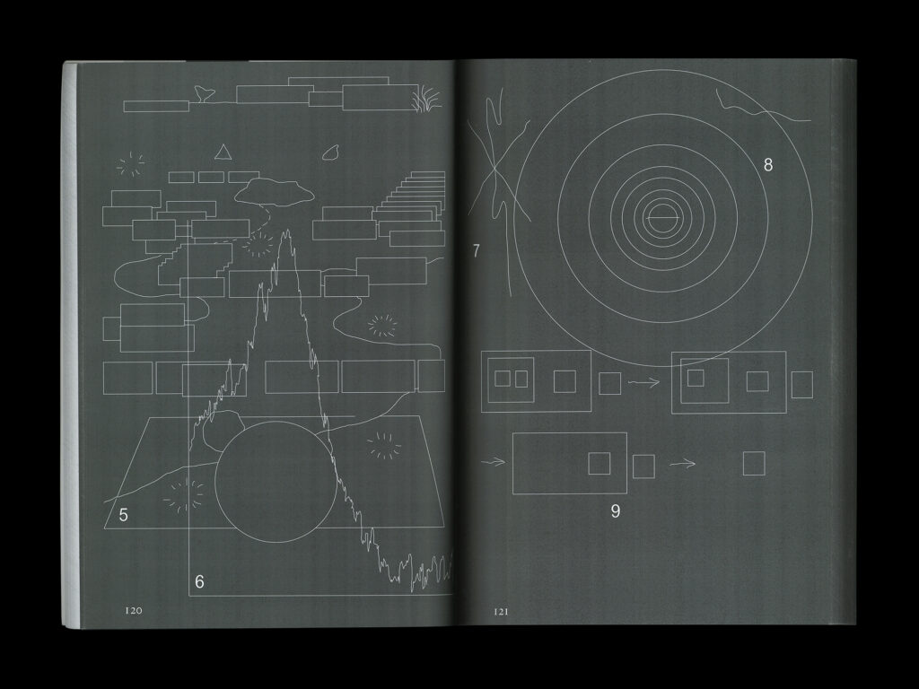
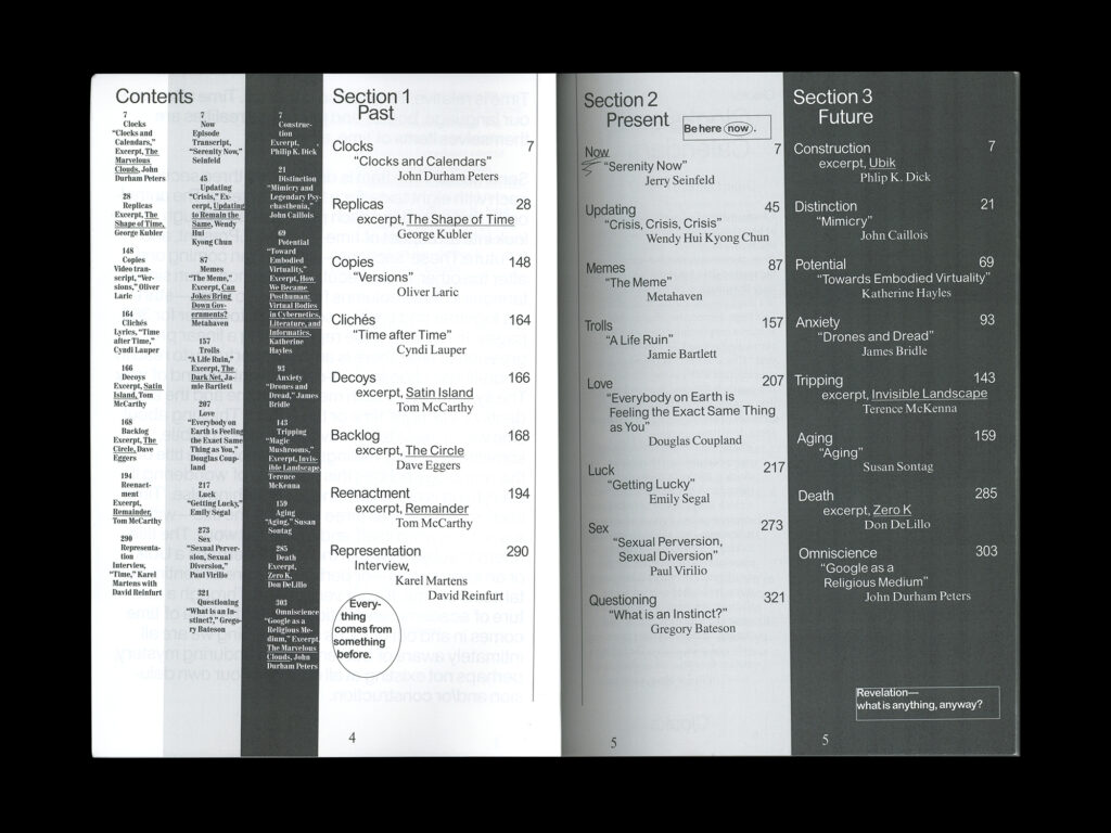
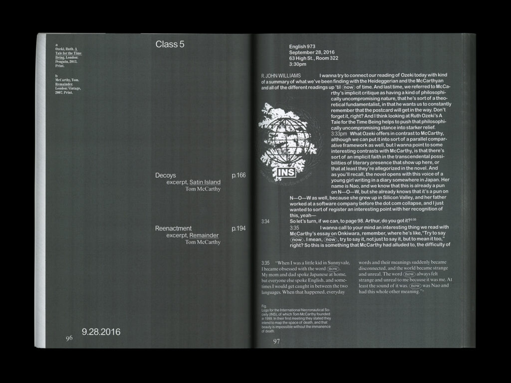
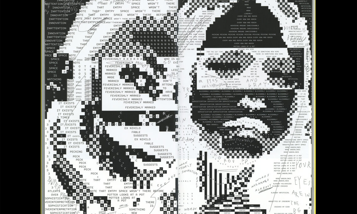
I liked her work because of the balance between experimentation and minimalism. Very often, experimental design tends to be very colourful and very often breaks the rules and conventions of design to create an artwork that conveys various emotions. However it is not the case in Coombs’s work. Sentimental Time Item is a book by Coombs that combines 3 different sections – The Past, Present and Future. However, there is a catch to it. The section are not one after the other. Instead the page is divided into three columns, each column showing a different section from the book. As one can see, in terms of layout, it still respects the boundaries of the modular grid, but in terms of concept, it is very unique. As the pages have a ‘three-in-one’ layout, it allows the reader to choose which way to read the book. Could be one column after the other, one section, or even line by line from left to right. This sectioning of the book reminded me of Dante’s epic The Divine Comedy, for it is also sectioned in three parts. It would be an interesting take on the epic, should one apply Coombs’s concept on it. An epic epic.
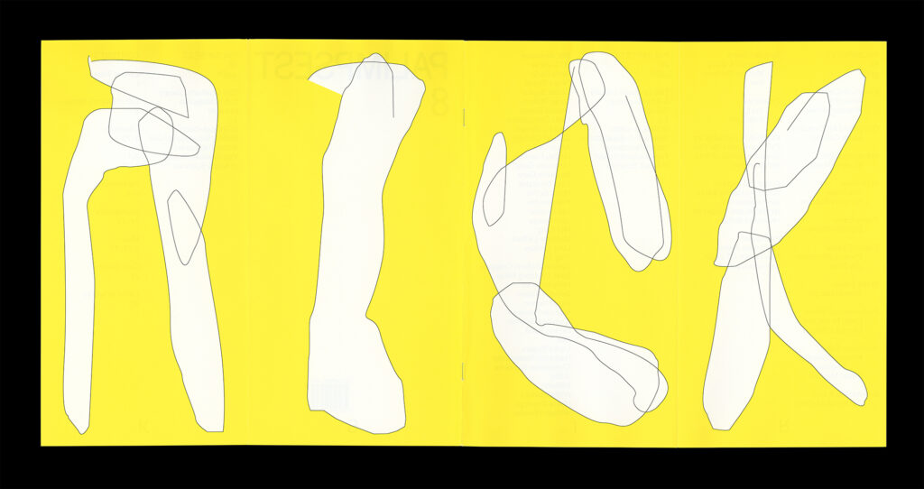
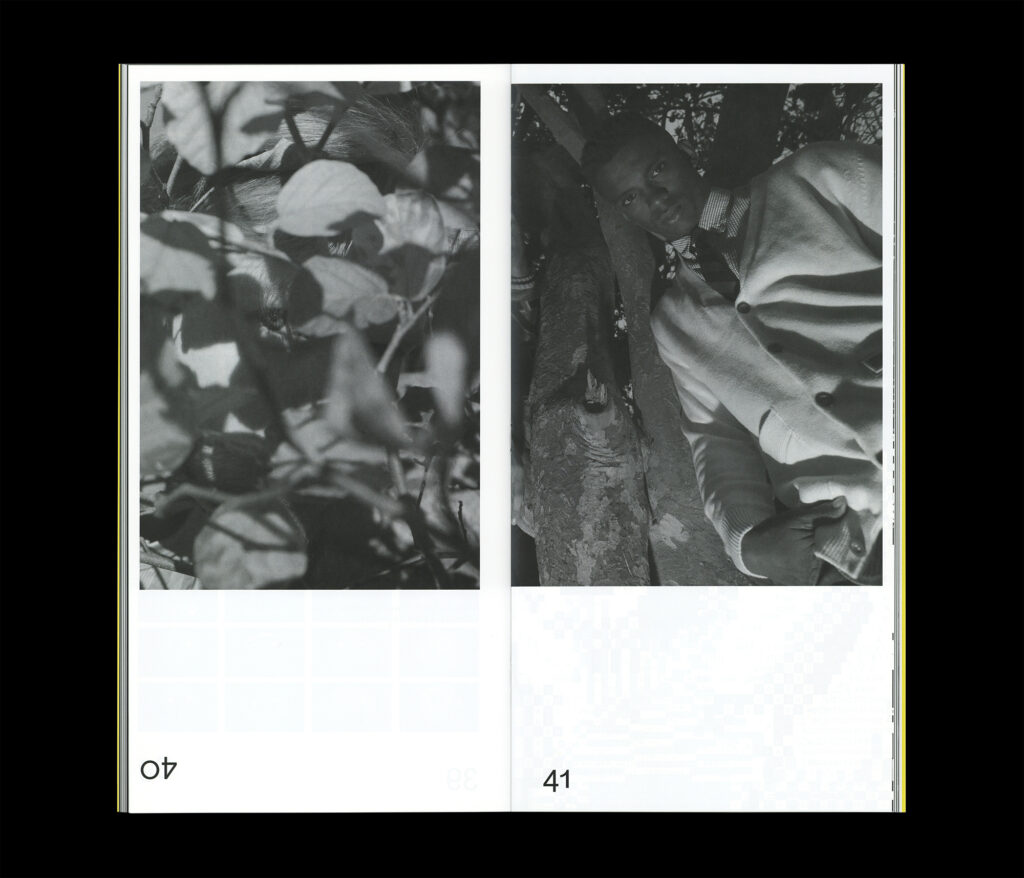
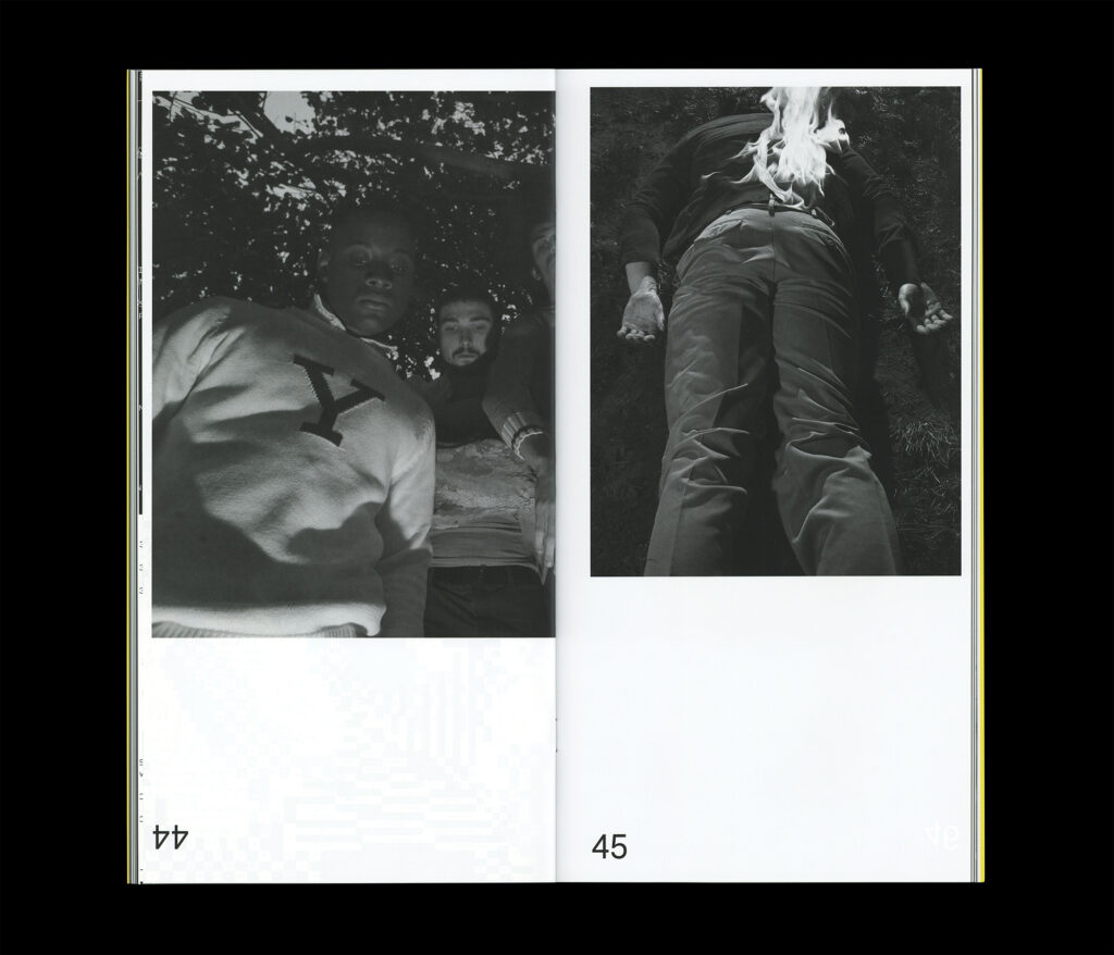
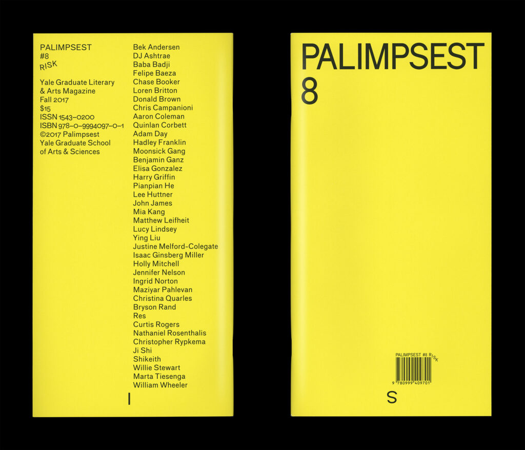
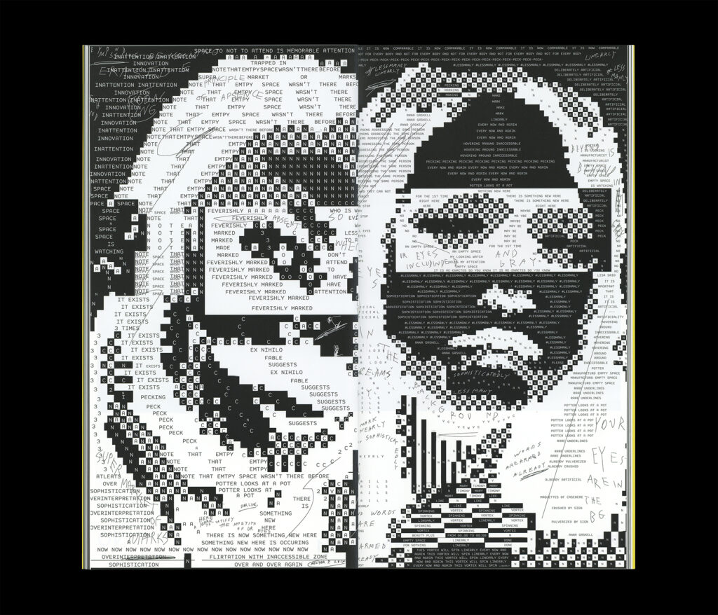
Another interesting piece of work is Palimpsest 8, a magazine published by Yale University. Once more, the visuals ae mostly black and with, but the vibrant yellow used as an accent colour gives this publication a new buzz in its pages. Unlike the previous example, the magazine content is more visual and more experimental, but overall, still respects the general conventions of Graphic Design. A similar project is The Pill, only this time the dominant colour is a pastel pink, along with high contrast monochrome photography.
Quite interesting design work indeed. Looks like a very insightful week ahead. Will be exploring more and brainstorming about my final outcome in the coming days.