Putting the Project Together

I have not written that much this past week. I was a bit all over the place to see from where I am going to start – from deciding what kinds of pages do I require to create an MVP for this app I am creating, to learning Figma (the UI design software I chose to work with), the usual design style with colours and fonts… the usual pre-project jitters, mixed with ‘blank canvas syndrome’. I have to say that it was intense and a bit stressful, but looking back, I enjoyed working on it, and seeing it coming together in the prototyping phases.
Getting familiar with Figma and Designing the App
For those who do not know what Figma is, Figma is a free UX and UI design software that is available online and one of the best features of it is that is autosaves everything you create automatically in cloud storage. I chose this as some of the UI designers at work also use it, and I figured that gaining some knowledge in this software, will benefit me both in the course as well as for work. To which I started off by going through tutorials, whilst learning I thought that I should find something that would help me build the app prototype as well in the process. I was lucky enough to find a couple of tutorials – one was more of a bootcamp course to go through the major tools, and the other was a very in-depth master class that was very good for people just starting out in Figma.
In the meantime, I was also laying out the basic wireframe of the app and also put together a moodboard to have clear picture of the style that I am going for, which I talked about in a previous post. You can check it out here. Wireframing is essential when it comes to UI design as you can see a draft of how the layout is going to look like. Albeit it looks rather generic and dull (it’s all in grey) such an approach speeds up the process quite a bit. Different to when you’re laying out a magazine, a digital platform (app or website) it is important to have consistency across all the pages and sections, as users tend to go back and forth between pages for than once. In addition, pages in a digital platform usually hold more information besides the main topic, such as search function, access to other areas of the platform and the like. In a magazine, the ‘user’, or rather reader is skimming through the pages one after the other… in that case, although the design concept should be consistent, variations of layouts makes the experience more enticing.
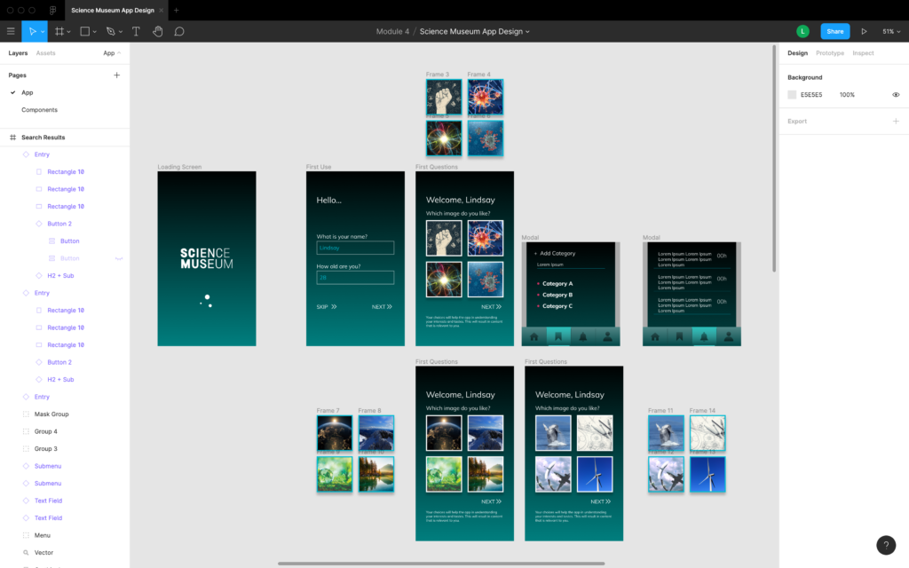
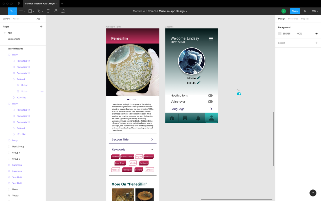
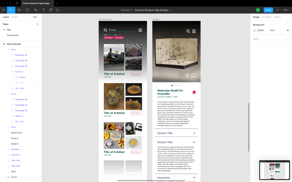
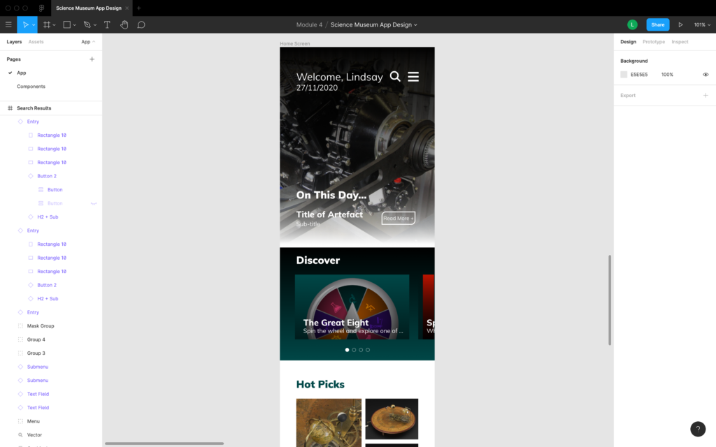
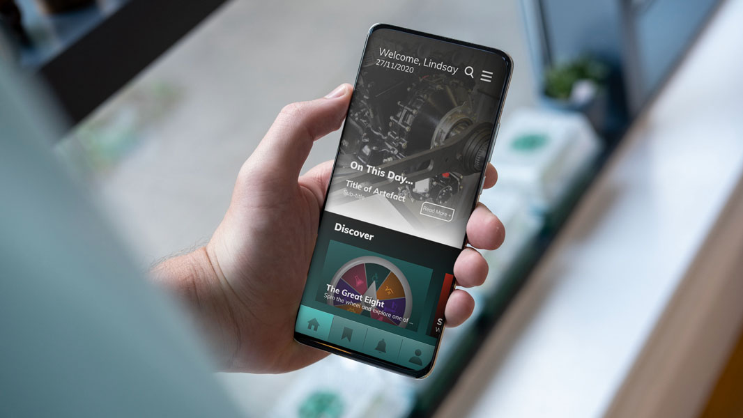
Following this procedure, implementing the design styles and elements was a lot easier. By using ‘components’ in Figma – it is like creating a master element and then implement duplicates in your designs – it was simpler to change any of the elements whilst maintaining consistency throughout the design. As I also explained in previous posts, I kept in mind the brand style of the Science Museum and also created a mood board to help me visualise better the ‘look and feel’ of this app. I wanted to go for a look that is friendly and welcoming, yet not too casual to the point that is looks childish and gimmicky. As it is an app representing an entity of a certain stature, a certain level of professionalism needs to be reflected. Below are some screenshots of the app using Figma.
Prototyping the MVP
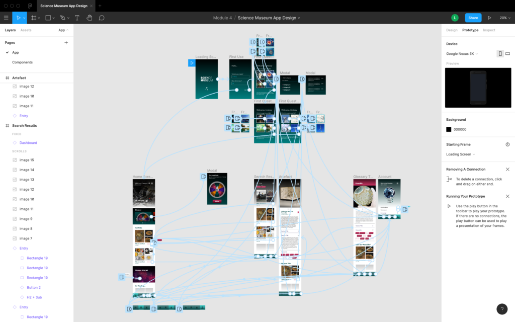
Another feature in Figma is that of prototyping the UI functions. Now this part was something that I have never worked on before, so it took some time to get the hang of it. Turned out it was relatively easy in terms of setting it up. The challenge for me was more when it came to making the prototype as seamless as possible. The above image shows the mapping of the different links between frames and functions. This is my first ever prototype in Figma. I will make sure to work on keeping the workspace neater next time round. You can follow the link here to try out the app.
Gathering Feedback
The feedback was positive so far overall. The feedback I got was praise and constructive feedback. The main critique I got was when it came to the naming of certain sections, to which I agree – I am terrible at naming things – and some also suggested ‘dark mode’ for the app’ It is something that I have considered indeed, to which I should probably include it in the prototype… although I also want to make sure that the prototype loads properly for the potential ‘testers’ of the app. At the moment most of the feedback has come from the student cohort. I would like to perfect the prototype a bit more before sharing it outside the student cohort. As the prototype only works through the Figma app, the Figma mirror app tends to lag on certain phones, meaning that the prototype is best viewed on desktop for the time being. I should probably include a link to download the mirroring app so that whoever is interested in seeing it on a phone, it would work well. Will be posting about further feedback in the upcoming posts once I share it with people outside the course. Should be an interesting take on the exercise…

