My Library


The Scope and Boundaries of Graphic Design Today: Current and Future.
This week’s task was focused on how the Graphic Design practice is divided into more focused categories that reflect various fields of expertise. In order to understand better this topic, we were to study and write about the various categories found in the D&Ad Awards Winners. Finally, we were to present this writing in an editorial piece, either digital or printed.
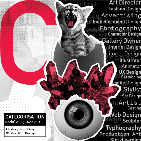
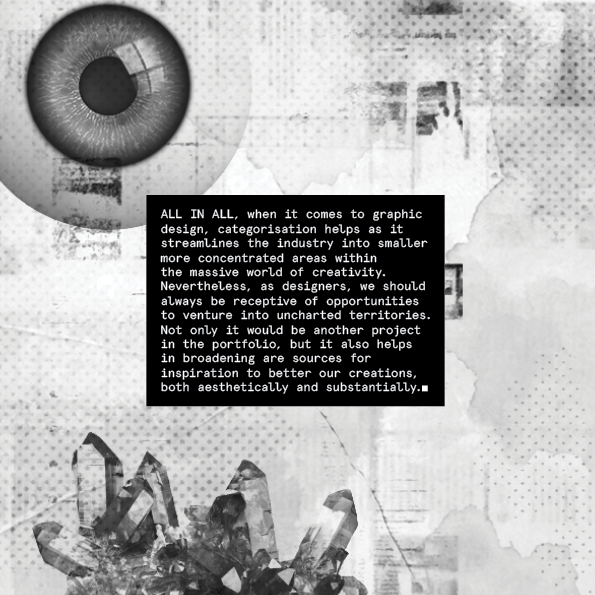
I presented the idea in the form of a pamphlet. I used Rebus to illustrate the word ‘categorise’ – split into “cat-egg-ore-eyes” and was inspired by the Constructivist collages, the punk era of the 60s and the Postmodern styles of the 90s. I also applied this train of thought to the typography chosen. I went for DIN and Apercu Mono, sans serif and serif respectively. I chose DIN as it is sleek, modern and it makes a statement with minimal effort. Onthe other hand, Apercu Mono is a serif font that is stripped down from any styling, giving it that raw, bold feel.
