Paula Scher and Her Typographic Works

‘Typography is painting with words’.
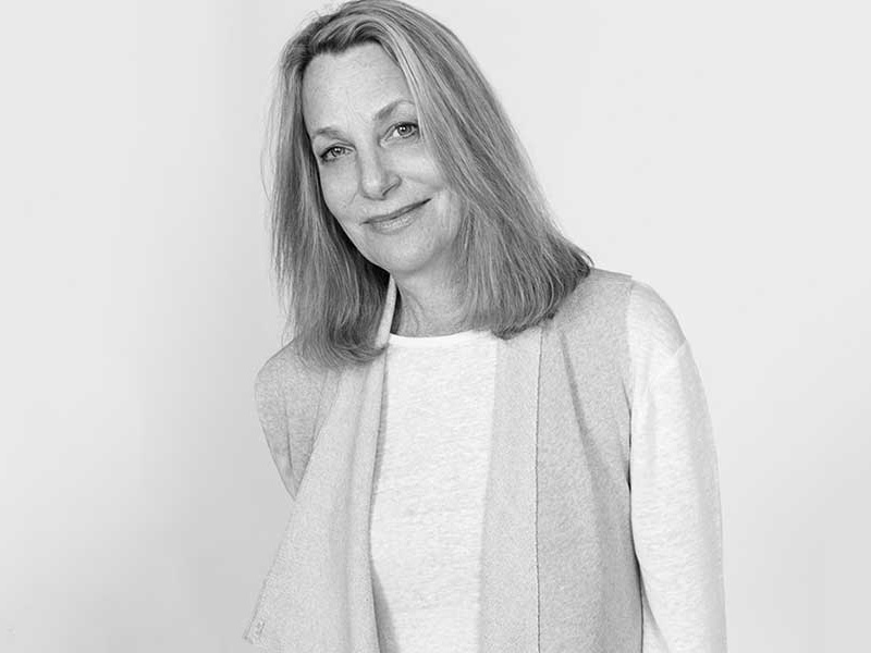
Paula Scher
This is how Paula Scher describes typography in her episode from the Abstract series and I cannot agree more. In this episode, the creators showcase some of Scher’s pivotal works, starting from the album cover designs and progressing to when she transitioned from producing designs by hand to going digital.
In this episode, Scher speaks about various aspects of how typography affects an artwork, how typography can be the main element and how it can also be a means of conveying a message. In many of her works, she explores letterforms to make an impact and making the letterform the main element of her designs. In addition, in some instances she adds typography to compliment the imagery chosen. However, as her career progressed, she points out that the typography in her artowrks was gaining more prominence with every design she made.
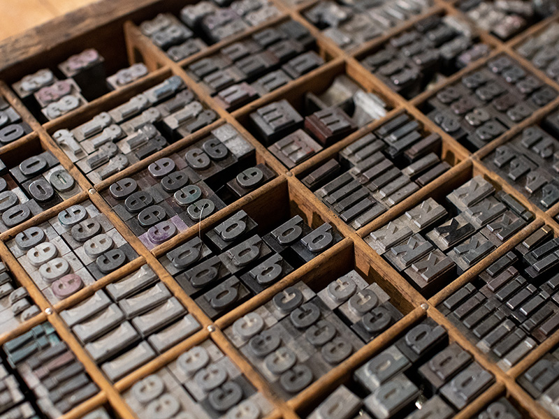
Typography is an artform in its own right, but it is sometimes underrated. Many think that typography is choosing a font in the last minute and just add it to a finalised artwork. It is not the case. Just like any aspect of Graphic Design, it requires skill and practice to master it and very few achieve that level of skill over the years.
