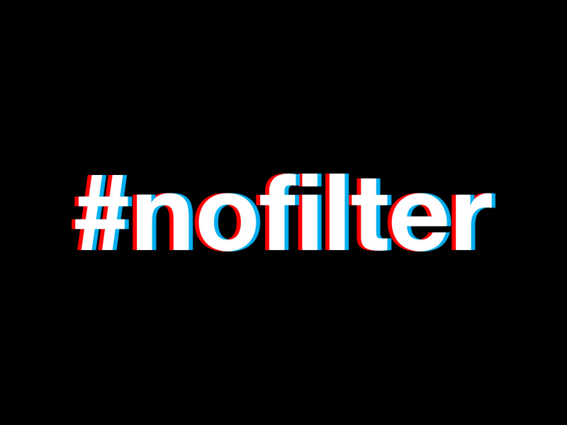
#NOFILTER – THE TRUE SELF
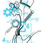
Finally, after some delays, I am writing this blog post. #NOFILTER is my response to Week 4’s workshop challenge. Week 4 was about exploring ‘The Self’ from a psychological point of view, and what are our core values that make ‘us’.
For this challenge, I went for an installation. It is an artistic area that I have not really explored and following a discussion with my tutors, I went ahead to see if I can bring this idea to fruition. I have to admit, that this particular task took quite some time, as I could not put a finger on a tangible idea. It was one of those weeks were ideas were bouncing around and I was trying to latch on to every single one.
Why ‘#NOFILTER’?
“Hashtag no filter” is what a colleague said to me once after some very in-depth discussion over coffee. I actually liked the ring to it and every now and then I recall phrases like these. This time, the morning coffee conversations was the spark for a whole creative process.
I believe that we our personality comes in layers. We show parts of our personality to some people, some parts to others. To some we show more and to others less. We use filters to see which part of our personality we should show. However, I think that our core values stick to us no matter which part of our personality we are showing. For instance, I see myself as an outspoken and opinionated person. I may not be direct in what I have to say to some, but then again, I would still give my opinion one way or another if someone were to ask me.
The same thing when it comes to me as a Graphic Designer. Whatever the project is, I always do my very best in order to come up with the best design solution possible. I like pushing the boundaries and experiment. I really enjoyed experimenting with light and colour filters while researching about stereoscopy and anaglyph 3D (read more about my creative process here).
I also made a short clip showcasing this installation experiment I created. Hope you’ll enjoy it as much as I enjoyed working on this project.
Music: We Disappear – Jon Hopkins.
A Closer Look at the Design
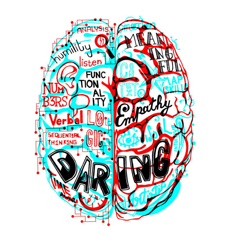
I wanted to show the two different sides of the mind – the technical and the creative. I used blue and red for the left and right respectively as blue invokes a calm mood, making it easier to concentrate and think logically. Whereas red invokes energy and stimulates emotions, triggering impulsive decisions and a more expressive output.
However, despite which part of the brain is dominant, the core values of our personality are always present, which is why are in black. Just like they cannot be blocked with the filters in my installation, we cannot switch off parts of our personality.
One might have noticed that in the artwork the colours are the opposite of what I said above. It is intentional, as otherwise the filters in the installation would have blocked the information that I wanted to show.