Inspirations and Ideas for an Outcome

The first step for this project is identify what is being requested from the client – the Science Museum. In last week’s presentation, John Stack – curator at the Science Museum, presented a more detailed version of the brief and explained further what is required. The brief is quite technical, and for a designer, it was rather confusing, however, following a couple of readings and the presentation, it was somewhat clearer. I came to the conclusion that I should base my research on the following two concepts, namely:
- Engagement
- Accessibility
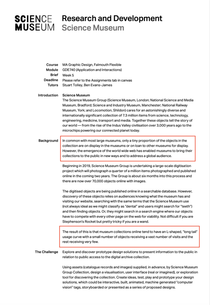
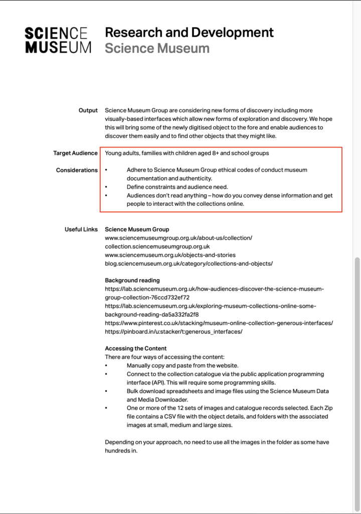
I came to conclusion because in the brief (shown below) as well as in the presentation, the number of exhibits in storage in comparison to what is displayed was mentioned numerous times. In addition, it was also mentioned that the current archive platform is rather difficult to access and navigate in the space – not the most user-friendly of interfaces.
The main reason being because it operates via a search engine function. And as a search engine, it relies on the number of keywords linked to the specific item in order for it to show in the results pages. Moreover, many users complained that they often do not get the results that they were looking for, or even do not know where to look for to begin with.
Inspirations
With reference to the links shared in the clients’ assignment brief, I went looking at different examples of how different museums are cataloging their archives and other modes of engagements, especially for children and young adults. I am focusing primarily on this demographic because it was specified in the brief. ‘Over 8 years, young adults and families’ is the specified demographic for this project. In addition to the examples mentioned last week namely: the Rijksmuseum, the Van Goh Museum and the Google Arts and Culture page (you can read more about them here) I also looked at work produced by different design agencies that worked closely with different museums.
Thought Den is a design agency with a client base made up of museum, including the Science Museum. Their portfolio is not extensive, but they have very interesting work and well-established clients. One of my favourite apps is the Tate Magic Ball designed for the Tate Modern Museum. It is a random artwork generating app that bases its selection on the date, time, weather and geo-location of the user. It is a very easy to use and a fun app. I have shared the video below to get a better understanding of what the app is all about.
Moving away from museum exhibits and related apps, I had come across a movie named Erica. It is a thriller with a twist. Unlike a conventional movie where it has a beginning and an ending, this one is interactive – meaning that the viewer can pick and choose what the characters do, and the story progresses based on the viewer’s decisions. I think that such a concept would engage people. It is still a fuzzy concept, but I think that audiences can respond well to it.
Similar to this interactive movie, I would like to mention again the Wayback Project mentioned in previous posts, this was a 360o view film created with the aim of helping people with dementia and Alzheimer’s engage in conversation with relatives and their carers. (You can read more about it here).
Initial Ideas
I also brainstormed a couple of outcomes for this upcoming project based on the initial research I did so far.
Idea 1:
Inspired by The Wayback project, the idea is to create a series of tours or missions linked to various fields of science, where the user makes use of VR technology and smartphones. The tours can be guided tours where the user can have 360 views at all times. Similarly the missions would be similar to mini-games. It can be helping Edison in his lab and you need to help him collect items for his latest invention, or Marie Curie with her discovery of Radium.
Idea 2:
Once more utilising smartphone technology, the user can take picture of any item, indoor or outdoor, and as app would generate relevant content accordingly. The user would need to confirm their age prior to using it, so that the content is relevant and suitable for the user. It would be very interesting to use in outdoor spaces , particular at nature parks. However it should not be limited to such places. It has also be used inside the home. It could something as insignificant as a microwave oven, you take a picture of it and content related to it it would be generated: who invented the microwave oven; what is the microwave technology; physics of frequency etc.
Idea 3:
The third idea is based on geolocation of the scientific artifact. Through an app, users can get alerts of important scientific events and/or occurrences based on their location. Alternatively, they can open the app, where they will see a map and as they walk around, ‘pins’ will show on the where they can be expanded to see what scientific event happened in that location on any given day. Also, some events can be for a limited time only. Case in point was last weekend’s equinox.
In the next post I will be writing and uploading my presentation about my strategy for this project and explaining further which path I will be pursuing in the coming weeks.




One Comment
Project Outline and Strategy: Workshop Challenge – Lindsay Aquilina – Graphic Designer
[…] at some different example of what other museums are doing. (You can refer to my previous blog post here). In conjunction with this, I will look at design studios that have worked with museums, such as […]