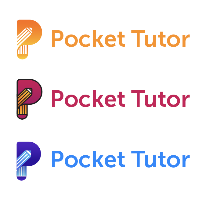
Finalising the Logo
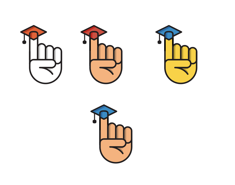
The last few days were dedicated solely to the design of the logo for the Pocket Tutor app. Working in Illustrator was relatively easy in refining the shapes of the possible logo ideas. As I could not decide on the best idea when I was still sketching, I decided to try out two potential ideas in Illustrator. Below is the final logo in black and white. I played around with the shapes of the ‘P’ and ‘T’ for quite some time before I came to this shape. I also decided on this option as opposed to the other, as I think that it is more timeless and ‘neutral’. The other logo consisted of a hand, and for some reason, I saw that flesh tones were working best, however, considering the app is aimed for foreigners and being in a country where it is becoming more multi-cultural by the day, I did not want the logo to make the app seem ‘racist’ or not culturally inclusive.
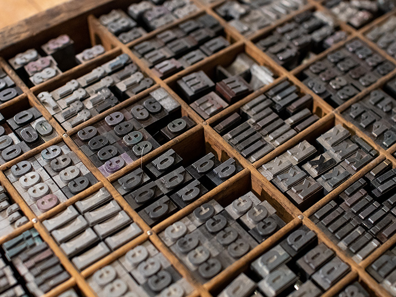
Logo Option B – the one I am having reservations 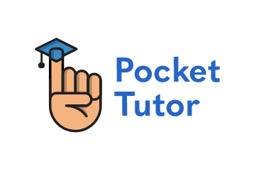
Logo Option B – the one I am having reservations
The Issues with Colouring
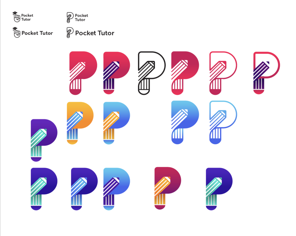
The biggest challenge was colour. Like with every branding exercise, I start by looking at some existing brands and look at their colour scheme used in their brands. In addition, I like using Coolors.Co – it is a colour scheme generator. Very often, I get so caught up with the logo shape, that I give very little thought to the work that comes after. Below are some of examples of colour schemes that I had put together using this tool. I want to go for something rather bright and lively.


Now, the issue was deciding on which colour scheme to go with. For some reason I started working with gradients, and initially I liked how the contrasts were turning out. However, after looking at the work with fresher eyes, I started having second thoughts and doubting whether it would look good. Currently I am at this phase:
I am most like to go with the first option, but I would like to have something with some more contrast. Would like to get some formal feedback on this, be it from peers or tutors. I have been working on this project for a long time, so some fresh eyes will be beneficial.
Up Next…
I definitely need to decide on the final logo, and the accompanying colour scheme, typefaces and possible some iconography style. Following that, as discussed in the latest webinar, I should create a “design brief” for my own project. That way I can have a better understanding of what is left to be done. According to the tutors, I am on track, however, I can feel the deadlines starting to creep up on me. I have also sent out the draft of the critical report to the Academic Skills Team to gather some more feedback. The peer feedback was a positive one, but I just want to seek a second opinion. Hopefully there would not be that many changes.