Final Concept Board, the Critical Report and Revising the list of Deliverables

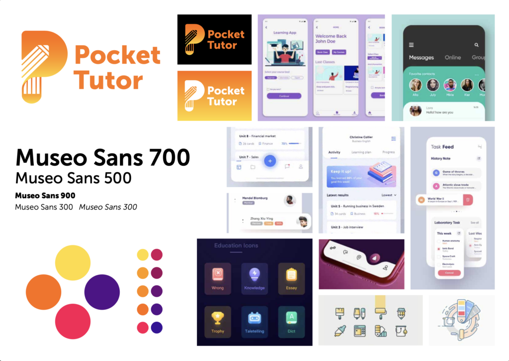
After going through what felt like hundreds of colour combinations, I finally decided to go with the monochrome logo design. I chose this as it words in various colours and can be easily produced on various media, both print and digital. Also, I settled on the yellow and orange as I want the feel of the brand to be friendly and welcoming. Yellow is indeed known to be ‘the colour of happiness’.
Below is the final concept board for this brand. Such an exercise helps me in visualising better the brand personality, and it is a good way of referring back to it along the project to keep the work in check. In addition to the logo and typeface of choice, I included some UI and iconography styles for inspiration.
Now that the logo is ready, I have shared it on some social media groups and introduce the concept of the brand to potential users and see what they feel about it. I will be sharing with them the logo as well, not to gather feedback on the design itself, but rather get the users to familiarize themselves with the brand, even if it is in the initial stages. So far there has been some positive feedback, which is very good sign.
About The Critical Report
I have only looked at it yesterday since the submission of the first draft. Following the feedback from the Academic Services team, I am revising what I have written so far and discussing my design process as part of my ‘methodology’ section. I am at odds as to whether this should explicity be part of the report, yet not including it feels like I am leaving a large portion of the process of how I am addressing the research question. Will be discussing this with my peers soon. Some insight would do well at this point. I will be gathering ongoing feedback from the target audience as mentioned above and would like to see whether those would be valid ‘findings’.
Deliverables
Even if the logo design is complete, there is a lot of groundwork that needs to be done. As suggested by one of the tutors, it would be a good idea to write a ‘design brief’ for ourselves or revise the initial plan of action. This is how I will be distributing the work over the final six weeks.
Week 19 – (11th – 17th July)
- Defining user journeys and finalising key app functions
- Start working on Studio Practice PDF – brand logo, colour scheme, typography, sample collateral
Week 20 – (18th – 24th July)
- Choose key pages of web app
- Wireframing
- Revise literature review on blog
Week 21 – (19th – 30th July)
CRITICAL REPORT DEADLINE
- Finalise Critical Report
- Design and layout of report
- Submit report
- Revise Blog for any gaps in documentation
Week 22 – (1st – 7th August)
- Revise wireframe and start implementing brand elements
- Set up social media page
- Plan prototyping
Week 23 – (8th – 14th August)
- Prototyping
- Continue PDF – brand story, beak down how app is used
Week 24 – (15th – 20th August)
FINAL DEADLINE
- Final Refinements
- Revise Blog for any gaps in documentation
- Finalise PDF
- Submit PDF

