Fetch Me A Manuscript
After burning brain cells round the clock the next couple of days, I have decided that I will visualise a data comparison between music genres and personality traits. I have found some informative essays on SAGEJournals and I also found a very good study on 16personalities.com. The report is to the point and the data is documented in detail.
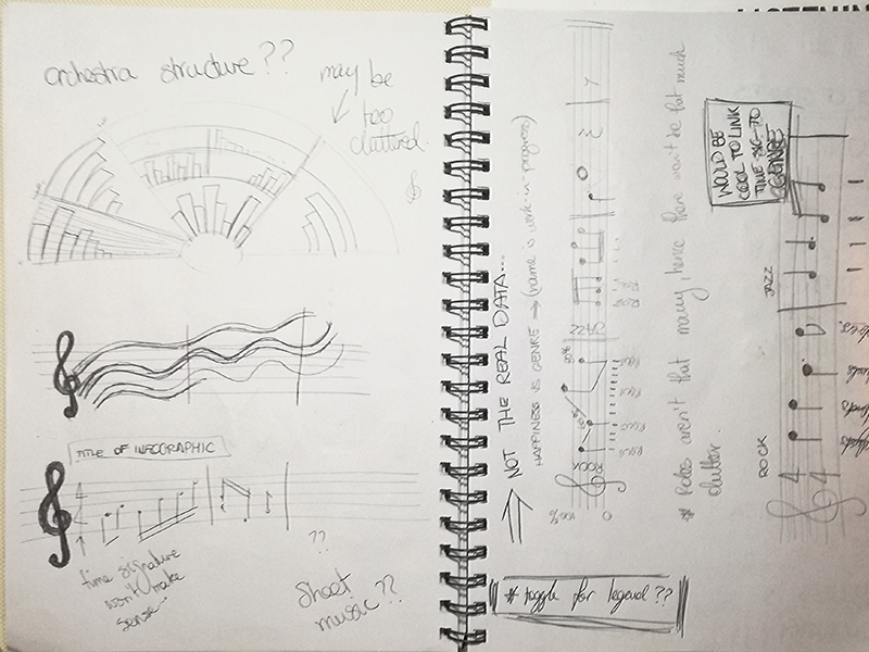
The second part of the challenge was to then decide on how I am going to present this in a clear, yet engaging way. Looking at some graphic design books and talks helped a lot in generating ideas, At first I was looking at more conventional information design examples, such as stylized bar graphs and pie charts. I was also looking at diagrams used in music – how an orchestra is laid out in an auditorium, technical drawings of various instruments and such things.
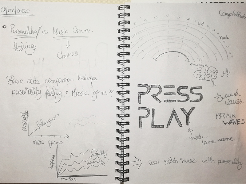
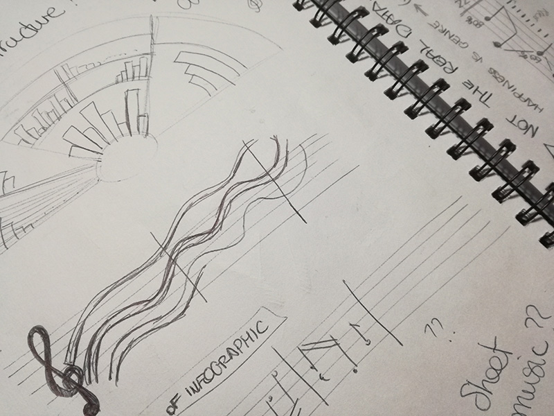
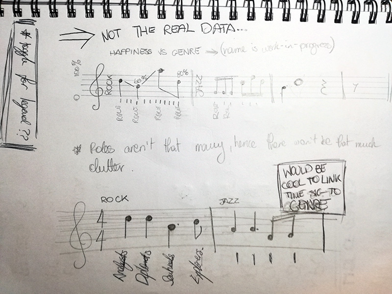
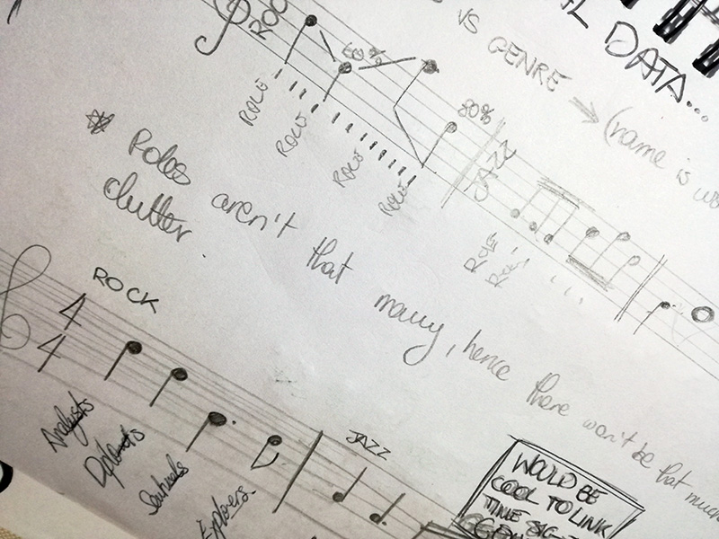
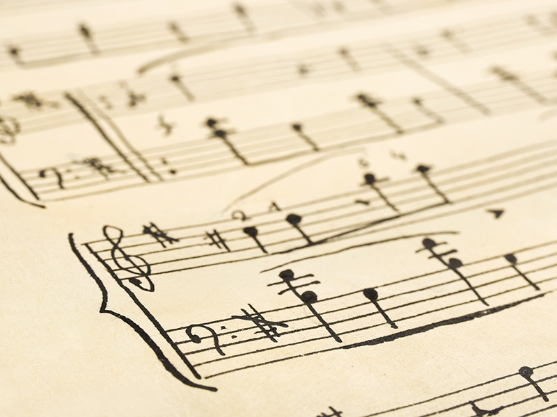
I was really close to go with a record player and plot the data on the records, make some gif or an interactive poster to show the data. However, looking at bar graphs reminded me of sheet music. It was there when I got the idea of using the lines in the staves to indicate data value and mark the data using musical notes. Currently I am figuring out the most efficient key to reading the data and whether I should do it in colour or just black. Really looking forward to start plotting the data and see how will the end-result turn out. Let’s get composing…


One Comment
AffiliateLabz
Great content! Super high-quality! Keep it up! 🙂