Designing Ideas

Should really get things going this week. The good thing is that I know where I am headed. The not so good is that I do not know how to get there. I know what is along the way, but whether I need to go over obstacles, go around corners or explore multiple routes to get there, that I still need to figure out. Following the crit session and also some reflecting, I have spent some time making a ‘to-do’ list to see what decisions to I need to make, what kind of tutorials do I need to watch (surely need in order to build an app), the UI style and of course go over my fuzzy ideas.
Some Inspiration from Experts
Although I definitely need to put more time in the ‘doing’ in the upcoming weeks as opposed to simply reading, I did go over some of the resource content of this week. The lecture shed light on some very important points. As expected, one of the points that was mentioned by various designers was that of ‘communication’. Now more than ever before, communication has become a requisite in any business, and the creative business is no exception. As the world is becoming always more globalised, technology has made it easy for us to get a message through, however it is up to us humans to make sure that the message we are passing is the right one. Moreover, as the creative industry is embracing collaborations in projects now more than ever, effective communication between stakeholders is essential to ensure efficiency and efficacy.
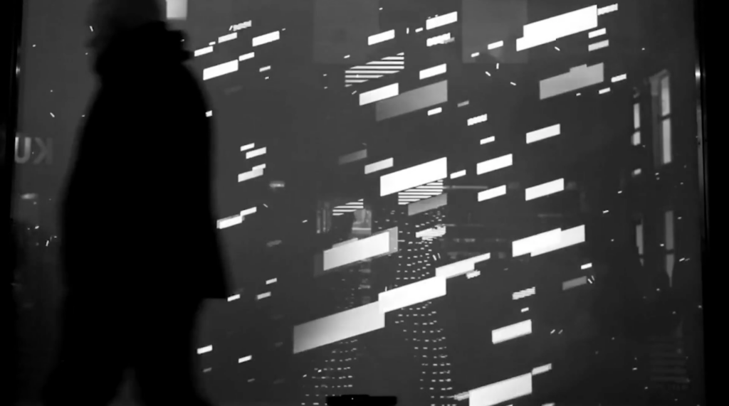
Matthew Jones from Accept and Proceed presented their collaboration project with SkyTeam. Although he did not mention it directly, his presentation showed the importance of giving your creations substance. Although it might seem obvious, many designers often fall into the trap of recreating what they see, or create something that is trendy, yet there is no real meaning behind the artwork. The approach they went for in this case was by looking at data generated by the cyclists’ health monitoring – distance travelled, speed etc. A rather unusual take on a design project, but the end result was very beautiful.

Another interesting point Jones made in his presentation, was the idea of discovery. In the collection they created with the pattern shown in the video, they had also added a little note in a pocket where it explains the concept behind the pattern. He iterates that people like to learn about things, but they like that sense of discovery too. This is something that I was exploring already in my research in response to my brief – it is about discovering what is in the Science Museum’s archive after all.
‘Outside-the-box’ thinking and identifying the main purpose of the projects are two fundamentally important concepts in any given project too. In conjunction to the above, whilst obvious solutions might work in numerous occasions, it will only do so for a short period of time. People are always in search for the next best thing, and the market is always becoming more and more competitive, therefore standing out and having a purpose is imperative. People are not seeking simply perfect products anymore. Now they are also looking for experiences. They want something that they can relate too, and something that they can take away.
Design as Communicating and Avoiding Clichés
In design school, we are taught that the main goal in our projects is to create something new – but not completely new, so as not to scare off your potential audience or consumer. As Michael Beirut aptly describes it, designers often ‘navigate between comfort and cliché’. Might sound confusing at first, but the point here is to identify what makes your audience tick and build on that. Understanding what the trends are makes a big difference in your design process. Although the obvious should not be used as a sure-fie way solution to a project, it is sometimes good to see what the obvious solution is and use it as an inspiration and expand on it. The example Beirut uses in his book,How to Use Graphic Design to Sell Things, Explain Things, Make Things Look Better, Make People Laugh, Make People Cry, and (Every Once in a While) Change the World, he uses the example of the new Minnesota Children’s Museum in St.Paul. Whilst the obvious choice was to go with rainbow colours and crayon markings, the designers of the project went with the truly obvious choice – using children in their designs. It sounds obvious but the result is very innovative indeed.
The Next Steps
Some really good take-aways from this week’s sources indeed. I have to admit that my thoughts are a bit scattered these days. Probably it is because it is something relatively new that I have been working on, or the jitters of getting ever closer to the end of the module. I go through this phase time and time again, but I can never seem to get over it. I just need to sit down and right down a step-by-step framework of what I will do along with that ‘to-do’ list I mentioned…


