Content Review – Editing and Reflection

The last couple of weeks have been quite eventful I must say. Change is not always expected, but one must adapt. So, I was going back though a couple of lectures of the previous weeks, as I needed to refresh my memory on what was discussed so far. It was a good thing I did.
The lecture for Week 7 was an interview with Anaghard Lewis – writer, editor and lecturer. She is currently based in London where she teaches Graphic Design at the Cass School of Design. She is also the co-editor of Grafik.net and has worked with Grafik magazine for a number of years. She was also published three books namely: So You want to Publish a Magazine (2016), The Purple Book: Symbolism and Sensuality in Contemporary Art and Illustration (2013) and Street Talk: The Rise and Fall of the Poster (2006).
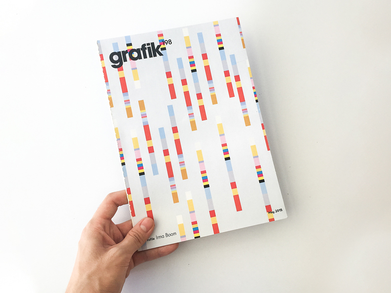
In the interview, Lewis talk about here experience and how she started working with then named Grafik International magazine, how later it evolved to Hot Grafix in the 80s and then changed to Grafik in 2003, where it then was then adapted to an online publication. She explains how the magazine was rebranded as a response to what was going on in the industry, how society was affecting it and how technology was impacting the design world. She also talks about how the context and audience are key when it comes to publishing. Without a focus on who do you want to reach with your writing and therefore publication, the publication is very unlikely to be a success story. Following this, when writing, there needs to be a structure in how the final outcome is going to be presented, regardless if it is all writing, all visual or a combination of both.
Drafting was also a key element when it comes to writing and publishing. The first write up is never the best one, in fact it is probably rubbish, to say it bluntly. However, the first draft usually set a framework for the final outcome. Publishing the first draft is never a good idea, but on the other hand, through drafting, you can get to see (or read in this case) all the ideas in front of you, making it easier to piece the best ideas together and discard trivial ones.
It was quite an interesting lecture. I also enjoyed seeing the different covers of the Grafik magazine and how it changed from a rather corporate publication to a more experimental one. Lots of good points were brought up. Good thing I went back to the lecture. It should help me when I go through my first draft of the essay for this module. So far, I got to putting together all the material I wanted to include, and also managed to collect some responses from a questionnaire I put together as part of the project. Looking forward do the design part of it. You can read more about my essay proposals here and check out my first draft and design mood board here.


