Complex Simplicity – History Revealed
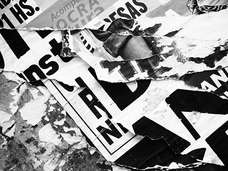
Module 2 is officially in full swing, and already in the middle of the first week. In this module we will be exploring the historical aspect of graphic design, how this impacts society and how can graphic design contribute for the future generations. In this first week, we are exploring typography in the streets. The lecture consisted of features as well as discussion of different aspects of typography, which included history, techniques and current trends.
The points that were brought up in the lecture are all quite interesting in their own regard. I liked the fact that although all the designers were all typographers primarily, they all discussed different parts of the discipline. I liked the way how they described typography. Hoefler and Jones see typefaces as “tools of the trade” rather than decoration, and it makes perfect sense. The written word is an important element that accompanies us every day and the way it is presented to us affect greatly our interpretation of it. Similarly, Paula Scher says in her interview: “Words have meaning. Type has spirit.” The latter quote really struck me, for I always saw type in that way, but never found the right words for it.
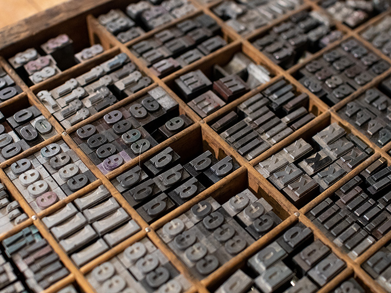
As a graphic designer, I am very fond of typography and very much into hand-lettering and calligraphy. The way art and technique (can be described as maths also I think) are combined is very unique. The history of typography and its evolution is quite inspiring. Probably it is due to the fact that since we are moving towards an era where everything is mass produced and digital, the crave for craftwork and artisanship is rising. Coming to think of it, as this module is all about exploring the past in order to contribute towards the future, I think it is worth looking at how typography was created back then, and see if there is a more efficient way to re-create classical typographic masterpieces using modern tools and technology. Might even bridge different media to create something completely new. An example of this can be the facelift of the Johnston typeface, in celebration of the 100th anniversary since its launch back in 1916. The Johnston typeface has become synonymous to the London Underground brand. Typography is undoubtedly one of the pillars of Graphic Design. It is a fact that without typography, a design is rarely complete. In addition to this, without adequate skills, an incorrect typeface can be a deal breaker in an otherwise perfect design. Although many are unaware, some totally oblivious, to what typeface is being used, it is surprising as how typefaces are processed by the unconscious mind. This is what makes typography even more beautiful…and even cool.