Communicating our core values
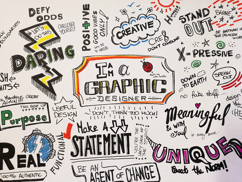
So this week is all about ‘The Self’, who we are and what makes us. Part of the challenge was to come up with a list of 20 terms that best describe what matters to us as graphic designers. So I started of by grabbing my usual pens, and some fancy paper this time, and started scribbling a mind map, which ended up looking like this:

Out of which came out the list of 20 words, and then condense them into 5. Here I wrote them in uppercase:
- Creativity
- Expression
- MEANINGFUL
- Uniqueness
- DARING
- Designing with Purpose
- FUNCTIONALITY
- Make a Statement
- Being Real
- HUMILITY
- Positivity
- Soulful
- Pushing Limits
- Challenging
- Down to Earth
- EMPATHY
- Consistency
- Reliability
- Commitment
- Authenticity
I enjoyed doing this exercise, however I found it slightly difficult to condense the list to only 5, for there are terms that overlap each other (reminds me of last weeks exercises about Categories). So I when I got to that point, I did my best to pick out the generic term that gathers up multiple meanings.
Following this exercise, we were asked to create a mood board for each of the 5 words that we chose from the initial 20. The words I chose are MEANINGFUL, DARING, FUNCTIONALITY, HUMILITY and EMPATHY. Below are my mood boards and will explain how I have about to the chosen images for each one.
The MEANINGFUL mood board
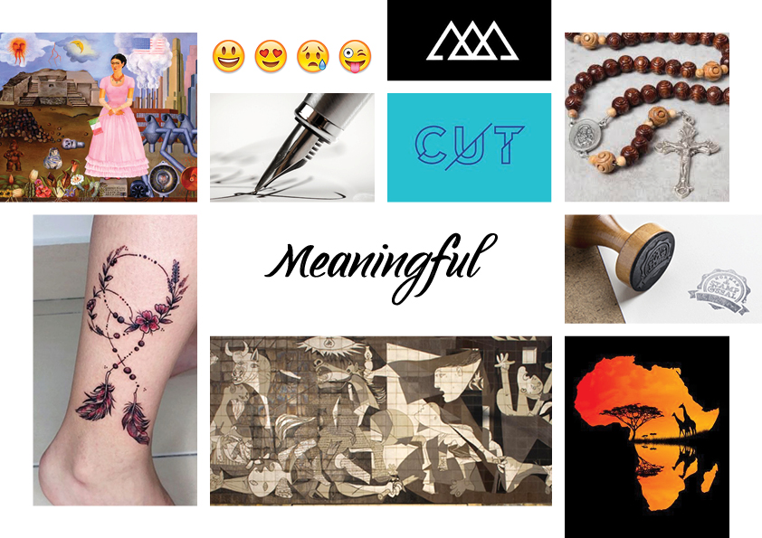
I see Graphic Design as art with a purpose, meaning that it is not just appreciated for its mere aesthetics, but also for its thinking process that ed to the end product. In addition, I think that things and concepts with a story matter more and are appreciated more, irrelevant if they are “beautiful” or not. In this mood board I have included various of paintings, religious symbols and iconography. As one can see, I have included Guernica by Picasso and a self portrait by Frida Kahlo. I chose Guernica as it represents a very important historical event – the bombardment of Guernica during the Spanish Civil War – and I also included Frida Kahlo’s work for she painted her experiences. Her paintings are like a window to her soul and an expression of her feelings were words failed.
In addition to the above, I have included tattoos, icons and brands. The tattoo has been used for symbolic marking for thousands of years, be it religious, ritualistic or even personal. Similarly, various shapes and motifs have been linked to religious figures for a very long time. Humans have used symbols to help comprehend better the unknown. It helps giving a “face” to what is otherwise abstract.
On the other hand, I have also chosen to include images with visual meaning. I have included emojis, a logo and a poster. These three are generic representations. I wanted to show the materialistic side of “meaningful” – we use emojis all the time to “express” how we feel and let the person on the other side know what is going on. On top of that, the CUT logo is made up of cut-up letters. Here the meaningfulness lies in the appearance. Similarly, the poster showing Africa and the Serengeti is quite self-explanatory. It is showing the African wildlife through the use of negative space and warm colours, a typical colour scheme one sees in the wilderness.
Lastly, I have also chosen to include images of rubber stamps and signature. Both care a certain level of meaning, especially at the of a document. It literally “seals the deal”.
The DARING mood board
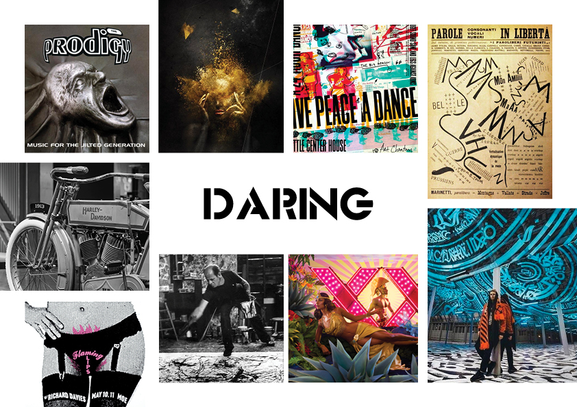
To be daring is to be audaciously bold and adventurous. In order to change yourself, first you must challenge yourself and this also applies to being creative. It is important to push limits when it comes to creating something.
In this mood board
I included visuals that either break the norms of graphic design or
representing something or someone that was considered ground-breaking during
their time. I started off by including Zang Tumb Tumb, the Futurist Manifesto
by Marinetti. Their manifesto was very experimental, both visually as well as
its content. Similarly, Jackson Pollock and his action paintings baffled the
people of his time. Many failed to comprehend what we wanted to capture with
his paintings and I think that many artists kind of enjoy it one way or another
till this day. Even if the general population is considered to be very
open-minded in some parts of the world.
I have also included the first Harley Davidson bike and the Prodigy in my mood board.
Both are considered ground breaking, and definitely ‘daring’ in their
respective field during their time.
On a different note, I have included works from contemporary artists like Pokras Lampas, whose works consist of very decadent calligraphy, which he describes as “Calligraphitti”, as works from David La Chapelle, a photography known to push the boundaries to the very edge in his works. Both are very daring in their regard, one for being bold and impactful in his art, result in beautiful statement pieces, the other for his experimental shoots and sometimes for the shock factor that comes with it.
To conclude, I have also included a couple of editorial examples as I wanted to show how designers to not just think outside the box, but they tear it up and make something with it. Breaking the grid, using explicit imagery and contrasting colours all contribute to the traits of a daring designer.
The FUNCTIONALITY mood board
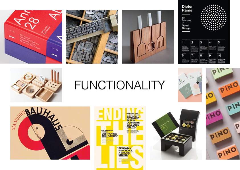
Being functional is another important factor in terms of Graphic Design practice. Mies van der Rohe’s famous phrase ‘less is more’ comes with some food for thought. As Graphic Designers, we need to bear in mind that our designers often serve a purpose, if not a physical function, such as packaging. Therefore, is many cases we need to prioritise the function, in which then we can come up with the suitable form.
In this mood board, I have included various examples of functional design pieces, both 3D and 2D. Here is were Minimalism usually shines, as adornment and extra décor are not prioritised. I also made a reference to the Bauhaus. I included this as the Bauhaus’s as the Bauhaus are a pivotal movement in the history of graphic design when it comes to the area of functionality. In fact, one of its core values was indeed functionality over aesthetics.
The EMPATHY mood board
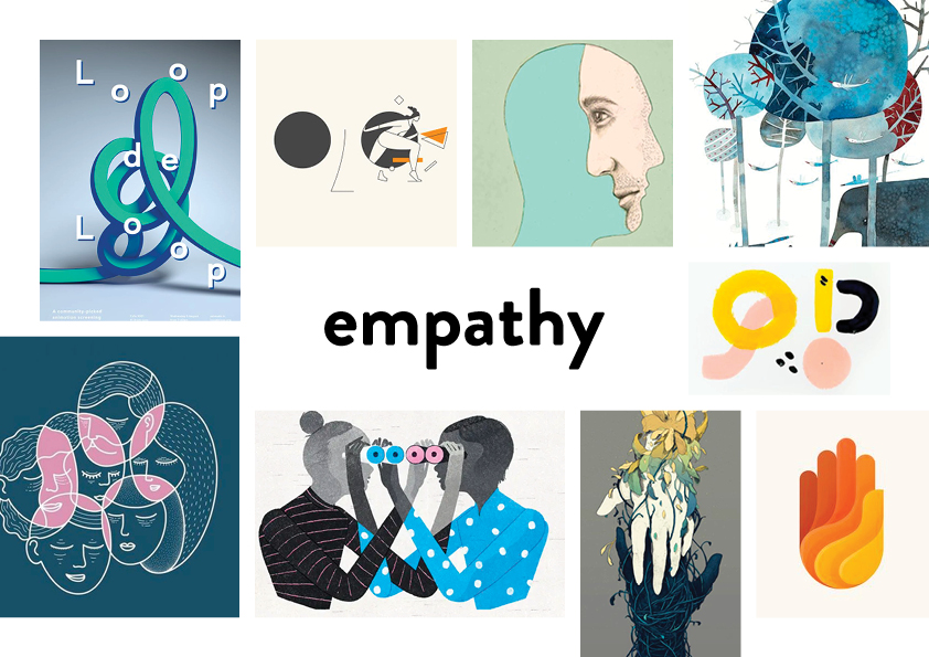
Being empathic is being able to relate to other people’s situations and also to put yourself in their situations. In return it also gives us the ability to see the world from different perspectives. It is a very good quality that a lot of artists and designers possess.
This mood board is slightly different from the previous ones. Here I wanted to convey the empathetic mood through shapes and colours. I looked for images that have soft, organic forms, and relatively light colours. These include a mixture of logos, illustrations as well as posters. As designers, we rarely are commissioned to design for one sole medium, so we often need to create a ‘look and feel’ that goes beyond the edges of a page or boundaries of illustration. It can be that a sense of empathy needs to be shown in a leaflet or business card, or even a website. In such cases, I think that we should move on to a more abstract overall concept when working on a project.
The HUMILITY mood board
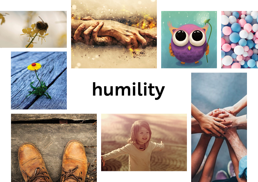
I used a similar approach to that of the empathy mood board for this one. In this mood board I wanted to go for warm tones and soft forms. I have included multiple images of nature and human features, as I wanted to show the humanistic aspect of humility.
Being humble is not about being weak, but rather taking credit when credit is due and equally giving credit and praise when others deserve it. Also, being humble is letting your work speak for itself. Focusing your energy on you’re your work gives far better result than focusing on showing how good your work is supposed to be.
For some reason, my mood board includes a lot of hands. I guess I subconsciously wanted to show the fact that being humble also includes treating everyone equally, regardless of their background. In addition, in this mood board I wanted to show a sense of innocence. That child-like innocence that one keeps asking to know more, not out of naivety, but out of curiosity and hunger to learn more. Creative people are naturally curious, which is what keeps our inner child alive.


