BIG DATA – ANALYSING ‘MOONLANDINGS’
From the research I have done this week (read my summary here), in my opinion, a good infographic should start of by having an interesting, or even unusual topic. It has to be a topic that triggers the readers mind. In addition to an interesting topic, a visually appealing design that is easy to read makes it more likely for people to read it. Legibility is very important, especially when it comes to visualising data. Moreover, simplicity is equally important. Data can be incredibly complex, making it a daunting topic for some, however if the complexity is embraced and in return is disseminated into smaller pieces that are easier to process, the end result is impressive and rewarding.
As this week was all about exploring information design and looking at how data is communicated easily and effectively to the common reader, obviously the workshop challenge was to analyse an example of information design chosen from a pre-selected set. After choosing which infographic we are going to analyse, we were to look at clarity, communication, message and the role of design in communicating the message. We then sum it up into a synopsis.
The set included six different examples of information design, which are as follows:
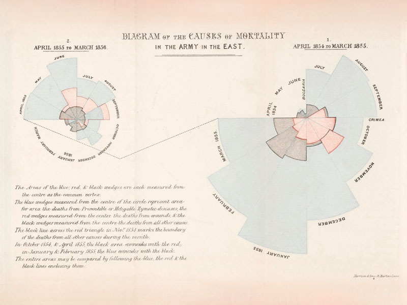
Deaths from Diseases, Florence Nightengale (1855) 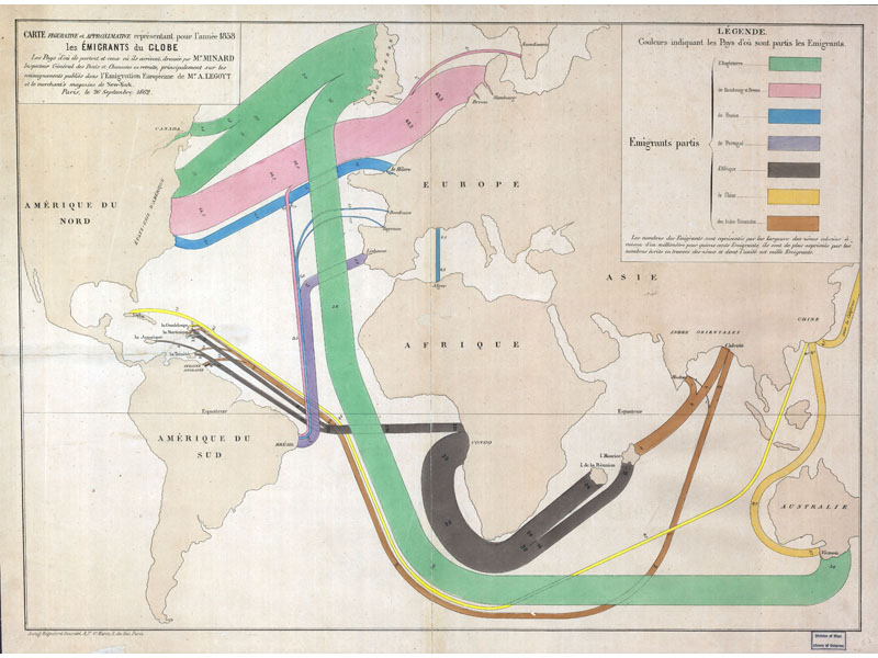
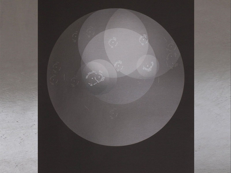
Global Immigration, Charles Minnard (1858) Moonlandings, Accept & Proceed (2016) 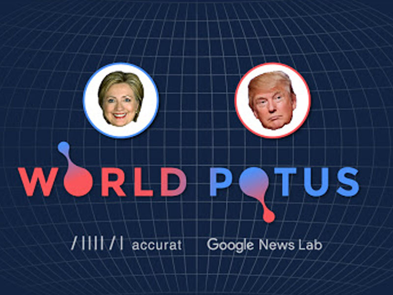
WorldPOTUS, Accurat (2016) 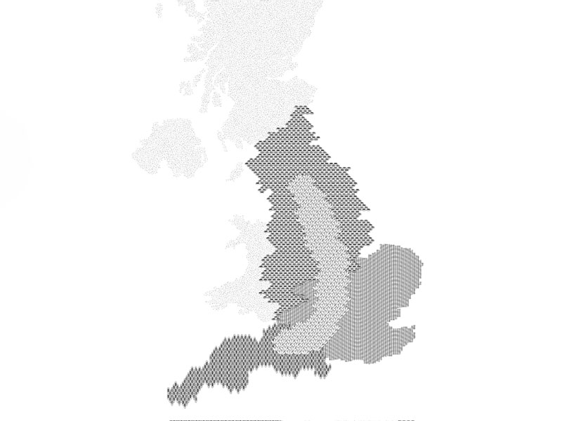
UMK – Lives & Landscapes – Dunne & Raby (2014)
It is fair to say that the six examples are interesting in their own right. The two examples from the the 19th century – the Death from Disease by Florence Nightengale and Global Immigration by Charles Minnard are very well made, considering the period in which they were created. However, in Minnard’s case, I did find the map slightly confusing at first. Maybe I just needed to look at it into more detail. On the other hand, WorldPOTUS by Accurat was very data heavy. Many may find it interesting, but honestly the media already does a lot of coverage related to Donald Trump and his doings, and the 2016 election still makes my head spin. So as soon as I got the gist of what this was about, I scratched it immediately. As for the United Micro Kingdoms, I just did not get it. I did not understand what sort of data it was showing. I figured that the topic was fictitious, but I never got to understand were the data actually was. In addition, when I tried clicking on the map, it did not work.
I choose to take a closer look at Moonlandings by Accept & Proceed. Looking at the Ideas Walls for this week, I saw that many found it unappealing. However, I thought it looked very intriguing. I do not know why it struck me more than the others. Could be the dark monochrome palette, the topic itself, or maybe I am a bit of an airhead.
Moonlandings by Accept & Proceed – A synopsis
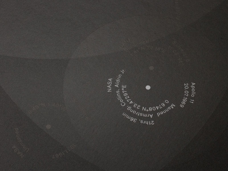
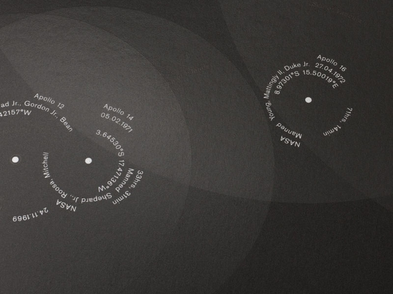
Moonlandings is a poster created by Accept & Proceed in 2016. It is a visual representation of all the moon landings, including probes as well as manned landings with astronauts. The creators were inspired by the actual footage of the first human landing on the moon, particularly the colour scheme.
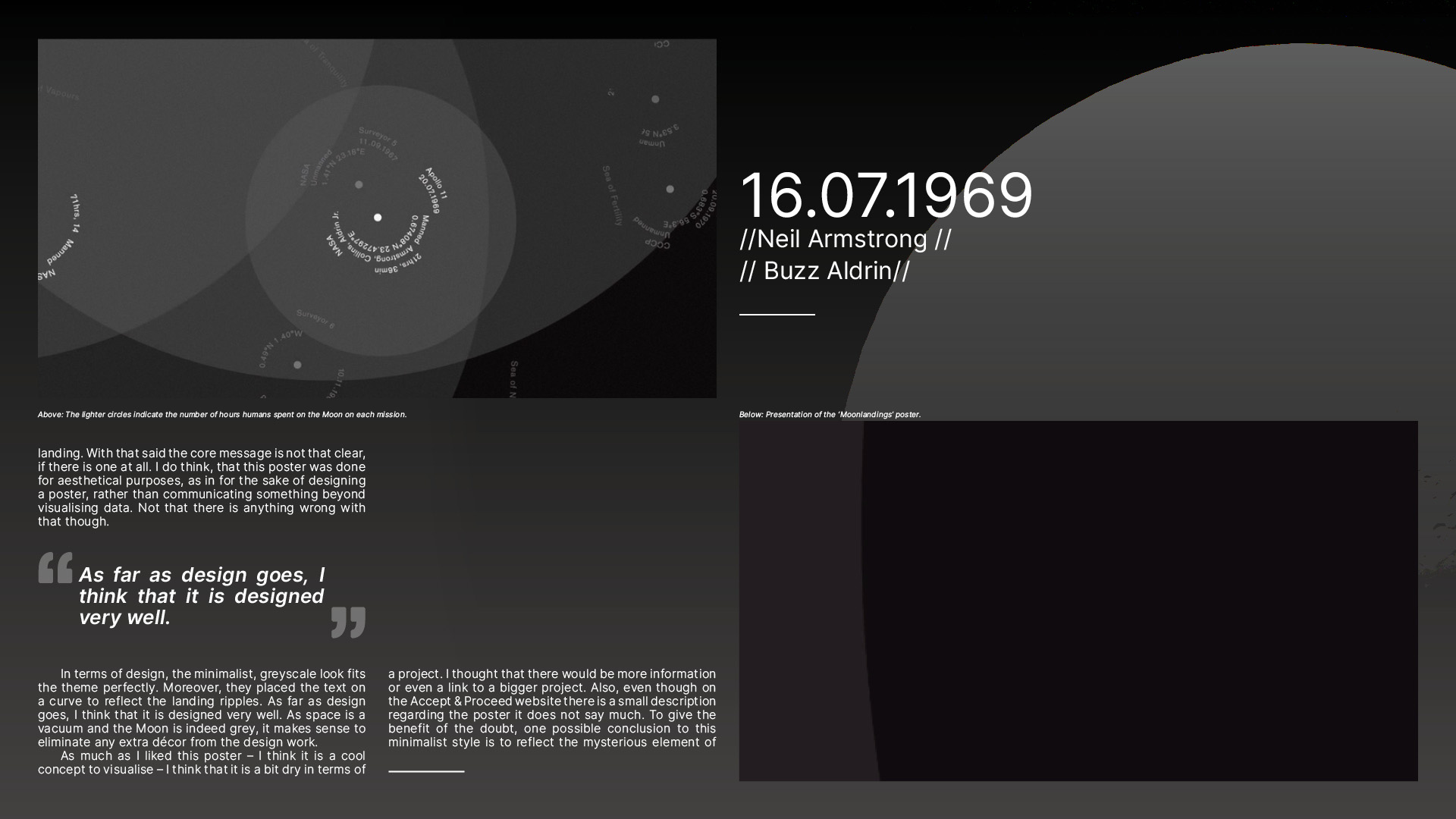
Aesthetically, it is a beautiful piece of design and at face value, one came easily read what it says. However, the meaning of the information given in the poster is not as clear as to what is representing for no key is provided to interpret it. I had to look up some background information regarding this poster before I fully understood what the content presented. I figured that the names were of astronauts and the numbers were co-ordinates, however I did not understand what the overlapping circles meant. Later, I learned that they represented the number of hours the astronauts spent on the surface of the Moon on each mission.
In terms of communication, this piece of information design is not that self explanatory. Visually, the information is relatively clear – there is not difficulty reading it, but I do not know (or perhaps did not figure out) if there is a deeper message behind it. In addition to that, I managed to decipher some of the information on the poster as I have some background knowledge in History, but will the common passer-by get what is this poster depicting? Also, if one looks at the posters from a glance, one can see that humans have not explored that much from the Moon (besides the dark side of the moon of course. Nothing has been there yet), for the top part is only highlighted in lighter grey. Then again, this last point is not that obvious.
From what I gathered after looking up information regarding this poster, it seems that this poster was created to pay homage to the astronauts that manned the space missions. As Matthew Jones, creative director of Accept & Proceed, explained in his presentation at a Nicer Tuesday’s session of 28th May 2019, he said that the day of the presentation was a month or so away from celebrating the 50th anniversary of the first moon landing. With that said the core message is not that clear, if there is one at all. I do think, that this poster was done for aesthetical purposes, as in for the sake of designing a poster, rather than communicating something beyond visualising data. Not that there is anything wrong with that though.
In terms of design, the minimalist, greyscale look fits the theme perfectly. Moreover, they placed the text on a curve to reflect the landing ripples. As far as design goes, I think that it is designed very well. As space is a vacuum and the Moon is indeed grey, it makes sense to eliminate any extra décor from the design work.
As much as I liked this poster – I think it is a cool concept to visualise – I think that it is a bit dry in terms of a project. I thought that there would be more information or even a link to a bigger project. Also, even though on the Accept & Proceed website there is a small description regarding the poster it does not say much. To give the benefit of the doubt, one possible conclusion to this minimalist style is to reflect the mysterious element of the universe. There is still a lot to be discovered. If this is the case, then I would stand corrected and I would say that they depicted a void brilliantly.
The Editorial Piece
The last part of the task was to present the synopsis in an editorial piece of our choice. This is mine below. Enjoy.


One Comment
AffiliateLabz
Great content! Super high-quality! Keep it up! 🙂