And Brief 4 It Is… – Initial Reading and Competitor Analysis

After some thorough thinking, I decided to go for Brief 4. I feel like there is more room for exploration in that brief that can be done over the upcoming eight weeks. I have to say though, that the brief is rather mind-boggling. I could not put my finger on what is required exactly in terms of design. So far I had a look through the links that were shared along with the briefing to help me understand better what the upcoming eight weeks hold for me.
Getting familiar with the brief
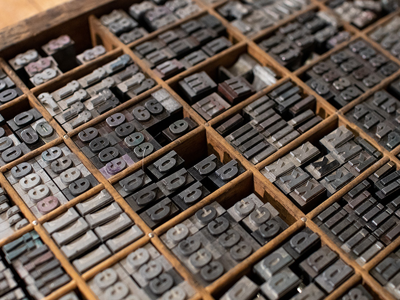
I started off by looking at the Collections page of the Science Museum, and I have to say that it was rather disappointing. Given that it is a museum of such a high caliber, the material could not be discovered as easily. I am guessing that the ultimate goal behind this brief is to sort this issue out. Other links included essays and articles discussing different ways of searching and how users interact with these interfaces.
In one of the articles, the concept of ‘Generous Interfaces’introduced by Mitchel Whitelaw, an Australian researcher, says that these are a more engaging solution for the casual user. He describes them as ‘rich navigable representations of large digital collections. They invite exploration and support browsing, using overviews to establish context and maintain orientation while revealing detail at multiple scales’. Whilst reading this, it reminded me of social media apps like Instagram and Pinterest. They are very visual-based, and it is common for people to open these apps, just to see ‘what is on today’. Whilst the primary mode of finding thins is indeed through searching, a typical search is limited to those who know what they are looking for.
In this same article, a number of examples where shared. I particularly liked the V&A Fabric Visualiser. Essentially, the page loads ‘a pile’ of artworks that are exhibited at the V&A museum, and they are grouped together by colour to form a spectrum of sorts. As soon as the user navigates, zooms in or clicks on a particular artwork, it comes into detail and the adjacent artworks would have the same colour scheme. Although this page is not easy to find on the V&A main website (in fact I had to Google ‘Fabric Visualiser’), it is a very interesting page for those who come across it. Another interesting concept is that of the Instanovels by the New York Public Library. As the younger generation is more present on social media for than ever and reading is becoming less and less popular, the NYPL felt the need to find new ways of reaching out to this generation of young adults. And out came the concept of Instanovels, where they uploaded numerous classical novels in the form of a series of Instagram Stories.
Another link that caught my interest was a essay titled I Don’t Know What I’m Looking For: Better Understanding Public Usage and Behaviours with Tyne and Wear Archives + Museums Online Collections. As the name suggests, it discussed the issue many users come across when they are browsing through a museum’s collection is that they are limited to terminology or specific names of exhibits, and as the name of the essay suggest, many do not know what they are looking for exactly. ‘Digital collections interfaces have been traditionally designed for audiences with an established interest and motivation to probe the collection for specific objects.’ (Coburn, 2016). At face value, the way of getting around an archive is indeed searching for specific things, however, in many instances, archived items have very specific keywords linked to them, and usually the typical user is not familiar with certain technical jargon. This essay sheds light on this issue and also looks into finding other ways of going about making it easier for the users to find information as well as discover new information through the archive.
Museums worldwide are investing a lot of time and money in digitising their collections so that they can be reached by a much wider audience, but that is only the first step. Accessibility to the digital information is equally important. According to Coburn, design concepts and principles should be ‘simple, visual, intuitive and immersive’. Also, high-resolution images get much better engagement. It is the idea of serendipity is what many archives want to achieve. ‘Conceptually, the experience was to enable audiences to ‘lose themselves’ in the richness of the collections – to easily navigate visually rich and provocative information without having an initial search destination.
Competitor Anaylsis – Synopsis
As part of this week’s challenge, we were to look at what competitors are doing too. For this exercise, I looked at various museums, art pages as well as design studios working with museums and expos. However, I think that at this stage, it is best to look at ‘direct competitors’, them being museums and digital artistic spaces.
Rijksmuseum, Amsterdam, Netherlands


The Rijksmusuem online art archive is by far one of the easiest to access. The homepage prompts you directly to three different options: one of them being to discover the collection, which you are then asked whether you would like to ‘search’ or ‘explore’. The landing page of the archive is made up of multiple ‘pre-curated’ collections that fall under popular keywords, such as ‘paintings’, ‘birds’ and ‘landscapes’. However, there are also collection curated by registered users. This is because a user can create their own RijkStudio. The Rijkstudio is a page where users can save their favourite artworks found in the archive and categorise them the way they like.
When it comes to specific artworks, each item is photographed at a very high resolution, which allows for very detailed closeup views. Also, the information is classified by order of importance, meaning, title first, then artists, then dimensions, and long description. Additional information is placed in a collapsible panel. In addition to the typical information, in each page, one can find access to download the artwork, order a reprint and of course share it on social media.
It is a well-designed archive and quite engaging. The ‘self-curating’ part of the archive is definitely something worth exploring. Being such a vast archive, very often it easy to get lost amongst all the information.
Vincent Van Gogh Museum, Amsterdam Netherlands
 Collection Homepage


The Vincent Van Gogh archive is also a well-designed one. The access to it is not as obvious as the previous one, however, it is only a couple of clicks away. The ‘collection’ page also starts generating images automatically, however it does not change whenever you referesh the page. I did not understand in which order they where placed. That being said, there is the option where the collection can be filtered as well as searched.
When it comes to specific artworks, once again each artwork is in high resolution that permits extreme closeup views. Unlike the previous example, the artwork information of the Van Gogh museum is more detailed, yet it is placed in multiple collapsible panels, allowing the user to scroll through easily till one finds the specific information.
Another interesting element in these pages is the listed keywords and technical jargon that are linked to the artwork in question. The ones that are directly related to it are highlighted, and others are dimmed, to show the order of importance. All these are clickable and link to different glossary pages, explaining the meaning and showing further examples related to that particular keyword. I really liked the latter part, as it triggers a chain reaction of discovery, where the user can easily trace back and forth from one artwork to the other. Very easy to use, and definitely fits to young and mature audiences alike.
Google Arts and Culture
 The Google Arts and Culture Homepage - Virtual Tours


This last example is not a museum, but rather an art space. I like to think of it as the ultimate art search engine, which ironically is powered by the world’s leading search engine. The Google Arts and Culture page offers a multi-faceted experience when is comes to discovering artworks and artistic heritage. The homepage has multiple categories to choose from, from ‘virtual tours’ to ‘treasure hunts’, pre-curated collections related to a specific theme and even an option of searching artworks based on the painting’s ‘base colour’. This ‘colour search’ was also used by a couple of museums, one being the V&A as I already mentioned, and it is indeed a very easy way to get people engaged. Everyone has a favourite colour, and there is no wrong answer to such a question.
Unlike the previous examples, this page also offers the options of 360o virtual reality tours and walk arounds. This works really well with the younger, more tech-savvy audience as it is more immersive. Although it may sound gimmicky, the younger generations is always looking for the next ‘new thing’ and the idea of a typical museum may imply that it is something dull and for ‘the old’.
On a different note, when it comes to specific artworks, the items are presented in a similar way to the previous options, with the addition of 360o rotational views for 3D objects. The Neil Armstrong suit is a very good example of this. Also, within the same page, the user is prompted with other suggestions based on the keywords linked to the current item being viewed. Very interesting and engaging indeed.
In Conclusion
I am still a bit wary at to what I am heading towards, but it seems that it going to be a big learning curve for me. I think it would be a good excuse to explore also the realm of SEO and understand its engineering, and maybe even reverse it, but it is still far away from where I am standing. Interested to see what the next eight weeks will bring about. So far, I have made some interesting discoveries already. Maybe, even this project itself will give me that sense of serendipity.