Moodboarding – kicking of the Design Process and Deciding on that Name
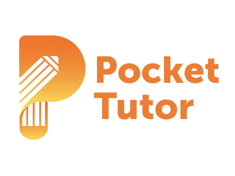
Following my last post, I have shortlisted the name to two contenders: MALTISTANTI and POCKET TUTOR. As I cannot decide for sure which name will I go with, I thought of experimenting with some rough lettering sketches, to see where I can take them and how far I can stretch my ideas. I am still in the beginning of this experiment, but in the coming days I will be more productive in this regard.
In addition to that, I start collecting some logo inspirations as well as UI ideas. Along with the analysis I did of other language learning apps, I thought of looking for some other UI ideas outside of the educational theme.
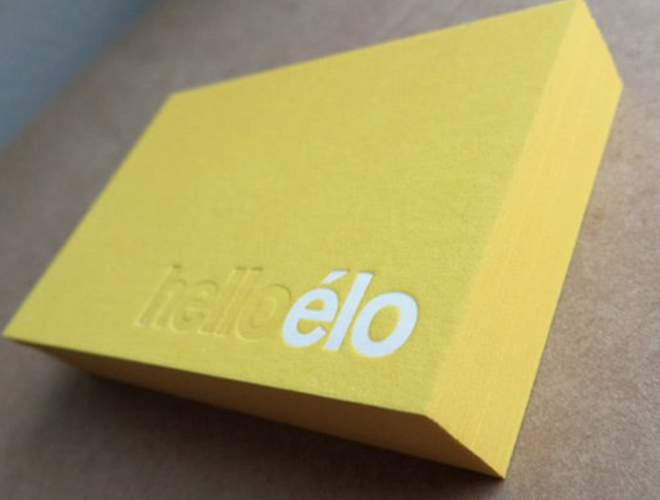
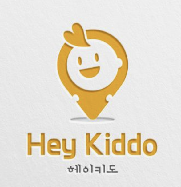
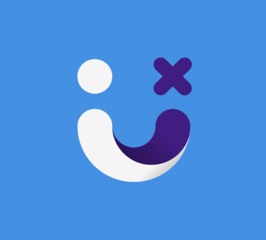
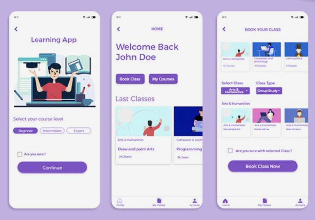
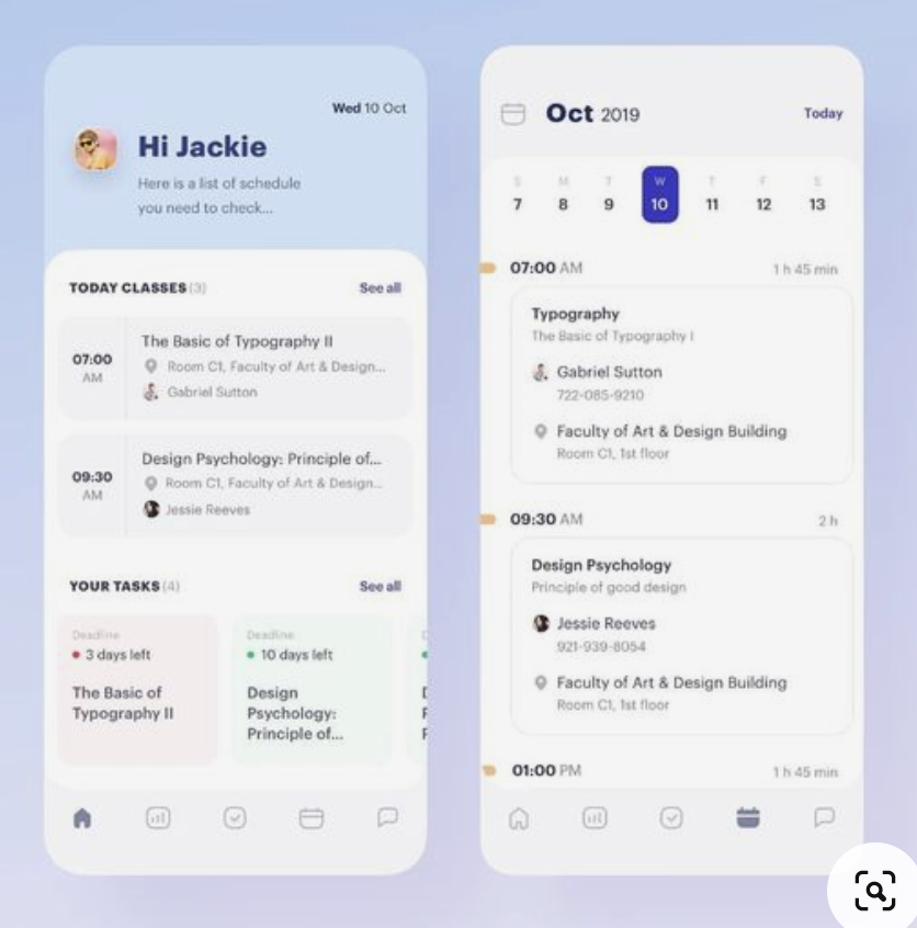
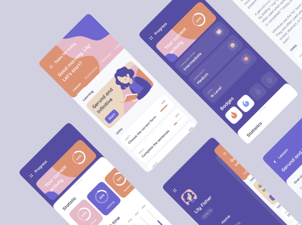
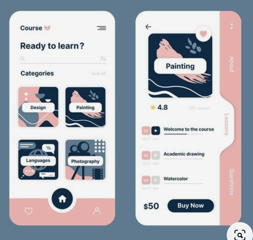
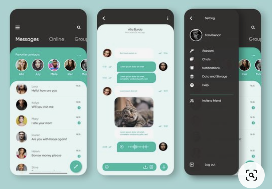
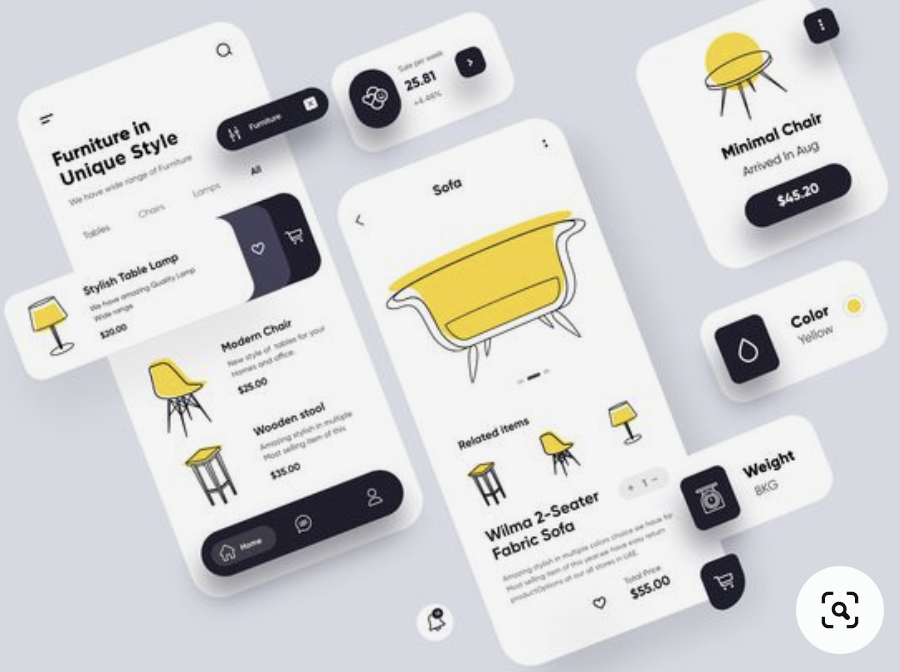
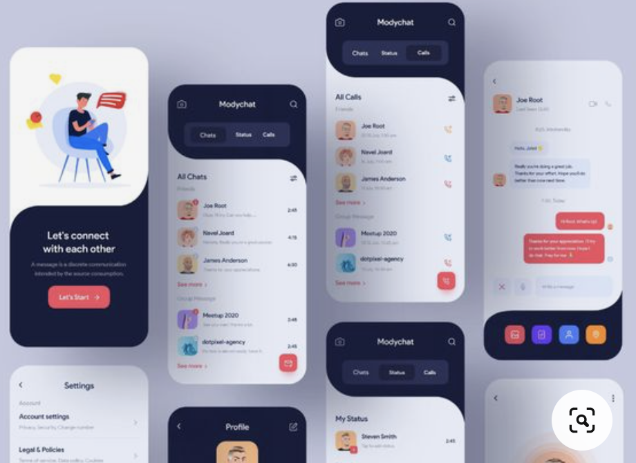
These are some of the examples of logos I included in the moodboard. I want to go for something simple yet striking. As for typography within the logo it is very likely that I would go for a sans serif typeface. In addition to this, below you can see some of the examples of UI designs that I am looking at for inspiration in conjunction with the UI from language learning apps. You can read about the analysis here.
At this point in time, it is a question of tackling this project one small step at a time, to be more efficient and minimise oversights of any details. As mentioned earlier today in the Ideas Wall by one of the peers, there is also a PDF that we need to put together. From my understanding, this time round is more about showing the usability of the end-product or explaining how the deliverable is relevant to the research question. In my case, I am thinking of making this PDF is a form of introductory booklet for potential users and sponsors. I did not mention investors, simply because I am not aiming to put a price tag on the service offered by this app.