
Looking into What is On the Market Already

These couple of days I was looking at some different language learning apps, see how they are designed, and how it works. I looked at six different apps, some completely free, others at a price. Whilst the main goal was the same for all of them – that of teaching people a new language – The UI varied from one app to the other as expected, but also the UX – some were a bit dull in terms of interactivity as opposed to others, where they had more varied tasks. It could be the case that I do not like repetition, so I will not rule out an app as being inadequate for this simple reason.
The apps I looked at are:
- Duolingo
- Rosetta Stone
- Drops
- Babbel
- Busuu
- Memrise
I tried out all the apps, both on desktop and on phone, (which the exception of Babbel, which is available on only for mobile), took a couple of classes and took screenshots along the way to document the different UI elements and user experience along the way. Granted that my apps would not be teaching languages to the users, I can still learn and gather ideas for my final project. I collected everything in Milanote as you can see below.
Duolingo
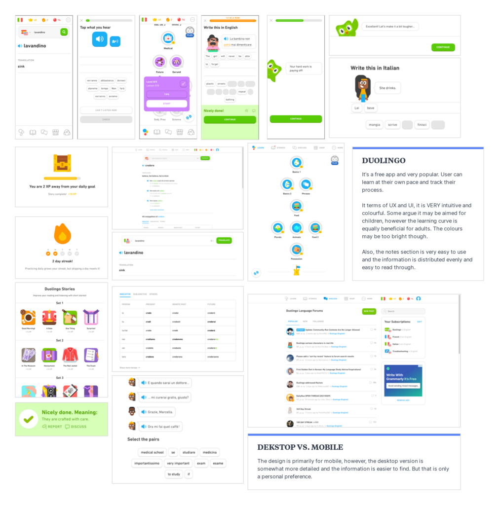
Prior to this project, I was a regular user already, so I was familiar with the gist of the app. However, I had not used in a long time, and since then feature changed, added new and some where removed. I particularly like the desktop version of this app because it also has a separate section for grammar notes and explanations. Also, the way the information and elements are distributed on the page, both on desktop and mobile, are in a way that the user requires minimal effort to understand how the app works.
When it comes to UI, it might seem that it is rather childish. Whilst I personally do not mind it, I think the colours can be more subdued and would choose a more “formal” typeface to appeal a more mature audience. That said, on the whole, I think that it is a well-designed app and would definitely use it as a source of inspiration.
Rosetta Stone
This one was rather disappointing. Partly because there was no free version of the app, and the demo available on the internet was that of an old version. I tried looking up some review videos of the app, but the UI did not change much from the demo I used. Considering this is one of the most expensive apps in the market, the experience was underwhelming. There is not much that I can say about it.
Drops
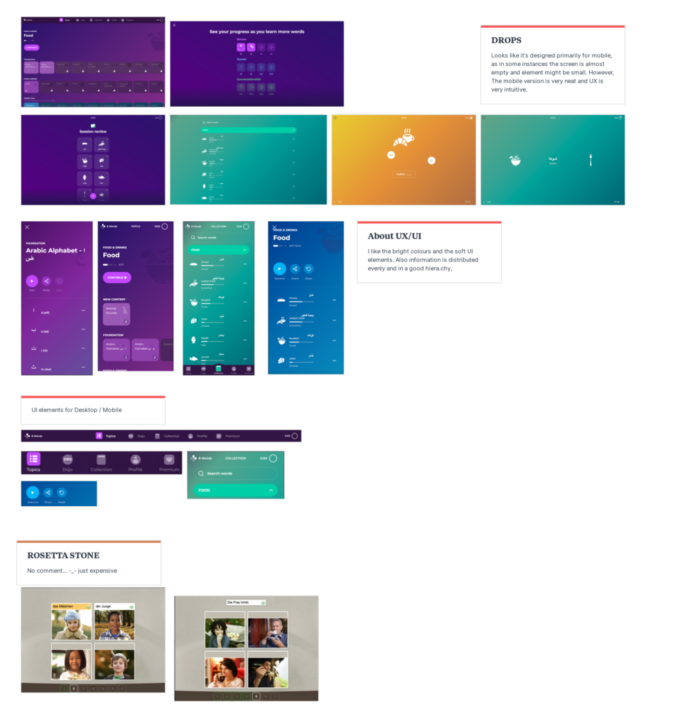
Contrary to Rosetta Stone, my experience with this app was much more pleasant, both visually as well as in terms of use. The mobile version is better than the desktop version, for the simple reason that on larger screens, some of the elements might be dispersed. By the looks of it, the app was primarily designed for mobile, then adapted for desktop.
In terms of UI design, it is very intuitive, modern, clean. I like the colour scheme, not the usual white background with hints of colour, but rather a vibrant colour scheme, that is not overwhelming, but not dull either. A good balance. Also, the system in which the information is presented is very easy to find. With UX is also very good. It features different forms of tasks, both audio and visual and make full use of the gestures normally used on the phone, from drag-and-drop, to tapping to “swiping right”.
Babbel
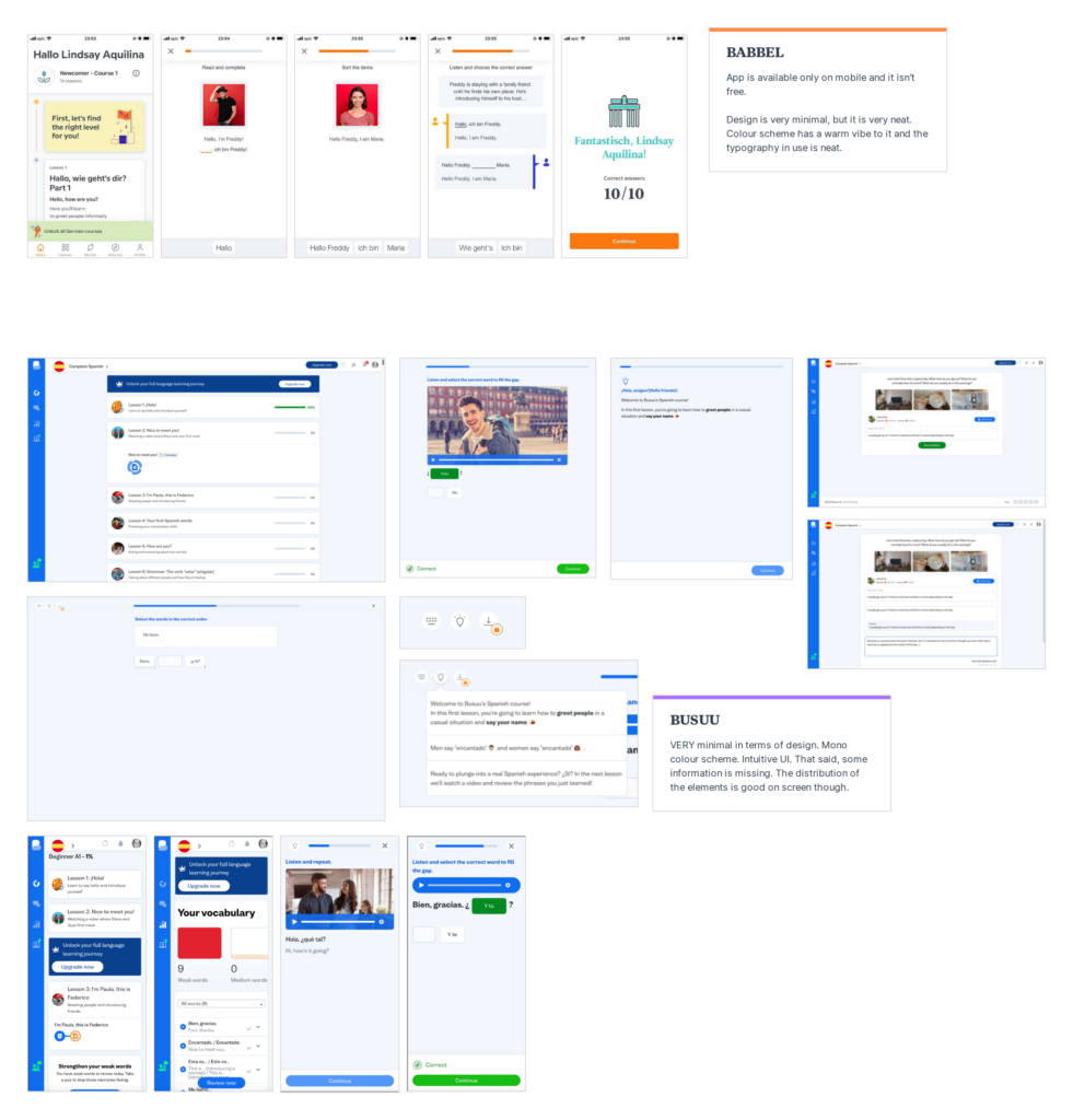
This was the only app that was available only on phones. It has the typical white background with accent colours UI design, but it works. I also like the choice of typefaces use d in the app design. It is sleek, possibly would be more appealing to adults rather than children. When it comes to UX, it is also very typical – tap to fill in the blanks most of the times.
It is a well-designed app, not much to add to that. Might not be a revolutionary design, however from the looks of it, the app users like it, as this also a very popular app and a direct competitor to Rosetta Stone.
Busuu
I really liked exploring this app. It was one of the few apps that featured videos of people having a conversation as part of the exercises for the users. Also, it is the only app that features signing up to community groups to practice the language and you can send and ask for feedback for your ‘homework’.
In terms of UX and UI it is rather minimal, and it uses a monochromatic palette. It is rather similar to Babbel in terms of layout to be fair, but it works very well.
Memrise
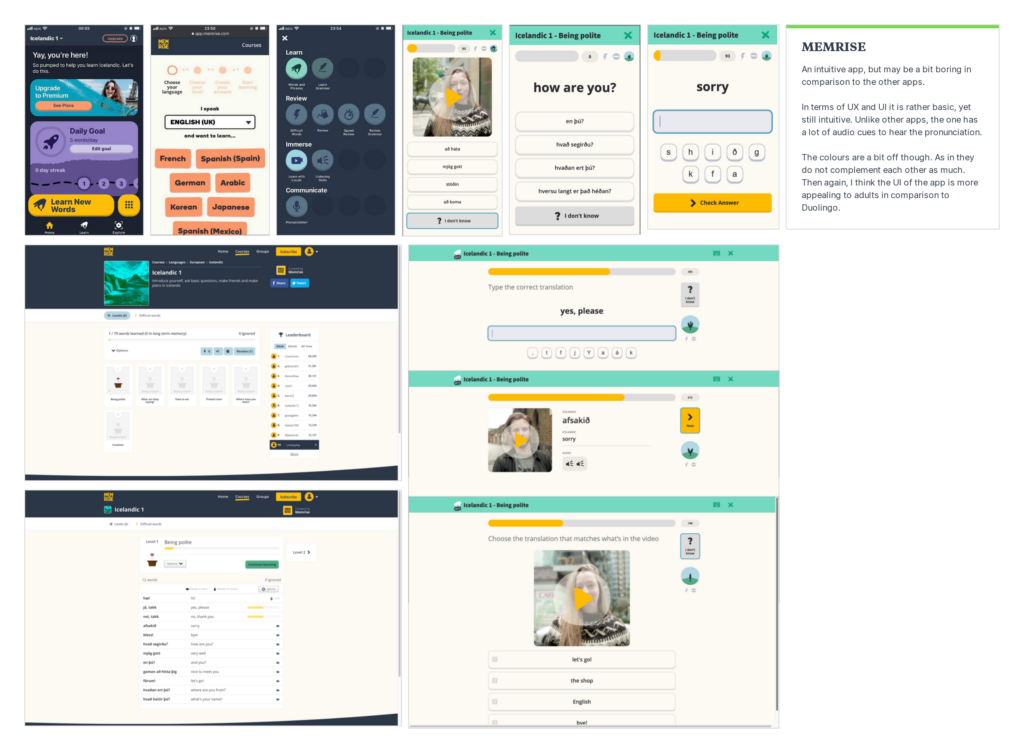
Memrise is also a very popular app. Although I have mixed feelings about it. In terms of UX, whilst it makes use of audiovisual content to introduce the user to the language, which in a way it is good as the user learns the correct pronunciation, I think it would have been better if the user is also presented with a phonetic version of the word or phrase. I tested it with Icelandic language – I have no knowledge at all in the language – and the language make use of more glyphs than the English language, making it confusing at times.
When it comes to layout and colour scheme, I was not very keen on it either. The layout works fine, although the home screen on the mobile version may contain too much information, but the colour scheme has some clashing colours.
BONUS: Beelinguapp
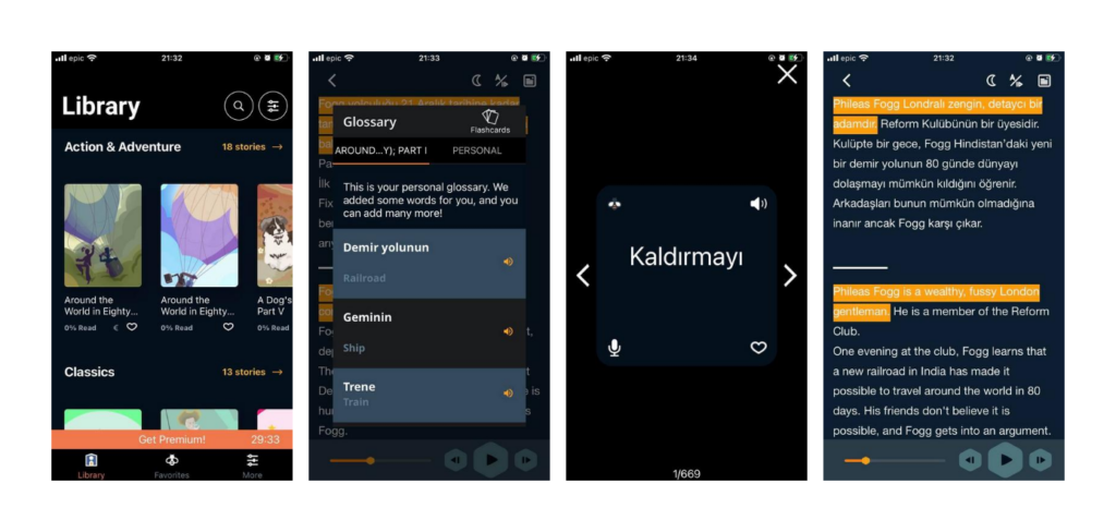
I did not include this with the others as the concept is different from the rest. This app introduces the user to new languages through reading and translating popular stories. It is quite unique and very good if the user wants to be introduced to the language without getting into the nitty gritty of grammar and syntax etc. The concept can come in handy should I include translations of reading books. I will definitely have a closer look at this app in the coming days.


One Comment
Moodboarding – kicking of the Design Process and Deciding on that Name – Lindsay Aquilina – Graphic Designer
[…] These are some of the examples of logos I included in the moodboard. I want to go for something simple yet striking. As for typography within the logo it is very likely that I would go for a sans serif typeface. In addition to this, below you can see some of the examples of UI designs that I am looking at for inspiration in conjunction with the UI from language learning apps. You can read about the analysis here. […]