Looking Back at the Project: Personal Thoughts and Evaluation
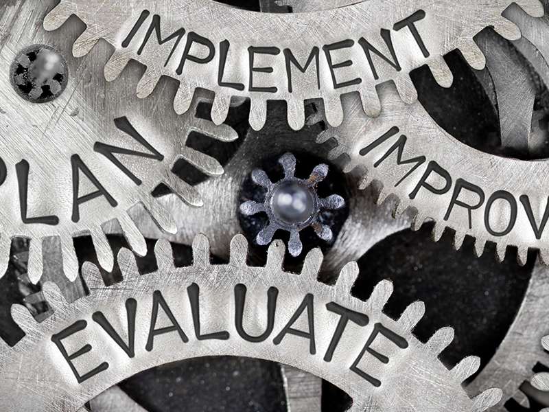
As we approach the concluding phase of the module, the last challenge is to indeed look back and think about what went well in the project, what could have done better and think on the feedback that was collected.
Overview and Outcome
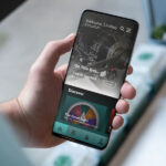
As mentioned in previous posts, I designed an app for the Science Museum that was meant to be an easy access to the myriad of artefacts owned by the Museum for children, young adults and families. The app was inspired as a ‘counter idea’ that goes against the common perception of what an archive is – that of being a room holding valuable artefacts that is locked and only accessed by a select few.
I looked into emerging trends around museums to see what makes people, particularly young adults, engage with such institutions. In addition, I also looked into how museums have adapted to the new ‘pandemic lifestyle’ that the world stepped into. As people are indoors for most of the time, visits to the museums are much less and any typical year.
As a final outcome for this project, I designed the UI of the app, and created some basic prototype functionalities. On the whole, the UI looks good, however, I think that the prototyping could have used some more refinements. Albeit, as an MVP, the presentation will get the message across. Before I delve deeper into the discussion of this project, I must say that the first couple of weeks, before I got the hang of how UI design works and differs from anything that is printed essentially, it was a bit intense. The planning phase was never more essential.
The Positives
Looking back at the project, stress and mini-meltdowns aside, I actually enjoyed working on this project. It was something that I have never worked on before, so it was a learning experience for me as well. In addition to this, being a live brief with a museum, was a motivating factor for I have never had the opportunity to work with such an entity, locally or offshore.
As a solution, I think an app works very well in terms of accessibility. One of the l=keywords in the brief was in fact ‘accessibility’ along with ‘engagement’. I went for such a solution as we live in an age were virtually w=everyone owns a smart phone, and since everyone is always carrying their phone, they are more likely to download it and make use of it. Also, the prototypes, considering that it was my first ever project from beginning to end, it delivers. As an MVP, it can be a good foundation to a fully functional app.
Another positive, however risky step was that I relied a lot on me having to learn a particular software. I used this project as an opportunity to learn Figma – a UI design software, as well as got the basics of how UI design systems work. It was a very good learning experience, but I was lucky in being able to find very in-depth tutorials and resources, and maybe it is a good thing that we are not leaving the house as much at the moment – I had more time on my hands to put to good use.
The Negatives
Although I got positive feedback on the outcome, if was far from perfect. Like every project there is always room for improvement, and his is no exception. The outcome was visually appealing – people seemed to like it at least – I may have focused too much on the presentation of the project, sacrificing time in focusing on broadening certain ideas that can be implemented as features within the app. This is something that I do struggle with from time to time. I tend to fast forward into how much time I have to deliver a ‘complete’ product, in hopes that the audience or client will like it more and understand better what my concept is all about.
There is definitely a lot more that can be explored with this project. Case in point, I was meant to do some research on SEO and the functionalities of a search engine, yet due to time constraints I had to prioritise accordingly. I think that segment of the research would have been beneficial for the app as one of the main aims of the app is to generate content that fit the user’s age, gender (if applicable) and taste. Although I delivered something, I think that I only have brushed the surface of this project.
In terms of feedback, I thought I was going to get more feedback from the public. The course crit sessions helped a lot in this project. I probably should have prepared better for public feedback. The direct link to the Figma prototype was not the best of ideas as later I learned that in order for the prototype to load properly, people need to download a ‘mirror app’, otherwise it lagged a lot, and that defeated the whole purpose of testing the phone app.
It’s a Wrap…Almost
I have also finished putting together the slides for the final presentation for this project. I need to work on the voice over still, but we will get there. I have also completed a short clip that shows the different panels of the app. It is much better than the link to Figma, and it does not jam phones either. I have learned many new things from this module. This will definitely prepare us for the last module to come – the dissertation and final major project. Should keep me busy over Christmas break…