Initial Development of The App

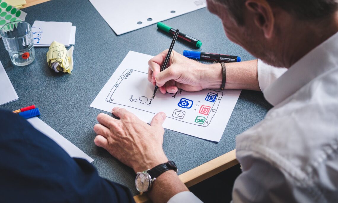
After a brief break to reboot my brain, I kicked-off the ‘digitisation’ phase of the app by watching a few tutorials, mood boards and wireframing. Although I have been working in the creative industry for a bit, most of my work has either been print or visual, meaning that although digital, I had very little to do with the UI of a website or app design. That said, wireframing was not as challenging as I thought it would be – the first couple of steps are the more challenging, but by working with a design system, the wireframing is then a question of putting different elements together.
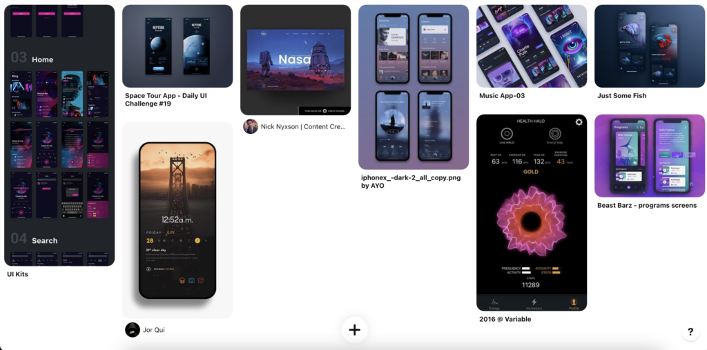
Creating Components and Wireframes in Figma
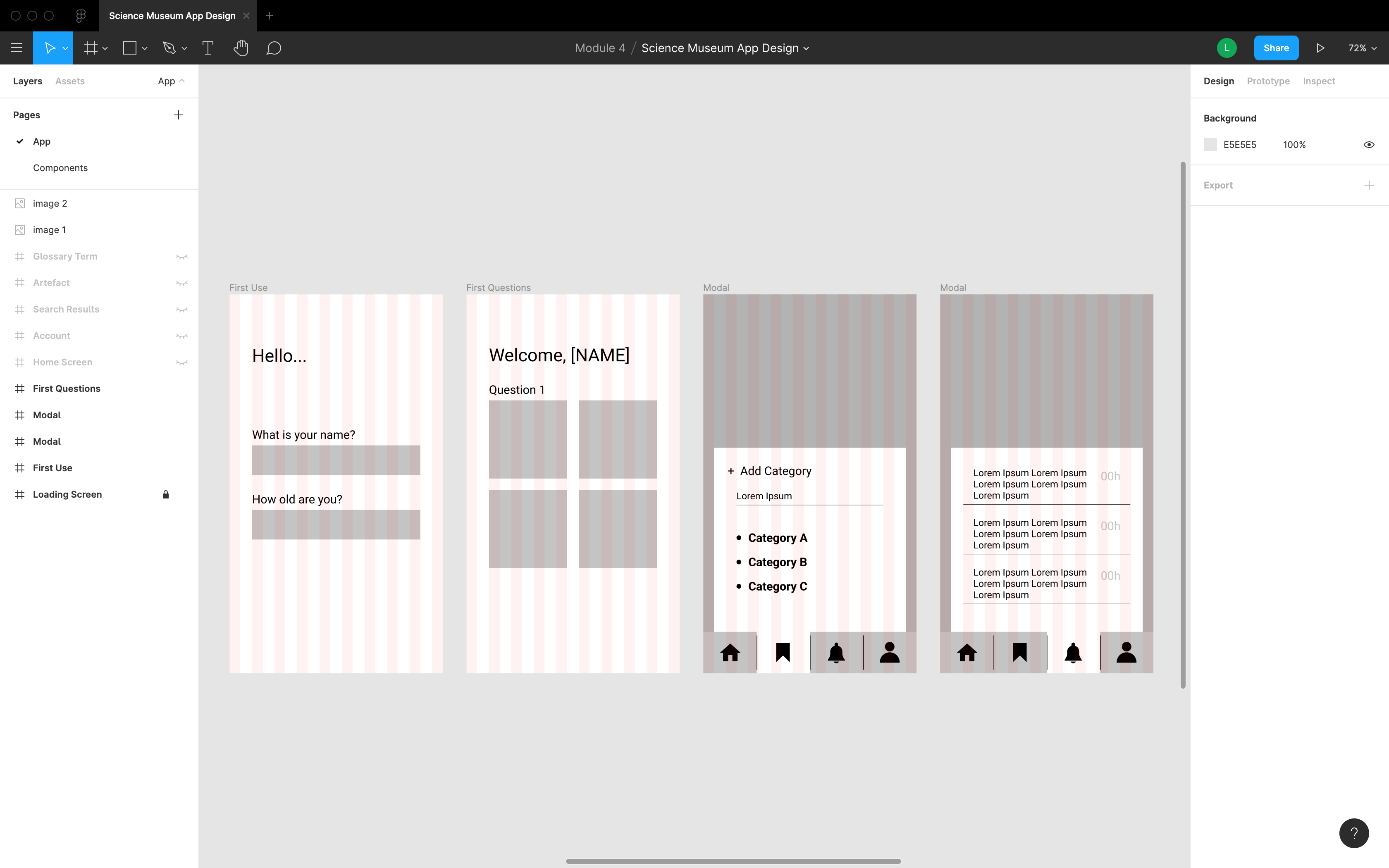
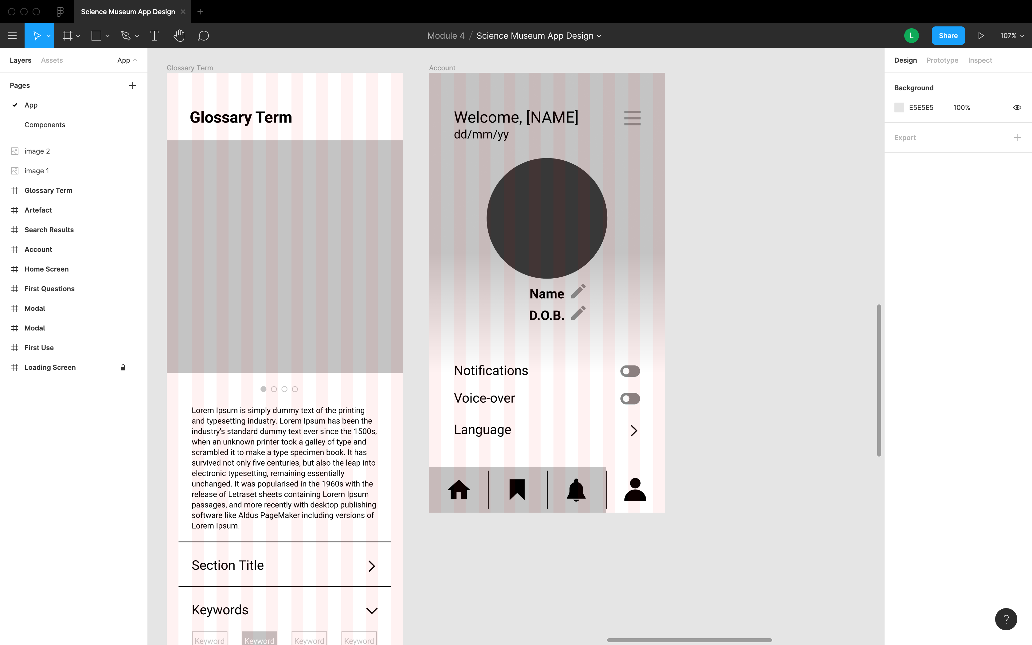
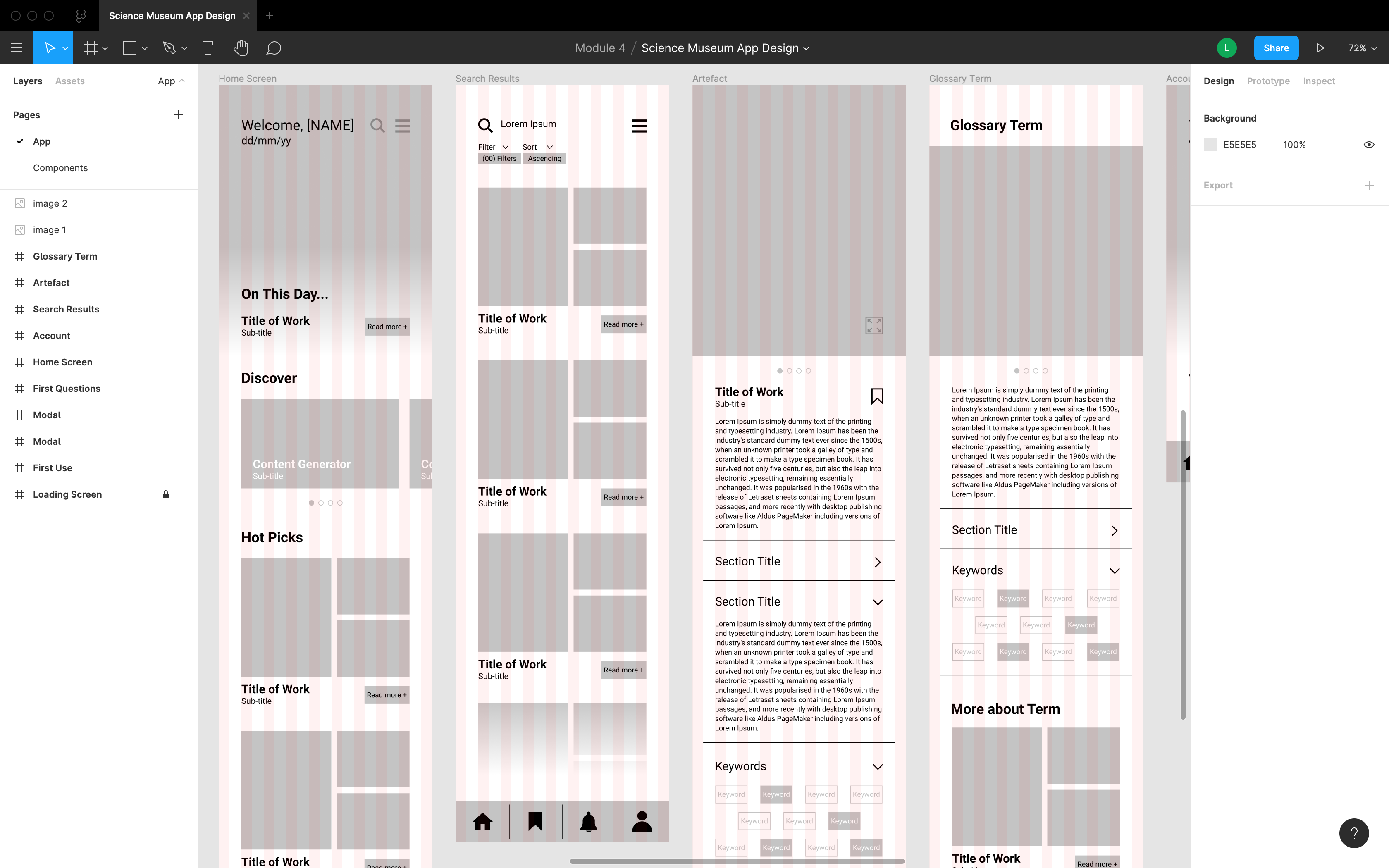
As I may have mentioned earlier, in the previous module, I did take a couple of short courses in Figma as I needed it also for work-related projects. Turns out that it became handy even now. I am still a novice in it however, it is more of a question of knowing the tools and hacks of the software. Anyway, for this project, I have also found a couple of masterclass courses that cover app design from scratch all the way to prototyping. Prototyping is something that I would definitely need to do in the upcoming week, for I need to gather some form of feedback.
In the above screenshots, you can see a number of panels with different layouts as well as the different component making up this app. I tried to wireframe as many pages as possible, making sure that the main pages are covered. Now it is a question of deciding on the aesthetical aspect of the app and start implementing some formatting and content. That said, I am not sure whether I should also be looking at some basic information regarding how a search engine is created or what should I look out for when creating such an app.
The Moodboard
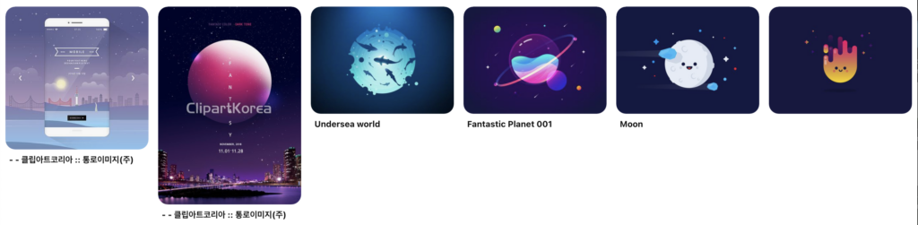
I had a rough idea of the sort of look I would be going for this app. Firstly, there is the Science Museum branding that should be referenced. Visually, it is minimal, but still has impact, and it is something similar to what I had in mind. As the app will have a lot of visual content already, the supporting design should not distract the user from the actual content.
That being said, I still thought of creating a mood board to help me visualise better the overall look of the app. I find mood boards very useful and very easy to collate ideas and create ‘the bigger picture’ of a project. The overall look for this app is on the minimal side, and I do not want it to be too formal, yet not casual to the point where it looks either childish or unprofessional. Surprisingly, music apps are very popular examples and seem to have the most interesting layouts and use of typography.
Onto the Upcoming Week…
This upcoming week, I definitely need to pick up some speed on this project. With the wireframe done, it is already a big plus for me. Layout design is not my forte and I tend to spend a lot of time making sure that everything fits in the grid. Despite this, I must not forget that there is a lot of work to do besides the prototyping. Collecting feedback and presenting it is as important as the project itself. The fourth module is almost over… what a journey it has been indeed.


One Comment
Putting the Project Together – Lindsay Aquilina – Graphic Designer
[…] of the style that I am going for, which I talked about in a previous post. You can check it out here. Wireframing is essential when it comes to UI design as you can see a draft of how the layout is […]