Designer as Author and Maker: Workshop Challenge Part 1

As time goes by, we are always moving away from the conventional meaning of graphic design – that of being something purely visual. Whereas in the old days, it required for someone who was a well-trained craftsman to produce signs and posters and books, now designers are looking more into the process and substance of their work. As Craig Oldham described it very well in the lecture (will be writing more about this shortly…) – “ Graphic design is a means, not an end” and that “the overall role of graphic design is communication”.
I am working in a bit of a different order this week simply because it is more feasible to write down the examples required for the challenge that I come across during my research straight away… while it is still fresh in my head. The first part of this week’s challenge required us to look up two different examples of graphic designers that show examples of authorship, whether it is a passion project, their soul output or because they found a gap in the market.
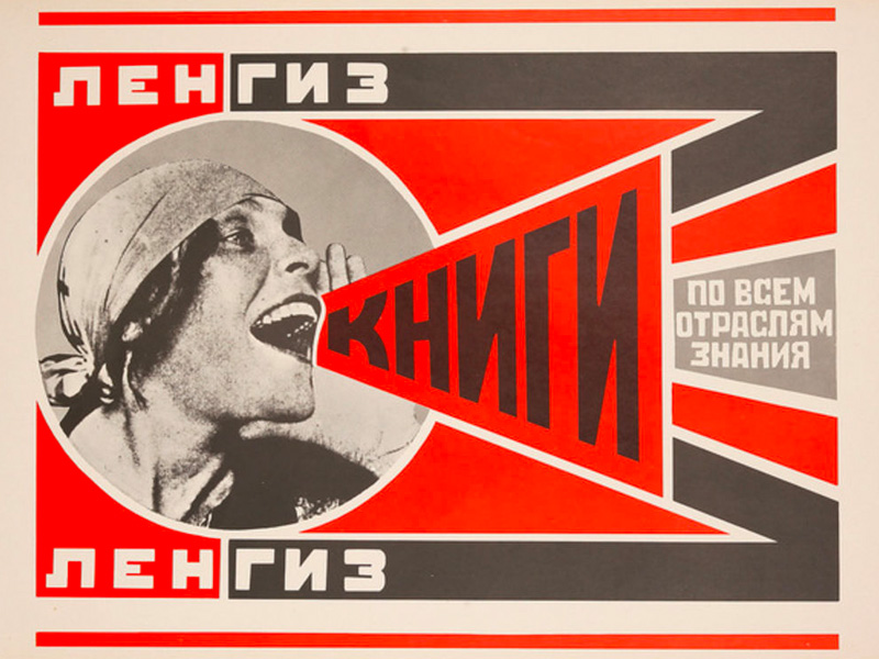
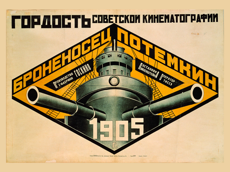
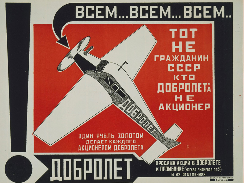
Example 1: Alexander Rodchenko
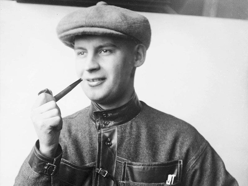
Alexander Rodchenko was a Russian artist designer and photographer. Born in St. Petersburg in 1892 and received his education in Kazan and Moscow between 1911 and 1914, taught by Vladimir Tatlin. Rodchenko is one of the leading figures in the Constructivist movement, in fact he most notable works are from that period. However, it is interesting to note that Rodchenko started out as an artist (as in ‘painter’). His initial works were very much inspired by Cubisim and Futurism. However, Rodechko developed a keen interest in elements of design during the time he was Tatlin’s student and assistant. By 1921, he abandoned ‘pure art’ to pursue visual communication, to which it led him to be the pioneer of constructivist typography. He believed that ‘visual commmunication’ served the needs of society. During that time, there was a lot political upheaval in Russia, and this was reflected in Rodchenko’s works. During this time, Rodechko was active in multiple areas of design that ‘served society’ one way or another. He was involved in the designs of publications, posters, interior, furniture and stage sets. His most notable works are the movie posters designed for director Dziga Vertov for Kino-Eye’ in 1922 and his collaboration with Vladimir Mayakowsky in 1923 for the arts magazine Lef, where he was art director.
Following this venture, Rodchenko branched into photography, in attempt to seek new objectivity through technical means. Over the course of time, his work was also exhibitied in the 1925 Crystal Palace Exhibition in Paris, however, following reforms in the laws of the time in Russia, it led him to work as a typographer and photo-journalist at various magazine publication houses.
Such versatility made this artist turned designer one of the icons of Graphic Design where his work is still an inspiration for many today.
Example 2: Fred Butler
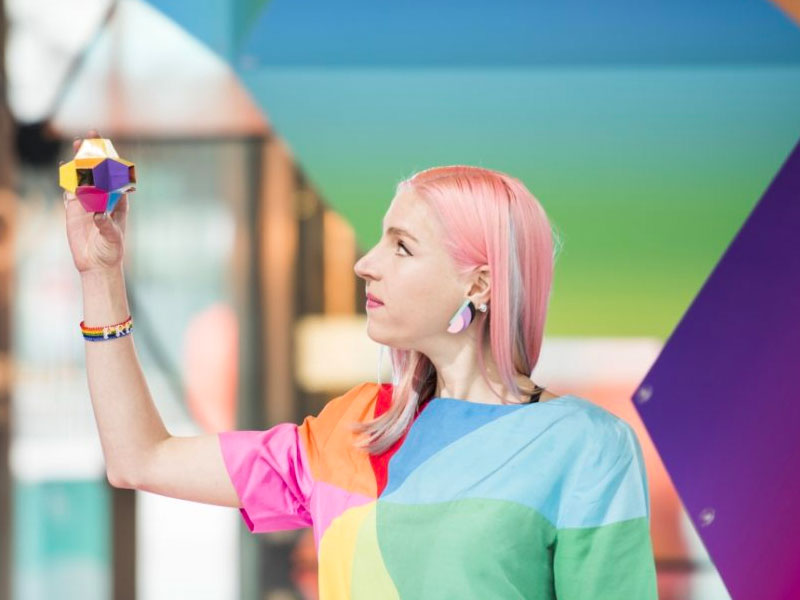
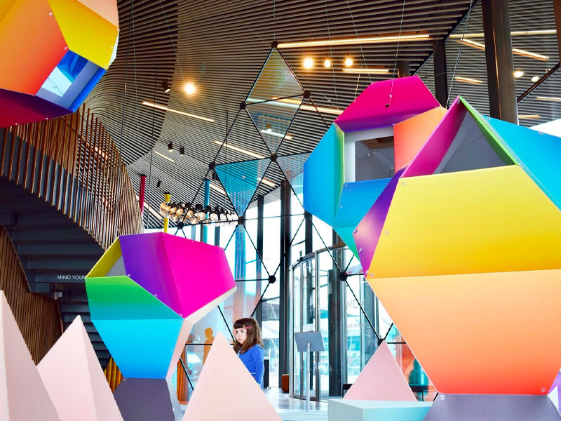
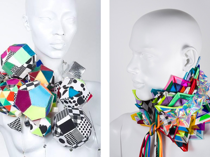
Fred Butler is a London-based designer, where she specialises in creating ‘pieces’ to be used as props and fashion accessories by various performance artists and filmmakers.
She was born in Colchester, England. Growing up there was tough in her opinion as she descirbes is as a ‘garrison town’ and the energy there was rather confrontational and not very relaxed. During her studies at Brighton University between 1999 and 2003, she was working as an intern with designer Shona Heath, who was part of ‘As Four’ a design collective. After finishing her studies, she went on to establish her own “firm”, where we started producing various accessories and fashion pieces. Her geometric quirky style quickly caught the eye of other fashion designers as well as performance artists, particularly musicians. She has worked with the likes of Lady gaga, La Roux, Beth Ditto and Bjork. In an interview with Dazed, she talks about her style were she describes it as ‘alternative’ and that she has only ‘one aesthetic’ – that being a very colourful and accented with black and white along with shimmering materials. Butler attributes this love for ‘glitzy’ clothing to her childhood. Her mother was not keen with embellishment colourful clothing, so as a child Butler wore plain clothing.
What strikes me the most about here work is her very creative use of geometry and the rainbow of colours she uses to create her pieces. It is a very unique and definitely avantgarde. It may not be the most convenstional of suthorship, however, this style is definitely unique in its own right, it would definitely make Butler an ‘author’ of her own ‘one aesthetic’.
Bonus: Brand Nu

This was actually the first example I thought of including, however I was not entirely sure if it fits the criteria or nit. That being said, I would love to share it with you nonetheless.
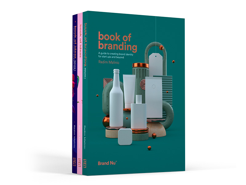
Brand Nu is a graphic design studio based in London. They have worked with clients from various industries, and they really have this unique style not only in their work, but also in the way they present it.
That being said, apart from being an agency, they are also a publication house and well as have their own store were the sell their own creations – these include apparel and sculptures. Their publications are quite interesting – as they are in a sort of ‘handbook’ format, yet it also doubles as a printed catalogue of their best work.

