Analysing ‘About’ Pages: Progressing through the Workshop Challenge.
To start off this workshop challenge, I looked back at the companies that I geotagged in the first module of this course and had a look at their ‘about’ pages. You can have a look at the companies in my other post here. To give you an overview, these are three design agencies, all operating in Malta, however they are at different levels of the business hierarchy.
The Local Market
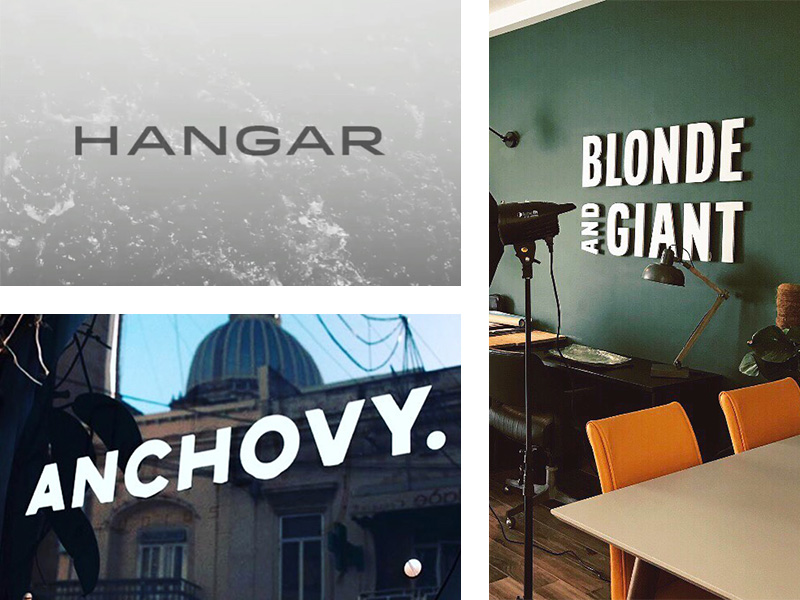
Hangar, the first company I looked at in this exercise, has quite an elaborate description in the ‘about’ page. I liked their mission statement – “we believe if something is worth doing, it’s worth doing right” – quite to the point, and they used it as their introduction. They also wrote the ‘about’ blurb in the first person. They used ‘we’ as opposed to ‘the company’ or simply ‘it’. I think that it helps in adding the human touch and makes it more real. Amongst other things they listed their values, their beliefs and a more detailed description of the company. I must say that at times, the diction used sounded a bit pompous, and the values sounded a bit cliché, such as ‘the pixel is the limit’ and ‘selective by design’, however people seem to like it and it does attract customers. Whilst reading through, I got that Steve Jobs vibe from it.
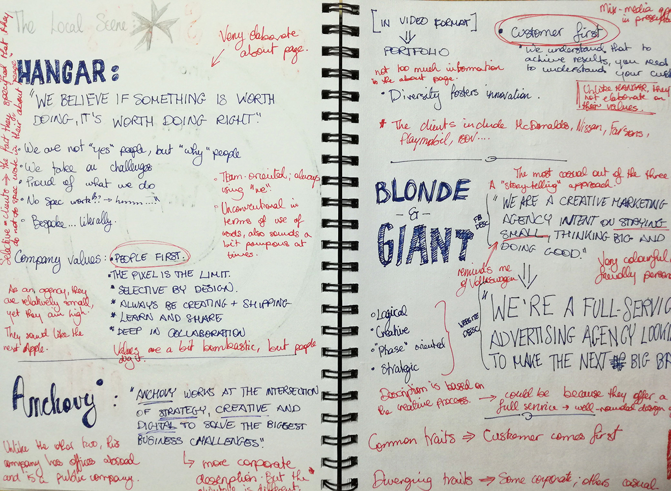
The second company I wrote about, Anchovy, is much larger than the other two examples. In face this is one of the few local design agencies that has offices abroad. In comparison to the other examples, their ‘about’ page is more corporate then the others. That said, one also needs to take note of their clientele. Clients include, McDonalds, Nissan and Playmobil amongst others. In addition to this, they took a mix media approach in the design of their page, rather than putting in chunks of text. Although there is not as much information as that of Hangar, it looked more on trend, even if at times it is good to include some more information about the business.
The last design agency I chose is Blonde and Giant, a “full-service advertising agency looking to make the next big bang”. I liked the way they chose a story-telling approach to their company profile. Also the writing style they used is very casual and friendly. Like Hangar, they also included their company values as well as the mission statement in the about page. It is not as lengthy as Hangar’s but it still gets the message across. I also liked the fact that they included a brief description of their creative process, something that I did not see neither in the other two examples nor in the ‘about’ pages of international companies that I will be talking about below.
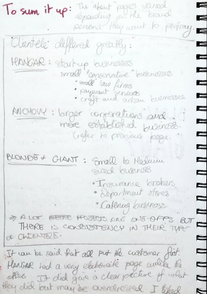
Following this brief analysis, it can be said that they all out the customer first, Hangar had n elaborate page in comparison to the other too. It did give a clear picture of what they did but may be overdressed in some areas. I liked the fun-factor of Blonde and Giant’s approach; it was very clear. It may not attract larger corporations but given that they intend on staying small (it was written in the page too), I think that they did a good job with their brand that attracts their desired market. As for Anchovy, they definitely went for the bigger clients. It may not be my approach, but I would say that they hit the jackpot. Definitely the “elite” way of presenting the company.
To sum things up, I can see that a personal brand is very important, especially if you have a target market or if you have a specific milestone that you would like to reach in your business. If you want to make it big and get into the higher tiers of the industry, I lot of work needs to be done not only in terms of your design skills, but also in areas that come with managing a business.
The International Scene
I also thought of comparing these three examples to three international design agencies. For this part of the exercise, I chose Pentagram, Sagmeister & Walsh and Ogilvy.
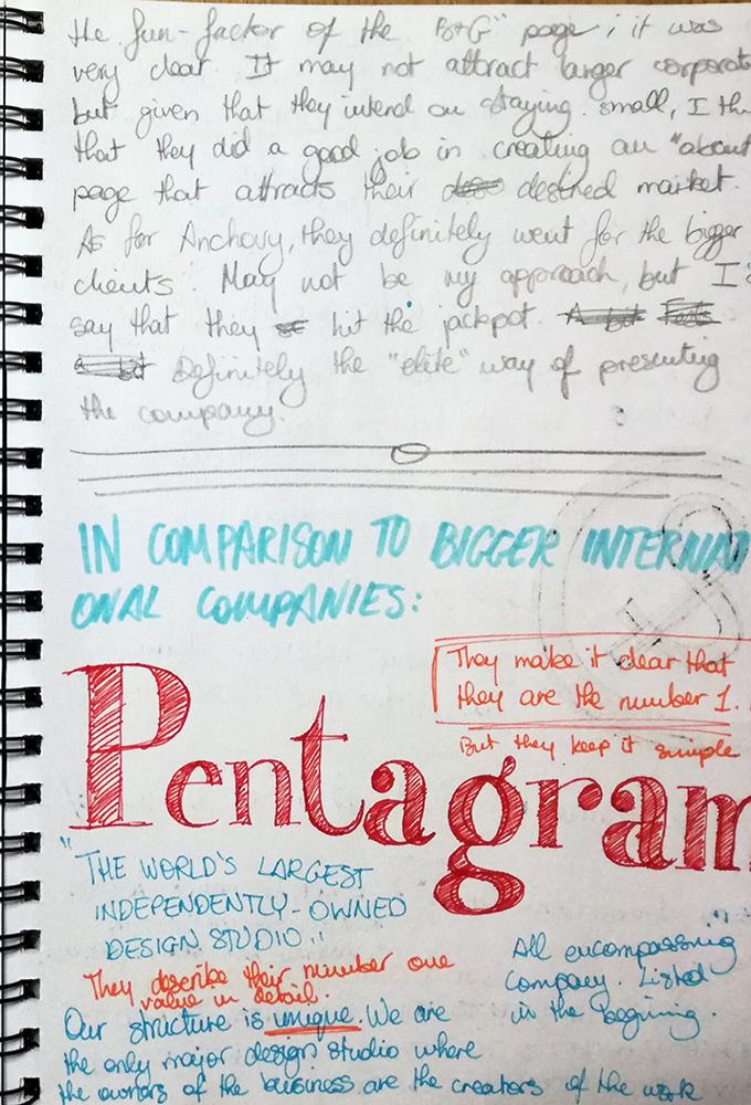
I really liked Pentagram’s approach to their ‘about’ page – short paragraph and to the point. They did start off by saying that Penta gram is “the world’s largest independently-owned design studio”, but given that they are indeed the number one branding agency in the world, I think that it is safe to say that they are in a position where they can show off a bit. However, considering the position they hold in the industry, they do not use any bombastic wording and over-the-top adjectives just to show how good they are. They focus on their brand value and their unique selling proposition;
“we are the only major design studio where the owners of the business are the creators of the work and serve as the primary contact for every client”.
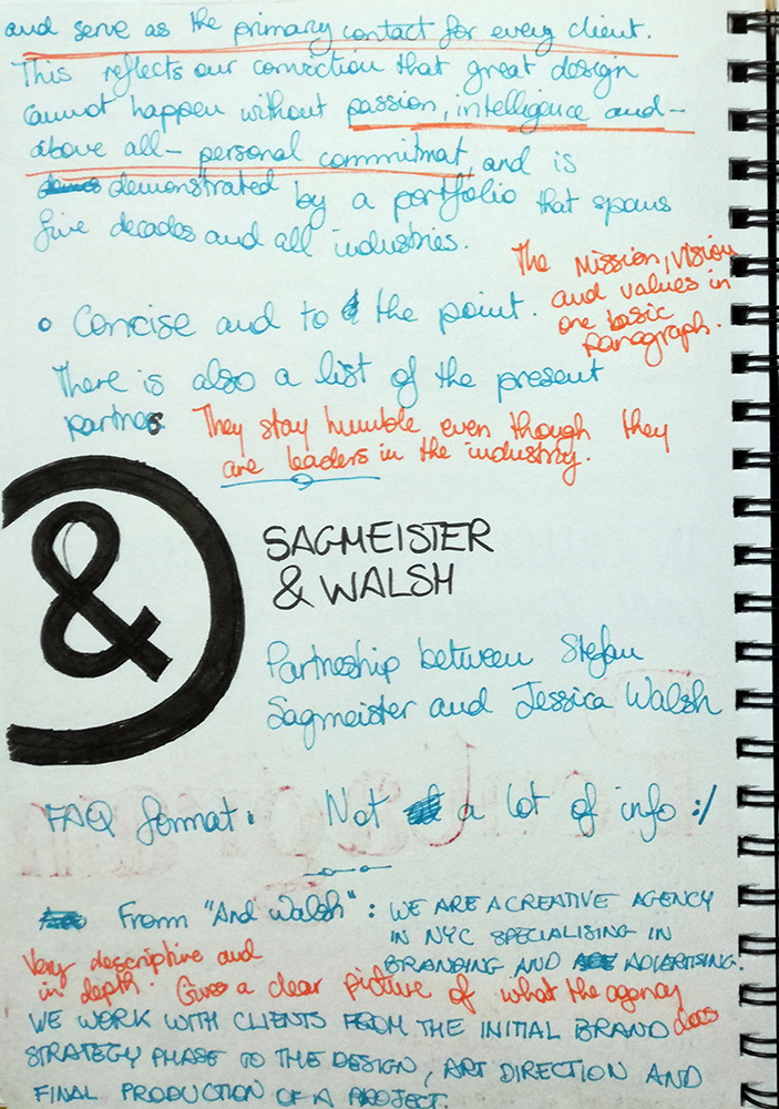
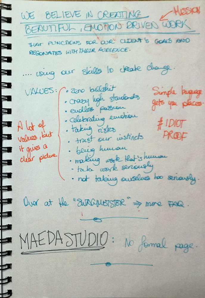
The Sagmeister & Walsh ‘about’ page was a bit of a disappointment. There was very little information regarding the partnership and most of the information was in an FAQ format. The idea is cool but having to click to expand each question was a bit daunting. &Walsh’s page was a lot more informative though. Jessica Walsh also has her own creative agency where she mostly works on branding projects. Just like Pentagram as well as the local design agencies, the &Walsh’s ‘about’ page started off with the mission statement. Similar to Pentagram, there was no elaborate and formal wording in the description. The company values list was a bit long and there were a couple of clichés, but on the whole, it was a well written description. I also liked the fact that it is essentially idiot-proof – anyone can understand what &Walsh is all about.
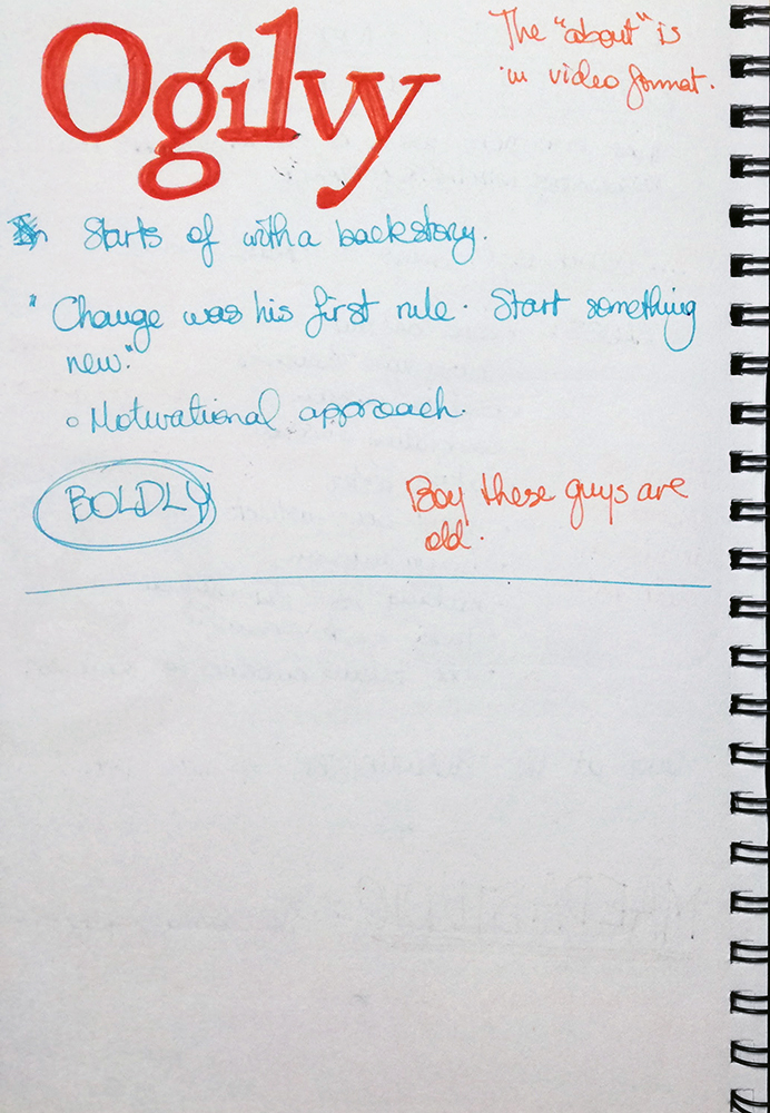
The last example was a real disappointment though. Firstly, I did not expect the staff at Oglivy to be that old. I know that creativity is not a question of age, but yeah, I was surprised. As for the ‘about’ page, there was now written description. There was a video were it showed the history of how the agency came to be, but that is about it… and of course, pictures of the staff. Did not expect that at all.
All in all…
After doing this brief analysis, I noticed that design agencies in Malta tend to blow up their company description and mission statements a bit. I could not find a valid reason for it, probably it is a matter of trying to stand out from the rest, especially given the fact that there are a lot of design studios on the island compared to the size of the market. However, I still think that good work does speak for itself so there is no need to over-inflate things. I liked how international companies kept it simple yet they still got the message across. I think that design agencies should follow such examples too.