Why do People Like Visual Data so Much?
Data gathering has always played an important part when conducting all sorts of studies to get a “better picture”. Be it something as complex as a national census to see how the general population is doing in various areas of life or something a bit simpler such as the hiring of a new employee. We unconsciously do it in everyday life – when looking to buy a new appliance or a quick price to volume comparison when shopping for groceries. But what is it with data that makes it so reassuring to many? And what is it that makes visual data so appealing? After looking at multiple sources, both online and offline. I came across some recurring points that are worth sharing.
- It allows us to make informed decisions. As data comes in numbers rather than words and data gathering is done over a span of time and multiple resources, it makes if factual and leaves little room for speculation. An example of this is business trade-offs and stock markets. Investors want a clear picture of what they are investing in. One of the documents they look at is usually a balace sheet, which is a form of data.
- It puts an argument to sleep. As much as people love to discuss things, very few enjoy heated arguments. With that said, following up on the previous point, data provides objective answers that are based on deduction and not prediction or assumptions. Whilst there are variables that may be at play in some cases, data does not lie.
- Some find it exciting. As the demand for data arises is becoming more complex, data processing technology is advancing more rapidly than ever before. At the risk of making overly bold statements, there is now a need to have more efficient tools to processes raw data.
- It satisfies curiosity, yet it can be mysterious. Some simply like data for what is it – an answer to a question. One could be sitting at a bus stop watching people catching and getting off buses and wondering how many times people commute from that particular stop. However, some argue that when gathering data, there are a lot of variables at play. Taking again the bus stop example, one has into consideration criteria such as, time of day, the season or even the weather. It is important can when gathering an analyzing data, one ‘sets the scene’. In turn this would make the results from the study more accurate and up for comparison with similar studies.
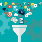
- It can be used for different domains. Data analysis can be applied to practically anything. As I already mentioned in the intro, it can be as simple or as complex as one pleases, depending on how far the analysis wants to be pushed.
A short note on Data Science…
As mentioned above, data has become more complex, data analysis has evolved from mere statistics to more complex processes. Nowadays, data is also being used to understand better certain traits within a field, be it a start-up business or a well-established corporation, make predictions. In the last decade, the issue was storing data. Now that this issue has been solved, now people are looking into what is there inside all this data.
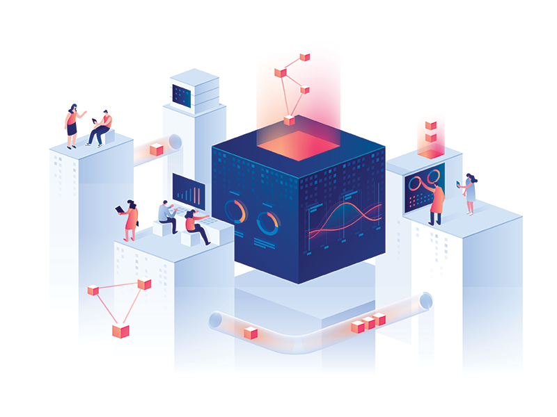
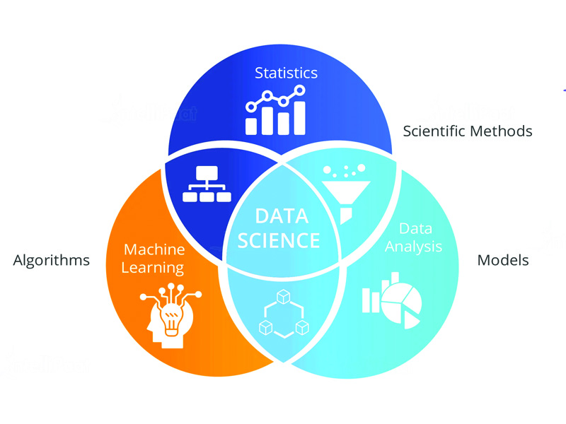
This is where data science comes in. In a nutshell, data science is a combination of tools, algorithms and AI used to disseminate complex raw data. Unlike data analysis, data science is used to compare variables within the statistical data that is collected, making it possible to make decisions and predictions.
The data science lifecycle is typical made up of six stages. Namely:
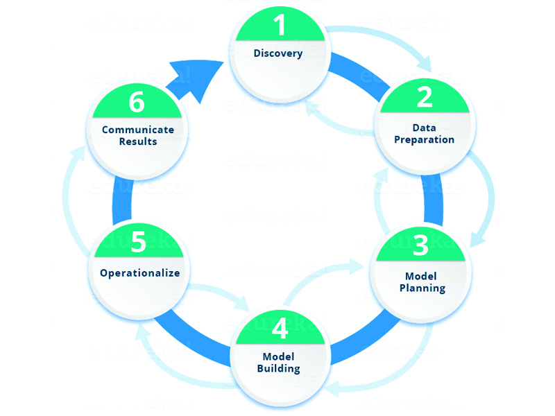
- Discovery – Prior to starting a new project, one needs to understand the specifications, requirements, priorities and required budget.
- Data Preparation – Here is where the raw data is collected. Could be with the use of tools or even manually. In this phase, one can also set out the conditions for the data collected (“setting the scene”). The process done in this phase is the ETLT process: Extract, Transform, Load, Transform. In this phase, one will be doing Data Analysis.
- Model Planning – Tools and techniques are determined that will be used to draw relationships between the variables in the data. The relationships will be the basis to the algorithms applied in the next phase.
- Model Building – In this phase, datasets for training and testing are set. Here one can decide whether conventional data collection tools are sufficient for running the models or whether more robust processes are required. Learning techniques will include classification, association and data clustering.
- Operationalise – Reports, briefings and technical documents are compiled and formally written for final delivery. In some cases, pilot projects can be implemented in this phase so that the research is tested in a real-time environment. The data collected here will provide a clear picture of how the project will work on a small scale.
- Communicate results – In the end, it is important that the results collected in the previous phases. Here, key findings are identified and are communicated to the stakeholders involved in the project. Also, it is important to evaluate any success or failures developed in the previous phases and proceed accordingly.
Data Gathering from a Designer’s Perspective?
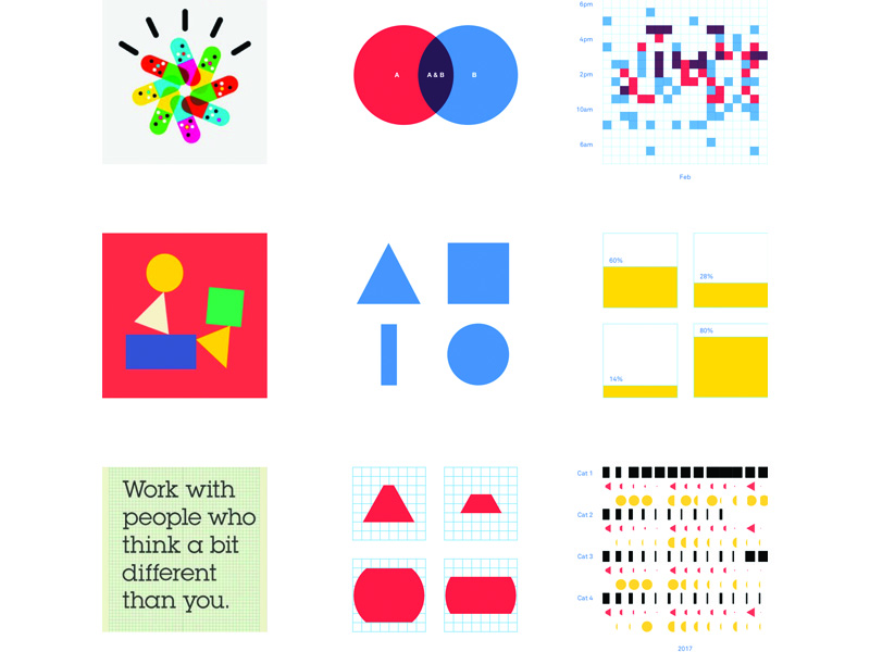
Now, as much as people are attracted by data, it is also true that people tend to find tables full of numbers quite daunting. As human beings we are attracted to things that are visually striking. Although people react to this in different levels, most of the information we process is through our eyes. ‘The language of the eye’ as David McCandless very well describes it, is a description of how human are able to see patterns and variations in colour. He continues by stating that data visualization can be a work of art in its own right, however, what really makes data visualization attractive is how data is presented in a simple way, making it easier for the common reader to read and understand what would otherwise be a jumble of numbers and letters.
Similarly, Giorgia Lupi, Information Designer and co-founder of Accurat, describes how the aesthetical aspect of presenting data is equally important as the data itself. It triggers the readers’ curiosity. As an information designer, one learns how to truly see. Similar to how a reader learns how to “read between the lines”. In her presentation of the collaboration with Corriere Della Sera, she sums up her presentation into five points that give an overview of how one can go about a data visualization project. These are:
- Embrace complexity. Complexity gives room to exploration and creativity. In addition complexity ‘is an inherit feature of our world’.
- Pursue beauty. Beauty has the power to attract readers’s attention and motivate them to dig deeper.
- Don’t limit yourself to standards. Dedicate enough time for exploration, because something good will result out of it.
- Data is not just numbers. Data is numbers with meaning, however it goes beyond that. Data can also be a collection of interviews, from which you can get different people’s opinions and perspectives. It can be a collection of samples of any kind. One can be as creative as they like.
- Data makes us more human. This is because it allows us to connect to a deeper level, both with ourselves and with others.
Through data, we can learn a lot about ourselves, the society we live in and the environment we inhabit. This is because it provides a factual answer to almost any question we may have. Given the correct criteria, data can even be the catalyst to finding a better solution to a recurring problem. As designers we do tend to think instinctively at times. As much as instinct can yield good results and also helps us survive and evolve, science and data are also needed to deduce the best possible way forward.