Story Told: Reforming and Projecting a New Future in a Type Design – Part 2
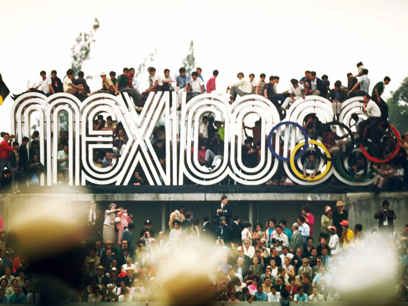
The second part of the lecture was about typography in relation to branding. It was a presentation by Lance Wyman where he talked about his Me0xico68 branding project for the Olympics. Instantly, one can easily tell that Wyman’s inspiration for the geometric logo was the Olympic logo itself. However, he also iterates that he was also inspired by the ancient art of the Aztecs in conjunction with Op Art, which was trending at the time. When I heard this in the presentation, I thought it was a bit far-fetched, however, as the presentation progressed, I saw what he meant by that remark. The implementation of the brand across Mexico City was quite unique and revolutionary for that time. Considering that technology was quite limited in comparison to today, people went to great lengths to showcase the event, from murals to uniforms, from posters to stamps.
What is makes this project even more fascinating is at how all elements were synchronised with one another. The brand was practically seamless. My favourite part was how the entry tickets were designed. The iconography was very well crafted. In addition, the new approach towards the usual ‘stick-figure’ icon system, made this branding project stand out for the years to come.
Typography in branding is a key element. As mentioned in my previous post, a typeface can be a deal-maker or breaker in an otherwise perfect piece of design. Many designers often make the mistake of putting typeface choices on the side lines, only to result in a more daunting task of looking to find ‘the perfect fit’ at the end after the brand is practically set in stone. Just like logo design, adequate time should be allocated to look at suitable typefaces. Similarly, when designing a typeface from scratch, that design should have a personality. Where is this typeface going to be used? Is there a target audience? On which medium will the typeface be used? Many think that fonts are no big deal, however many are unaware at how the unconscious mind processes information. Studies have shown that when reading, we often tend to absorb the overall look of the font rather than individual words. This in turn can affect how we interpret the information we read, deduce its authenticity as well as its relevance.