Story Told: Reforming and Projecting a New Future in a Type Design – Part 1

This week’s theme is a continuation of last week. We are looking at how typography impacts society, only this time we are looking at two particular case studies. These will serve as a springboard to this week’s research and task.
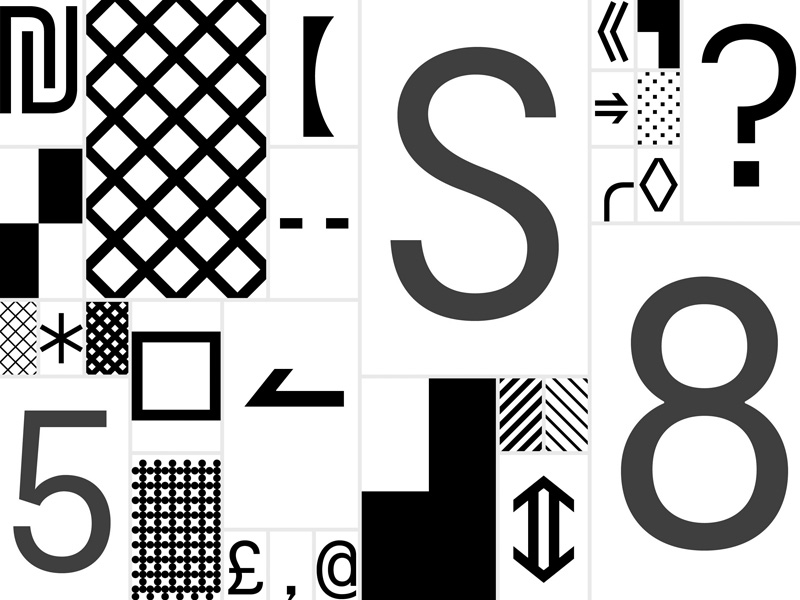
The first part of the lecture was a podcast between our module leader, Stuart Tolley, and the founders of Colophon Foundry, Edd Harrigton and Anthony Sheret. The podcast kicked off by introducing the Foundry and what it does, then the interview focused on the project where Colophon was to design a new typeface for the Tourism department of the Welsh government. The brief was to create a series of fonts that reflected Welsh heritage whilst also reflecting the contemporary side of the nation. This project resulted in the beautiful Cymru Sans and Wales Sans. During the design process, the typographers looked at how the Welsh alphabet differed from the English one. Although both are made from Latin characters, the Welsh alphabet omits certain letters whilst combining others.

My favourite part of the design was how they recreated the digraphs into ligatures, in particular the ‘dd’ digraph. The curves made the character look quirky yet elegant at the same time. The little curves and kicks that were added in the characters gae the font more vigour and made it stand out more. Also, as per request to the brief, these curves paid homage to the ancient Gaelic art and letterforms.
It was here were it got me thinking about this week’s task. As a follow up on
last week’s task, we are to illustrate the town’s name typographically based on
what we documented last week. The town I chose is called Marsaskala, however,
in Maltese it is called Wied il-Għajn [Wiid il Ajn]. Initially, I was going with the English version,
since the classes are in English and we are a mix of nationalities – it was the
first instinctive move. However, after seeing this project, the part of the
digraphs got me thinking. I realized that in Maltese we have two diagraphs –
the ‘għ’, which is silent and ‘ie’ which has a ‘ee’ sound. These
diagraphs also happened to be both in Wied il-Għajn.
This week is going to be a very interesting one. Even considering looking at
both versions of the town’s name, for when designing a font, it is good to
start with the lower case ‘o’ and ‘l’. They make a really good base and
considering that Marsaskala is a series of repeated letters, I think
that there will be some time to spare to have a look at it too.
The second part of the lecture focused more on
Typography in relation to branding. I will be talking about it in another blog
post.


