HISTORY REVEALED
The first task for this module is exploring typography in the wild. This meant that we had to choose a location and go around taking pictures of various examples of typography that we come across. Following this exercise we are to select the best five and write a short synopsis about it. It was a fun task to start off with this module. I am very much into typography and any excuse to look at fonts and/or read about typography-related material is welcomed eagerly. Below are my five responses for this week’s challenge.
Graffiti Hotel
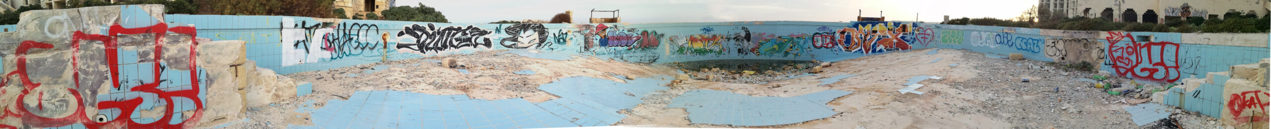
Ex-Jerma Palace Hotel, Triq il-Salini, Marsaskala, Malta [35.861374, 14.573573]
This is a panoramic photo of what used to be a hotel pool. From the numerous graffiti in this pool as well as the rest of the building, it is obvious that since the hotel closure 13 years ago, the area had been trespassed by virtually everyone. Personally, whilst walking there is brought back some bittersweet memories, however, from an artistic perspective, it has become somewhat of a showcase of street art and graffiti. The pieces shown in the photo are very diverse, yet all equally expressive in their own way, and they seem to complement one another and make up a very unusual typographic collage. Some pieces are made up of fluid letterforms, whilst others are rigid and polygonal. A very interesting juxtaposition indeed.
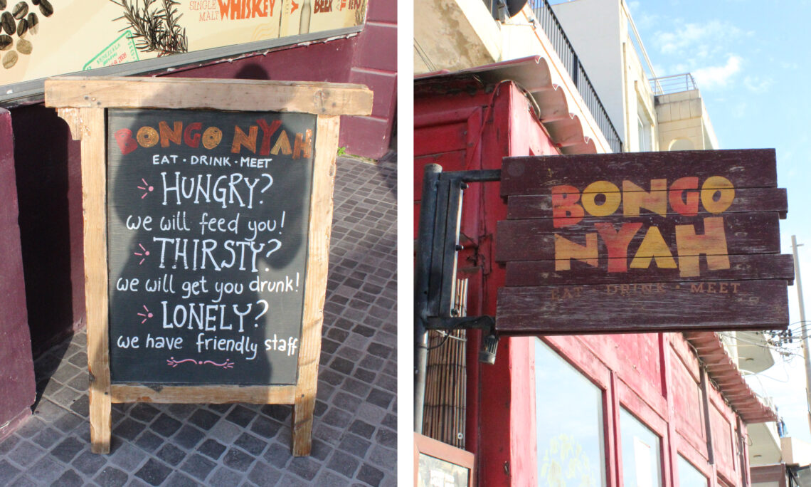
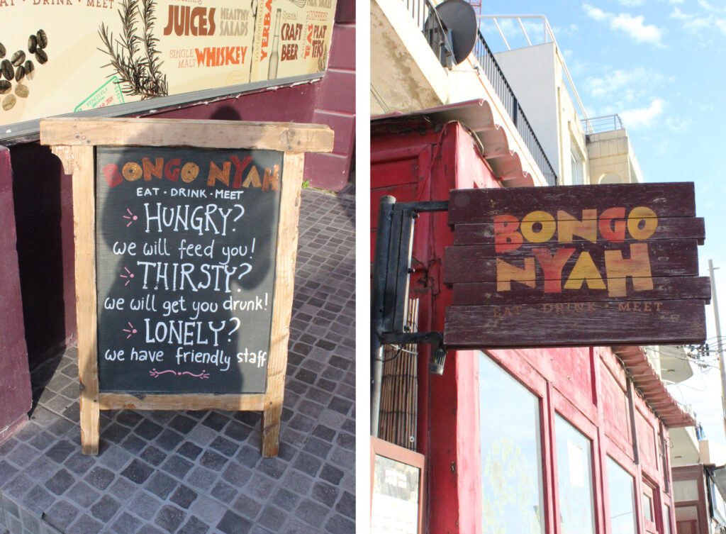
Boho Logos and Type

Bongo Nyah, Triq il-Gardiel, Marsaskala, MSK 3801, Malta [35.862757, 14.562648]
Bongo Nyah is a bar and restaurant located along the promenade of Marsaskala. Just as the name suggests, its design is a bohemian themed restaurant. In the photo, one can see the organic typefaces used on the A-board and sign as one enters the restaurant. The bold lettering used for the logo alongside the hand-drawn type balances out the design on the board, making it eye-catching yet easy to read. I also liked this design as hierarchy is also applied. The logo and tagline of the restaurant sit at the top, then the three key elements that make up the brand persona of the restaurants are in block letters, making them more prominent whilst any additional details are placed accordingly.
Mejd with Lavv!
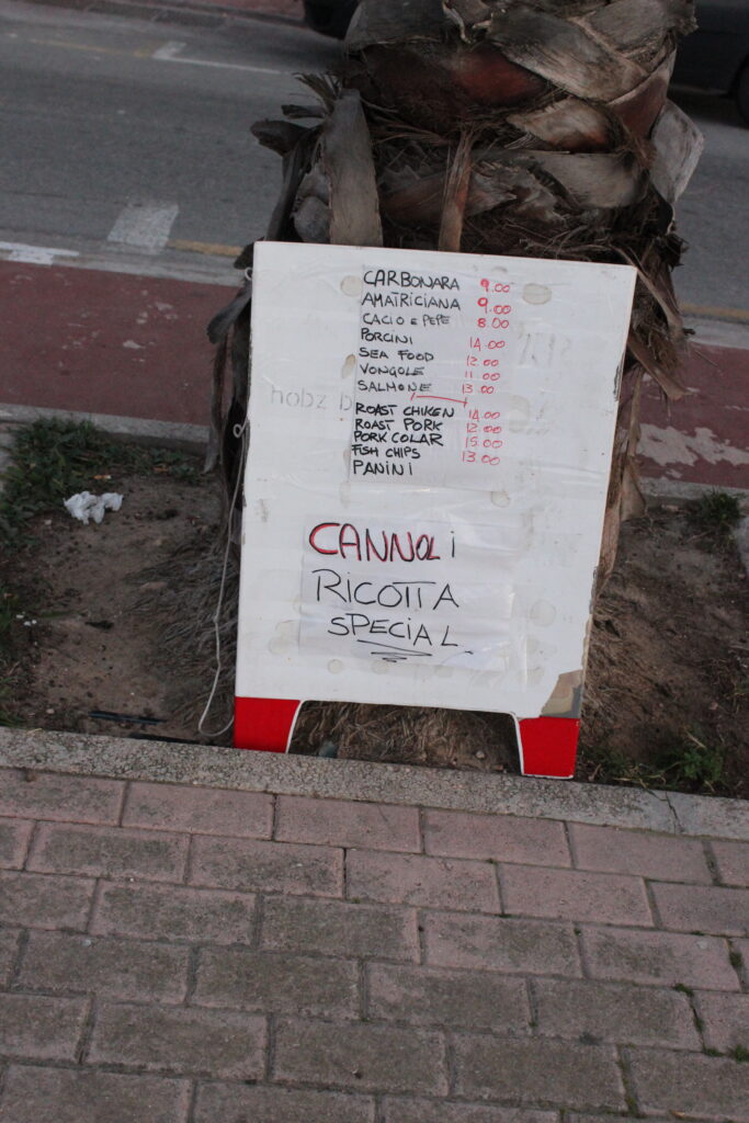
Zanadu / Rivans, Triq is-Salini, Marsaskala, MSK 3802, Malta [35.864671, 14.568105]
Whilst walking along the promenade, I am across this make-shift menu board, listing various food items and pricelists. Whilst one can appreciate the effort behind this masterpiece, the location is slightly questionable… it is placed opposite two adjacent snack bars… and there is no name on the board. Some may laugh at the way whoever made this clearly does not give a care in the world about presentation, let alone principles of typography, but we can all admit that the it serves its purpose.It is also worth noting that if you look closely, prior to the taped sheets of paper, the menu was stenciled on the actual board. I cannot make much of it,except for the word ħobż meaning bread. It is the item and the price, what else is needed. And in case you missed it, the ricotta cannoli are special!
On The Road
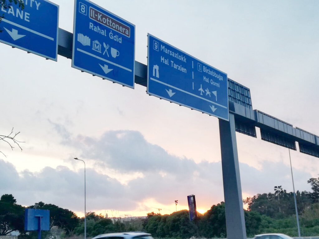
Opposite Millenia Building, Triq Aldo Moro, Marsa, MRS 9065, Malta [35.876237, 14.495773]
This is a photo of the signage recently installed at the re-built Marsa Junction. As lanes and flyovers were added in this junction, proper signage was imperative. Just like any proper wayfinding system, there is no room for aesthetics, but rather clarity of information should be prioritised in such cases. This wayfinding system is no exception. One can see that the names of various towns are listed accordingly, accompanied with matching iconography indicating various premises one finds should the commuter be taking that direction. As some may be aware, in recent years, road signs are replacing the Helvetica typeface with a more humanist font – Highway Gothic. In Malta, old signs using Helvetica are still around, however they are slowly being replaced.
Throwback to 1999
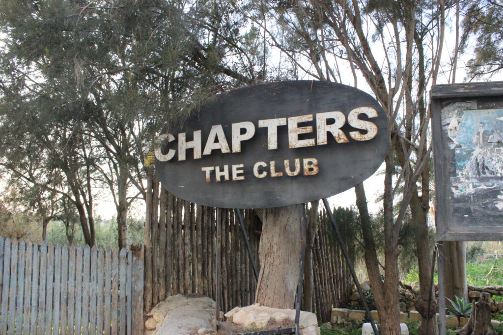
Chapters – The Club, Triq il-Gardiel, Marsaskala, MSK 9065, Malta [35.858742, 14.562570]
This was the place to be for the afterparty if you lived in the mid-90s and 00s. This has been closed down for a long time, but the outdoor sign and adjacent noticeboard stand tall till this very day. Considering how cringe-worthy graphic design tended to be during that time, I would say that whoever designed the logo did a pretty decent job. Simple yet bold font, a rare case where the Arial typeface is justified, white on a black background, that would of course light up at night. With that said, it is also worth noting the fact that the ‘S’ is upside-down and I only noticed it three days ago whilst going around taking pictures for this task. I will say that is was meant to be like that, although I have my doubts.
You can also check out the final ten photos I chose for this task prior to selecting the five I wrote about.
Bongo Nyah, Marsaskala 
Ex Jerma Palace Hotel, Marsaskala Somewhere in Marsaskala Chapters Club, Marsaskala Aldo Moro Road, Marsa 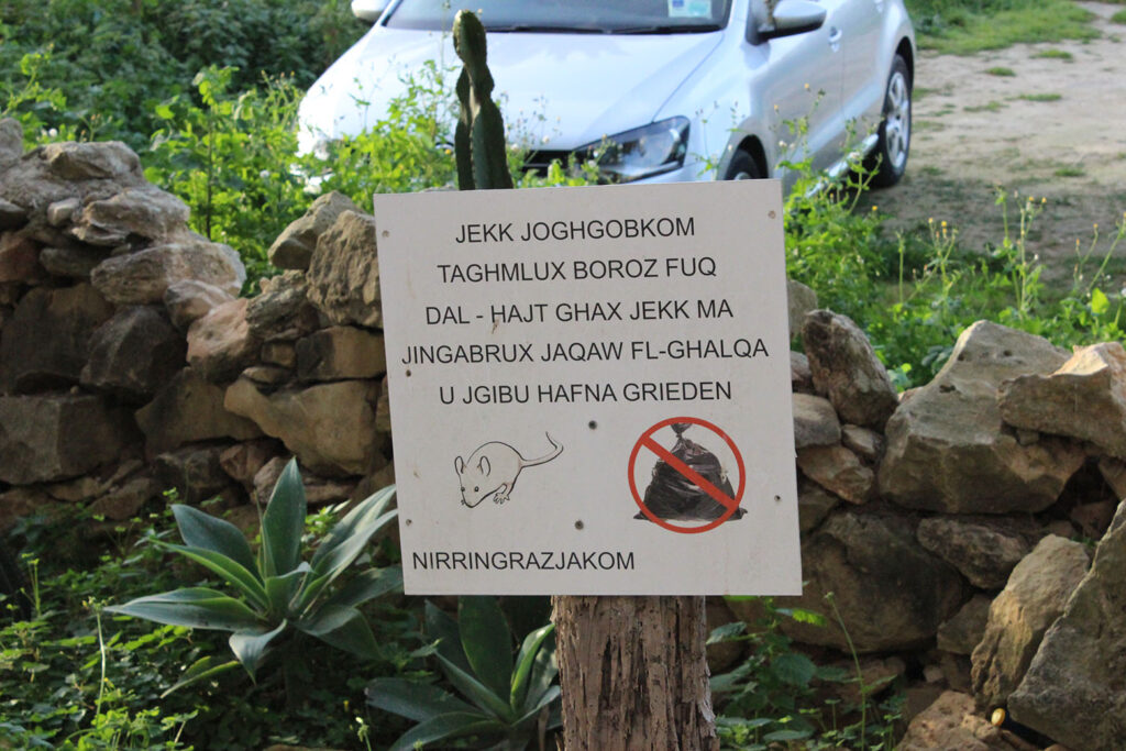
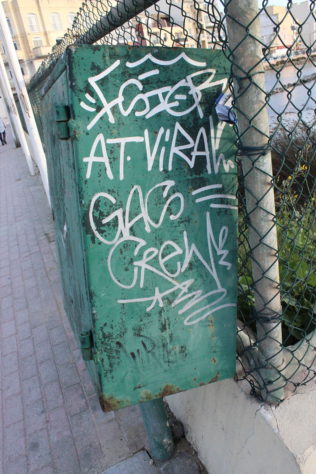
Somewhere in Marsaskala 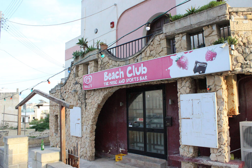
Beach Club – The Bar, Marsaskala 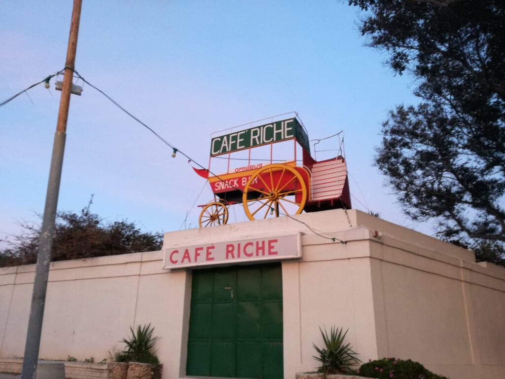
Cafe Riche, Vittoriosa 
Somewhere in Marsaskala 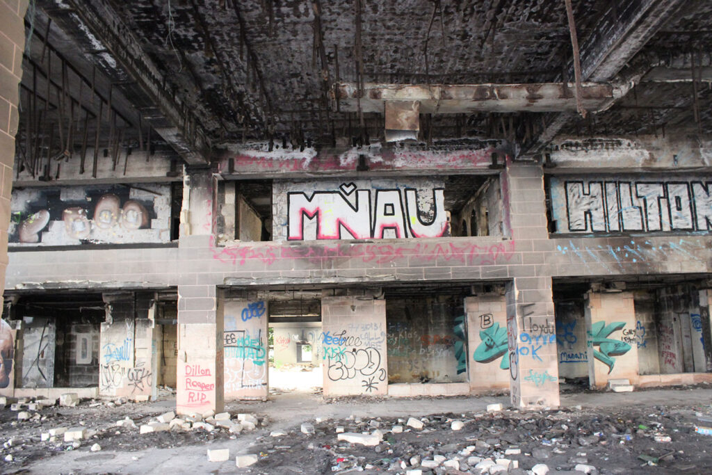
Ex Jerma Placa Hotel, Marsaskala