Trends and Environments: Lighting Up the Message, Symbolism and Semiotics of the New – Part 2
Case study: The Olympics Branding Through the Years
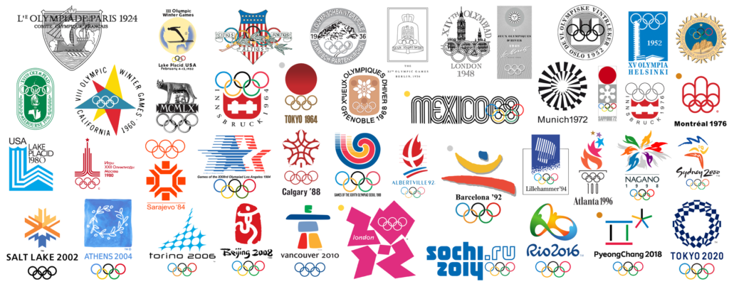
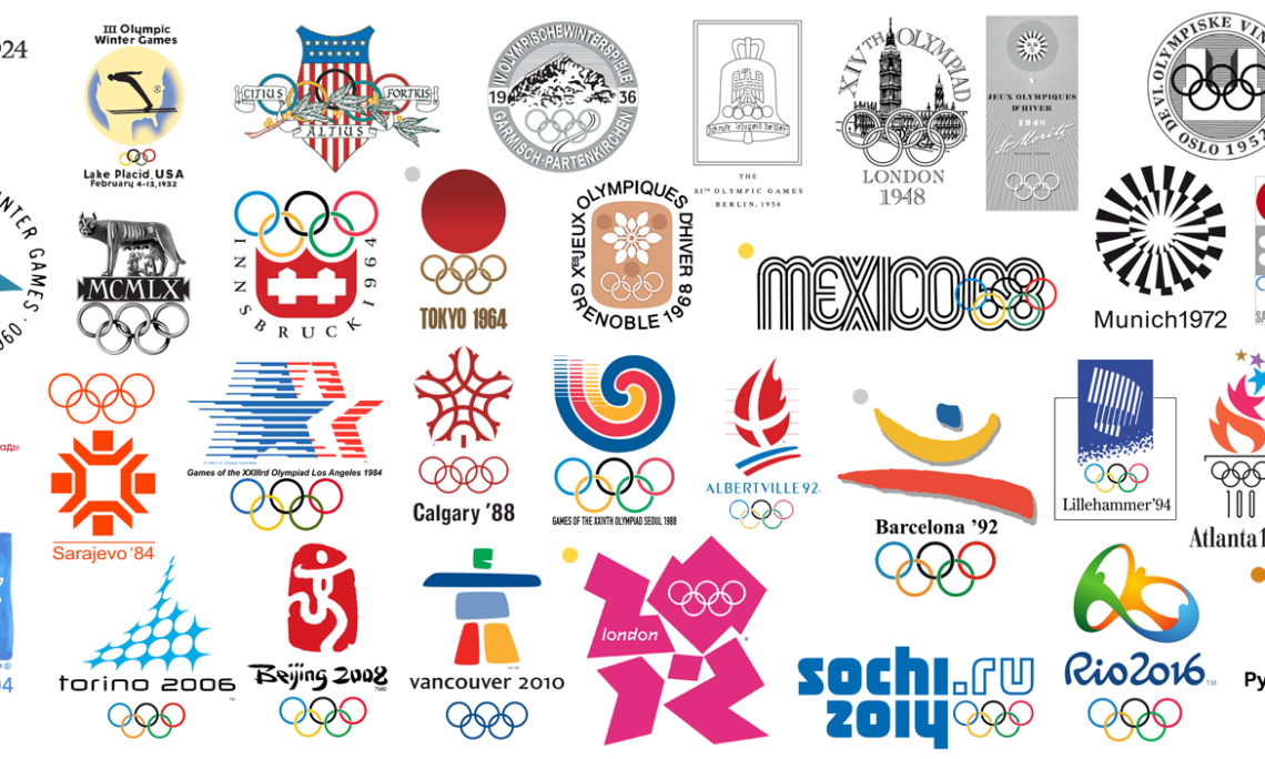
This part of the lecture is about comparing a common concept in different cultural contexts. Here we looked at the branding of the Olympics and how it changed through the years and how it suffered from one host country to another. People have become aware of “the global context”. This means that when speaking, writing or designing, they have a global mindset; they should cater for multiple nationalities. Therefore it is not a good practice to focus on one specific nationality or people.
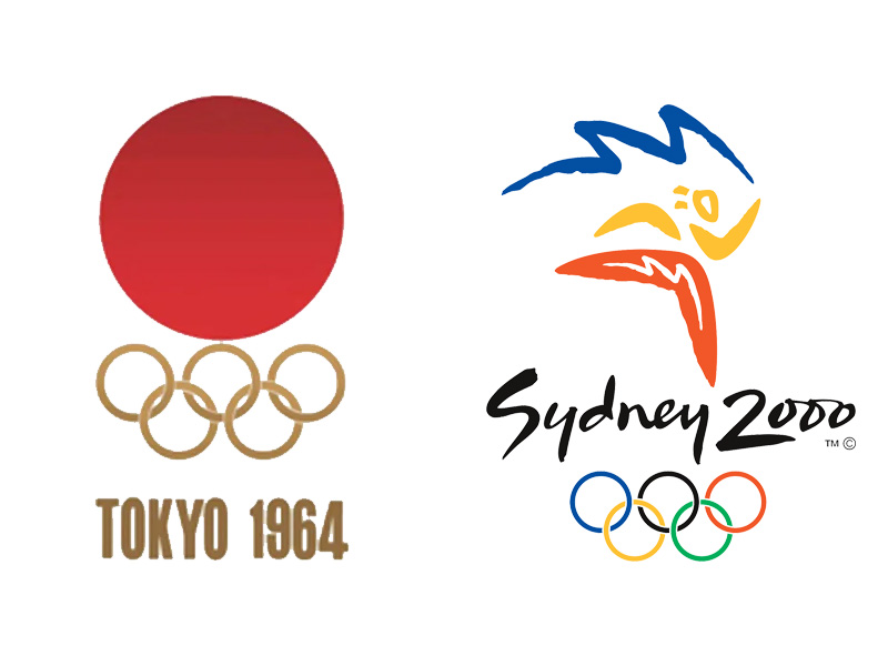
As the lecture progresses, we looked at various logo examples designed for the Olympics over the years. At first glance, one can immediately see that the logos vary greatly from one another and for a good reason. The host countries are of course different and each country has its own characteristics. Two very contrasting, yet similar examples were the Tokyo 1964 and the Sydney 2000 logos. Granted that design trends changed during those forty years, yet both logos had the same fundamental principle; that of showcasing that host country in the logo design. In the case of the Tokyo Olympics logo, the rising sun is the most prominent feature, whereas in the Sydney logo, the designer used the boomerang shapes to create a human figure inspired by aboriginal art.
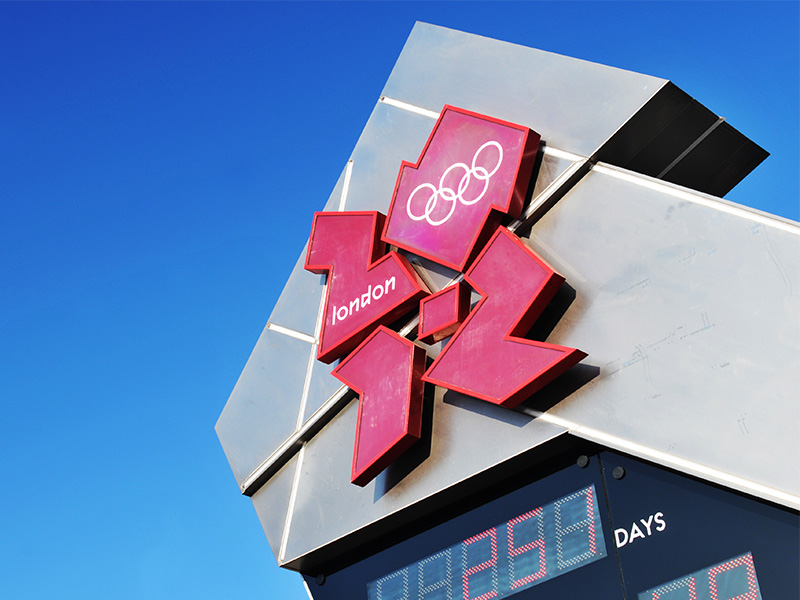
Another interesting example shown in the lecture is the 2012 London Olympics logo. Back then it was met with a lot of controversy because the public thought that it did not reflect “London”. Some designers also argue that whilst the branding system was well designed, the logo is poorly crafted. In spite of though though, if we look a t it from an abstraction point of view, is can be considered as a successful design. It stands out from the rest of the Olympics logos, and the designer wanted to capture the spirit of sport – the energy and dynamics of it. With this in mind, it can also be said that from a semiotic perspective, people have a general understanding of what the Olympics are. Therefore, this makes way for more exploration of abstract concepts. Back in the early 20th century, designers took a more direct approach in their designs. This was because the public was still unfamiliar with what the Olympics were all about, however as time went by, it is not the case anymore.
As we move forward in this world, we are exposed to an array of information from different parts of the world. As communication technologies progress, the world is truly becoming one global village, and continents are taking the shape of large scale neighbourhoods. To this, as far as creative work is concerned, it is important to keep this in mind from an early stage. Designing for the global community may impose a bigger challenge, however if tackled correctly, the results are far more rewarding.