Some self-reflection… in relation to this week’s task…
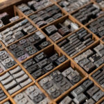
As this week is all about typography, I think it seems appropriate to share some thoughts about this topic. It is one of the pillars of graphic design and an art form in its own right. In short, I love typography. I do not know exactly why, but I just do.
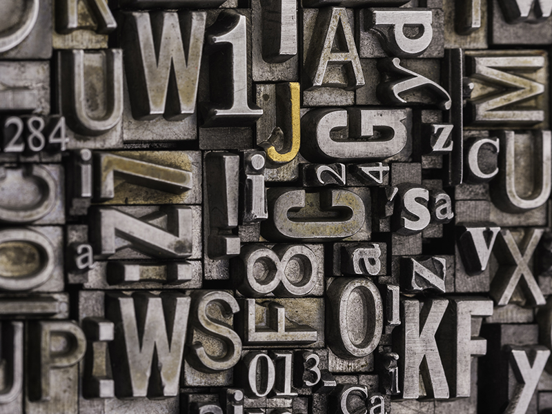
Following some of the lectures in the previous weeks, as well as this week’s, I think that it has to do with how fonts are made and the final product. The sharp edges of the glyphs, when they are stripped down from all decoration, the neatness in the presentation of a font makes it look so perfect. It is one of the rare moments were a piece of design is “complete” – the closest thing to perfection. By no means I am here to make typography seem like the nirvana of graphic design, however, I dare say that the art of typography and typographic design truly is beautiful and a skill that is not easy to master.
As many are aware, typography in design can be a dealmaker or breaker. The right font choices, the alignment of the text, the space between the text are all elements that if designed correctly (by ‘correctly’ I mean they complement each other holistically in an artwork’) will make the artwork look complete, whereas if overlooked or perceived as an annex to an artwork, can ruin everything in the long run. Personally, I like to take my time when working with type, be it selecting fonts, creating a typographic poster or working on an editorial piece. I like creating a mood board just for font pairings to see what works best.
So, as for me liking fonts, I think it has to do also with the logical aspect of my way of thinking. The structure of the letter forms looks very orderly, compared to the abstract fuzzy thoughts that are bouncing around my brain constantly. A sense of comfort, maybe? I do not really know for certain, but the fact that looking at fonts in a grid is relaxing for me, it probably has to do with finding order in chaos.
Yes, it is weird.
Ok, moving on… I thought I would share with you some typographic work that I did over the years, during my years in art school and in my free time.
Way back in art school years, I was still getting accustomed to how things and assignments worked. “Inspiration” was everywhere (or so I thought) and I was a bit of a try-hard. So my goals were pretty stratospheric. Following a presentation about illuminated manuscripts, I felt that I had to include that artistic style in my final hand-in one way or another. And amongst other things, we had to keep a reflective journal. This is how mine looked like:
Another art school project was a reinterpretation of a piece of text with typography. My text was part of an observation written by Annegret Hoberg in relation to Kandinsky’s ‘On Points’. We had to create a font book, as well as a make a poster. For this exercise I chose to work with Perpetua, for its classical elegance and it also fit the time period in which the text was written, as it was around the same time the Perpetua typeface was designed.
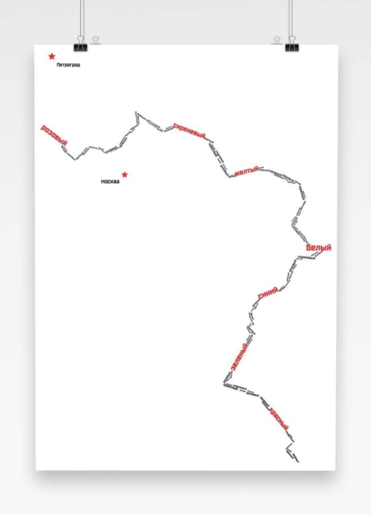
The poster shows the contours of the Volga River and the two most prominent cities in Russia during the beginning of the 20th century. Numerous battles were fought during WW1 near the Volga and thousands perished. The text that traces the contour of the river are in fact colours, representing the people and their individuality, yet it is stripped down to a number, which is why in the poster only black and red are used.
Fast forward to last year, I used to make chalkboard art in our canteen area in the sixth floor. It was a very interesting experience indeed. I got to sharpen my skills in hand-drawn lettering. If it was not for my allergy to chalk, I would still be doing it.


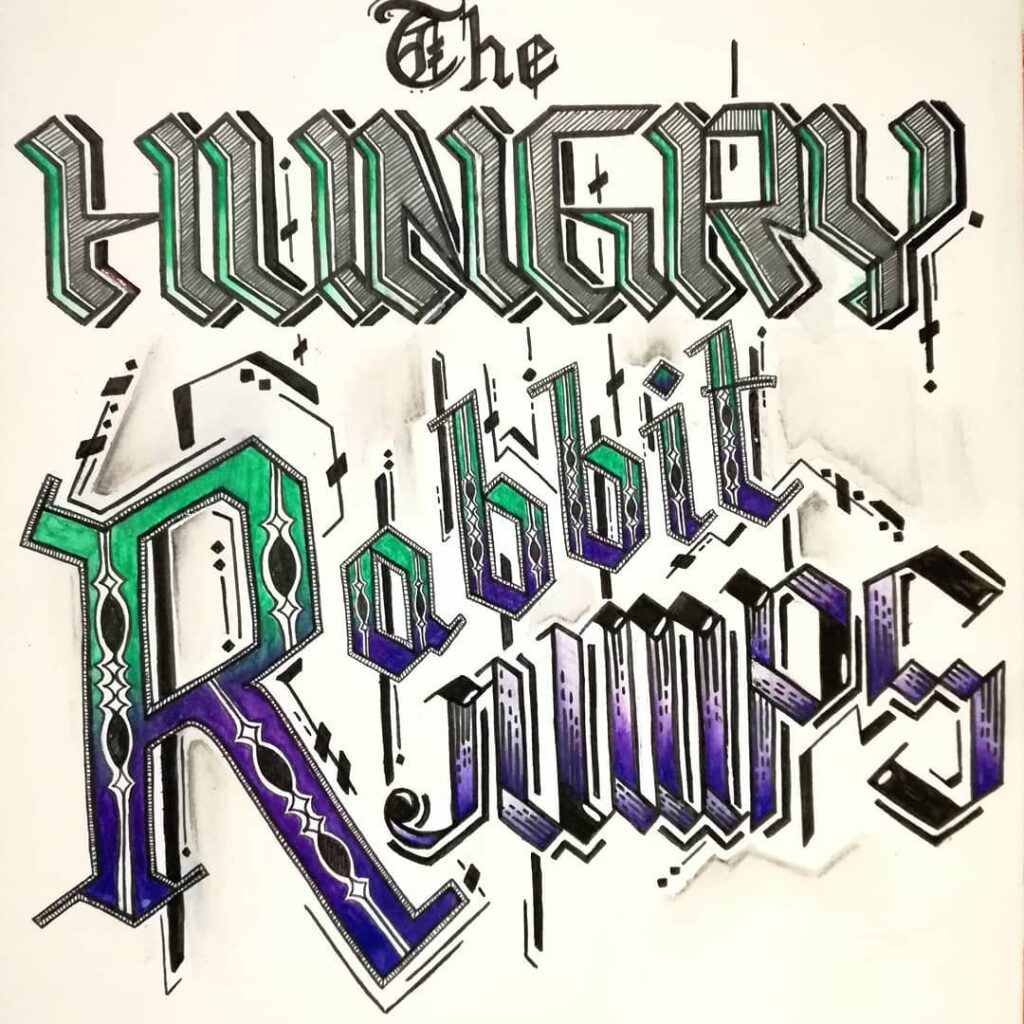
Lastly, I would like to share with you a typographic design inspired by the film ‘Seeking Justice’.
Probably this is my favourite week throughout the module. In case you have not figured it out yet… I am a typophile and a font geek. ?


One Comment
A short note about visual writing and self publishing… – Lindsay Aquilina – Graphic Designer
[…] include some of my typographic work I did a blog post for the previous module (have a look at it here). Can be a cool side project, even if it is just a couple of Facebook […]