Message Delivered – Message and Medium, Pencil, Pixel, Performance, Packaging
Where It All Began
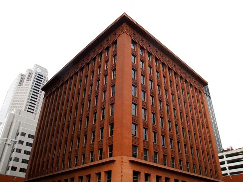
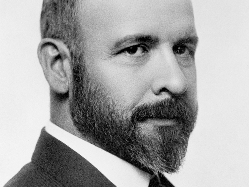
“Form follows function”. A phrase coined by the architect Louis Sullivan in 1896 in his essay The tall office building artistically Considered. During the time he used it to explain that a building’s exterior should reflect what goes on in the interior. Skyscrapers were a new trend during that time and steel was being used to build these high-rise structures, making the U.S. become more urban-oriented. After the Industrial Revolution, there was a rise in office-related jobs and competition was high in who will have the highest and newest building. Understanding the magnitude of this historical change in architectural design, Sullivan wanted to express himself and define principles in his essay. In his essay, he said that “The design of the tall office building takes its place with all other architectural types made when architecture, as has happened once in many years, was a living art.”

The principles described in Sullivan’s essay are still valid today. “All things in nature have a shape […] that tells us what they are […] that express the inner self”. What he means is that the form of a design, in this case that of a building – should change in appearance accordingly so it reflects the activities happening within. As for function, Sullivan’s idea was debatable as office buildings where rather similar in the way they operated, meaning that they would have common interior areas. It may have been organic at first, however later in time, Sullivan’s description was rejected, and many consider it to be dehumanising. He describes the office as a ‘cell in a honeycomb’ and ‘compartment’. After the turning of the century, Frank Lloyd Wright, one of Sullivan’s draftsmen continued exploring and elaborating the ‘form follows function’ concept. He believed that people were misusing this phrase without any understanding of what it meant and use it as an excuse for poorly executed designs. He also came to the conclusion the form and function are really two parts of one element. Despite this, Wright never rejected Sullivan’s idea. On the contrary, he continued building on it as he believed that Sullivan did not explore it enough. In The Future of Architecture, Wright discusses the concept of “Organic Architecture” – integrating architectural design with the environment.
From Etho to Principle
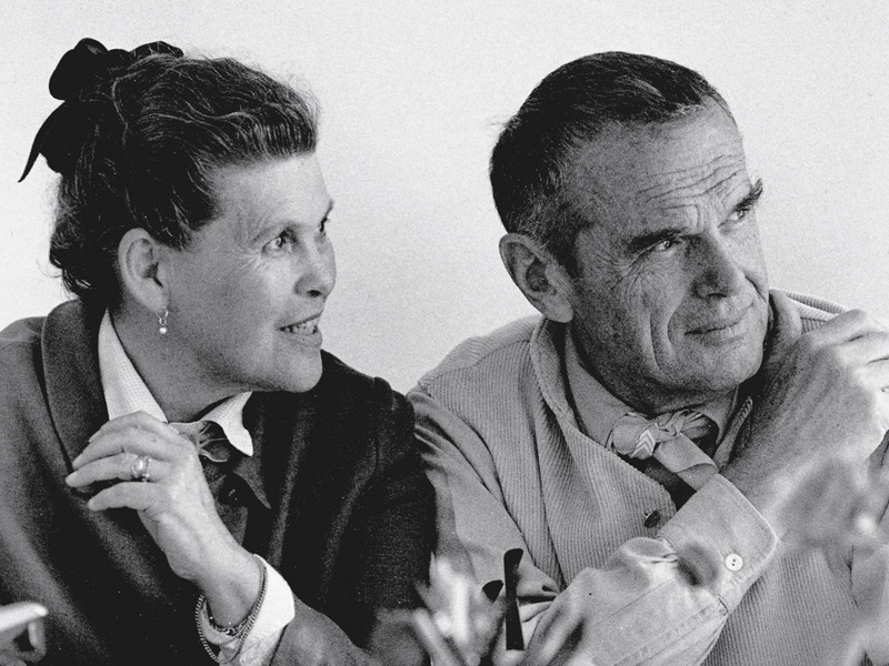
Over 100 years later, Sullivan’s ethos are still valid. The relationship between form and function is one of the fundamentals of good design. Regardless of what the project is, good design not only has to do with the way it looks, but also the way it works. As well explained by Charles Eames: “design is an expression of the purpose, and it may (if its good enough) later to be judged as art; design depends largely on constraints and it is a method of action.”
As discussed in this week’s lecture, the form in which the message is delivered is important in order to reach the targeted recipients. Selecting the medium goes because choose whether its print or digital. There needs to be a well-thought concept behind the method of deployment of the message. Choosing the wrong medium can result in message targeting the wrong crowd or missing it altogether. In the lecture, Sam Winston talk about the physical embodiment of a message. When working on an idea, it is good to experiment with different media and also exercise observation. This will in return make room for more experimentation, allowing broader exploration of that initial idea. This tactic reflects the dogma of ‘form follows function’ in relation to a thinking process. You are experimenting with different forms to find the right one that is best fit for the function your design work needs to serve.
Experimentation may be overlooked in some cases as in a commercial setting, deadlines are ever present, adding stress to creativity. Once more, Winston brings up the idea of “nothingness” in order to see things in a better perspective – stepping back and allows thoughts to catch some air, without working too much on the outcome. On the other hand, he talks about the importance of reflecting and observe our surroundings, all the time absorbing and processing what are we really looking at. In addition to this, as we live in relatively hectic lives these days, good time management is imperative. Allowing time for personal projects the same way we allow time for paid projects is important for personal development.
Furthermore, allowing time and space for experimentation and some thinking makes it easier for ideas to come out of your head onto paper, or whichever medium you choose. Processes are important as much as the final result. Which is why as creatives, we should embrace the unknown and at times allow our visual thinking to take its course. Doing this will allow our creativity to flourish, rather than walking into a project with presets. Very often, the medium chosen for the end product will be chosen my deducing which one is the most fitting, rather than deciding first thing in the beginning of the project, provided that there is budget, a clear message and the target audience is set.
All arguments reiterate the ‘form follows function’ at different levels. Be it designing a building, or describing how to go about a project, identifying the requirements in order for the product or message to ‘function’ well comes first, and the ‘form’ in which is presented will follow. By doing so, it will result in more efficient design work that is working at the same speed as ever-changing marketing channels. Innovative ways of communicating are created constantly and existing one rise and fall in popularity as trends change. This means that as creatives we have think outside the box, have a look at what is happening around us and identify the next best functioning solution to move forward with our next project.

